
A step toward understanding (part 1)
Using factor analysis to get a handle on the pandemic

In a series of newsletters entitled ‘COVID uncovered’ I have been wading through datasets, concepts, notions and fancies with a view to answering a simple question - just what was COVID meant to be? As I explained in one such newsletter I can understand a diagnosis of diffuse alveolar damage - COVID being a respiratory disease and all - but how does hair loss fit in with that?
Yes, I’ve been following the biochemistry so can mumble on about cytokine and bradykinin storms and, yes, I’ve been following surgeons taking lung sections and pathologists taking other bits but this is very much narrow focus study. What I really want to understand is what COVID looks like from a big picture perspective, perhaps at the level of an entire NHS Trust or even across the whole of England. With this big lens in mind I have been shovelling and cleaning data and am now ready to start baking. We shall start with the story for the whole of England…
England as a lens
The UK GOV coronavirus dashboard download section is a veritable boon (providing you take care with some odd data definitions and endless changes to those definitions), but this is only a starting point. Since March 2020 I have been crafting a few custom variables using this raw data such as rolling 7-day virus tests per person, disease prevalence (cases per 100 people tested) and the rolling 7-day case fatality rate for COVID certified deaths. In addition to these custom bakes I’ve been correcting basics such as deriving the actual number of viral tests undertaken under pillar 1 and pillar 2 if we reverse de-duplication efforts. All in all I’ve notched up 38 England-wide pandemic-flavoured daily variables over the last two years and here they all are for the period 1st Mar - 7th Dec ‘20 (i.e. pre-vaccine):
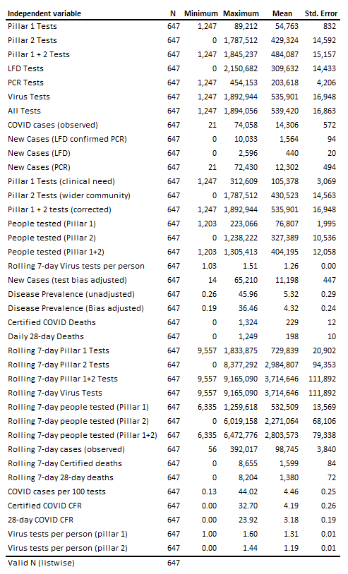
Many of these overlap in an obvious way (pillar 1 tests and pillar 1 + 2 tests, for example) but some will overlap in a less obvious way (pillar 1 tests and COVID cases (observed), for example). We could draw up an almighty correlation matrix and set about eliminating this unnecessary duplication within the variance space or we could opt for running factor analysis and boiling this large list of multiply-correlated variables down to a handful of orthogonal factors a.k.a eigenvectors.
Factor analysis
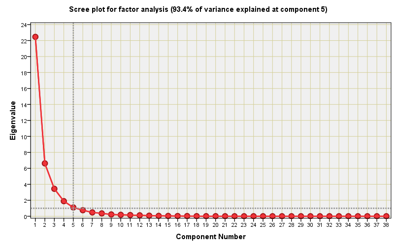
To bake this cake I opted for the classic approach of principal components extraction for eigenvalues greater than 1.00 with varimax rotation of the solution. I struck lucky because just 5 orthogonal components were needed to explain 93.4% of the total variance within the 38-dimension dataset. I love scree plots, so here is a corker with a well-defined elbow:
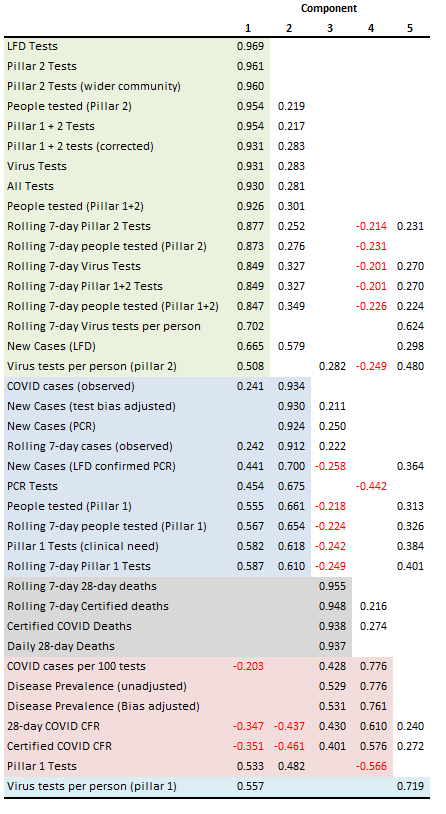
The rotated solution offers some intriguing insights for which we may munch our way through a few biscuits. I’ve highlighted the key sections in fetching pastels starting with pale green for what is a grand collection of all those variables connected with testing in the wider community (pillar 2). These dominate matters, and particularly so after the introduction of the lateral flow kits and mandates for the education and employment sectors.
The pale blue section section brings together all those variables connected to case identification and testing in a clinical setting (pillar 1): this is the realm of the PCR test and the inpatient population. This split between the green and blue is already telling us something valuable and that is COVID cases across England were never a big community thing; they were an inpatient thing.
The four variables directly concerned with COVID death appear together in the grey band. It would appear that death is a different matter entirely though there are weak coefficients that link death to new cases (PCR) and moderate coefficients that link death to disease prevalence and the case fatality rate (CFR). This makes a great deal of sense. The pale pink section collects together a whole bunch of rate variables, being a marriage of disease prevalence and case fatality, though there is an interesting negative coefficient of -0.566 for pillar 1 Tests.
The final component is an oddball centred on virus tests per person under the pillar 1 scheme with a smattering of modest coefficients across clinical and community testing data. Virus tests per person is one of those hidden biases that I like to bang on about and it’s great to see my ranting supported!
The dessert trolley
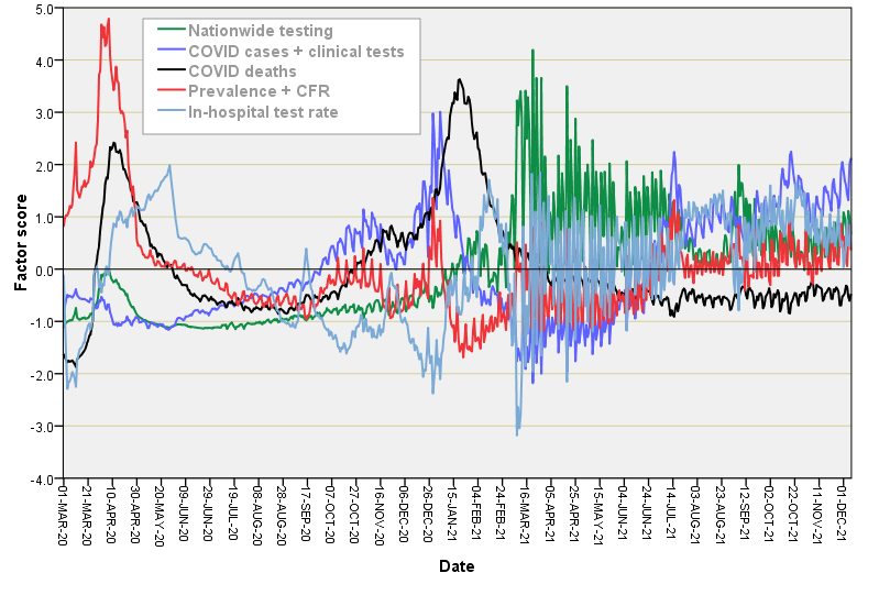
We started with 38 raw variables and ended with 5 orthogonal factors that explain 93.4% of the variance structure. That ain’t bad going! The 5 extracted factors were given the titles of: nationwide testing, COVID cases + clinical tests, COVID deaths, prevalence + CFR, and in-hospital test rate; herewith a colourful plot of how they vary over time:
I reckon that’s enough nerd for now! In the next newsletter I’ll run the same analysis for all of the NHS hospital activity variables I’m sitting on so we get to see how that shakes down.
Kettle on!