Age & sex factored mortality 1970 - 2021 (part 2)
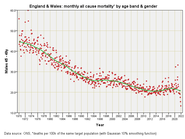
England & Wales monthly mortality rate by quinary age band and sex: males 45+y
I am hoping that subscribers who’ve read part 1 of this series have got the jist of what these big picture slides are about and feel confident to jump straight in and interpret what they are seeing in terms of the dynamics of the nations of England & Wales as a whole. Assuming this is the case I shall keep my comments pretty minimal for parts 2 – 4 and let the slides speak for themselves…
I want to interrupt here to point out that the tell-tale droopy tail for the latter months of 2021 has disappeared for all but one scrawny point. This suggests the ONS are able to process deaths for 55 – 59y males in next to no time but somehow are stumbling over the processing of more youthful deaths. Do I smell something going off in the larder? There is no obvious upturn following the Health & Social Care Act (2012) for this age group, merely stagnation. The pandemic is characterised by just two outliers that will invariably contain the most vulnerable members of society.
We observe serious seasonal scatter modulated by a steady decline in mortality for 85+y males. That scatter masks the impact of the pandemic somewhat, with mortality for the oldest group of males looking pretty much business as usual. This is unexpected for I was anticipating a vast cloud of outliers for 2020 but only one extreme point is observed, this being a rate of 2634.25 deaths per 100k 85y+ males during April 2020. Another outlier is observed, being a rate of 2320.73 deaths per 100k 85y+ males during January 2021 and that’s yer lot. Given this is the age group that got hammered this slide sure puts the pandemic into perspective and I’m inclined to start enclosing this word in apostrophes.


I also think the word 'pandemic ' is unjustified by the facts.