Age & sex standardised annual all cause mortality 1970 – 2021
A quick look at the annual series for England & Wales (rev 2.0)
Up to now I’ve been churning out umpteen charts for quinary age band and sex by month for the period Jan 1970 – Dec 2021. Today I’m going to simplify matters and aggregate the monthly sub-totals into an annual total, thence to combine age groups by sex into a single figure that is as standardised as I can muster! Age adjusted mortality always needs a reference population and I have chosen 2012 as the reference year for the population profile in terms of age (18 bands) and sex. The ensuing chart compares favourably to a similar chart published in the BMJ.
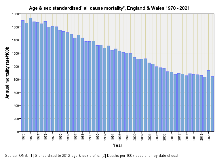
The pandemic year of 2020 certainly stands out as a blip but some folk will consider this a mole hill with greater rates for all cause mortality being found no further back than 2008; others will look at the series from 2009 onward and consider it a mountain. Being an applied statistician I will consider the blip an opportunity for a spot of modelling.
We can start by looking at the first order differential for the series. We’ve encountered this gizmo before so hopefully subscribers will be familiar with what I’m doing and why. When plotted out we arrive at this slide upon which I have scribbled 3 sigma control boundaries. We now see that - as a control process - age and sex standardised annual mortality for 2020 hit the alarm, with 1972 coming a close second. In plain English this means the pandemic generated a sudden surge in death like no other year before, perhaps with the exception of 1972. One wonders what we’d see if we could roll the series back to 1950.
Another thing we can do as applied statisticians is get stuck into Box Jenkins Autoregressive Integrated Moving Average (ARIMA) time series modelling given we have the good fortune of possessing a data series that is a smidgen over Box’s recommended lower limit of 50 data points. This splendid set of tools enables us to characterise a time series, thence to produce forecasts and investigate things (aka intervention analysis). I am not going to bore people silly with tech talk and shall plough straight in with a slide summarising my efforts…
You can see how closely the ARIMA predictive model matches observations and how nice and tight the 95% confidence boundaries are, with Pearson’s bivariate correlation fetching up at a mouth-watering r = 0.995, p<0.001, n=51. Geeks may note that the best model mustered was ARIMA(1,1,0) with natural logarithm transformation to stabilise the variance.
Now for the juicy bit…
If I run the model with an indicator variable for the year 2020 this pops out as highly statistically significant predictor (p<0.001) with a coefficient of 0.107. When converted from natural log values and translated into plain English this tells us that, on average, the year 2020 saw an 11.3% rise in the age and sex standardised mortality rate (e^0.107 = 1.113)
We can crudely cross check this by taking that whopping great change in the mortality rate of +102.2 deaths per 100k population from the second slide and throwing it against the overall mean mortality, this being 1,242.1 deaths per 100k population, thereby arriving at an estimated 8.2% increase during 2020. Alternatively we could take the rates of 831.3 and 933.5 deaths per 100k population for 2019 and 2020 respectively and come up with a 12.3% increase.
We can now see that the ARIMA estimate of an 11.3% increase for 2020 sits nicely in the middle of matters after having accounted for variability in the historic data record. Time series modellers will talk of ‘shocks’ (random processes) and ‘memory’ (lingering effects and/or trends), all of it being a dance in time.
This sort of fiddling enables applied statisticians to earn crust whilst sitting in a comfy chair scoffing cake and downing cuppas. I’ll get the kettle on and pull down the monthly data series of 624 data points and see what else we can see…


Like this: nice and simple. But show it to most people and they will accuse you of being a conspiracy nutjob! After all, they would argue, if all cause mortality is less than 1000/ 100,000, then we would all live to over 100, wouldn't we?