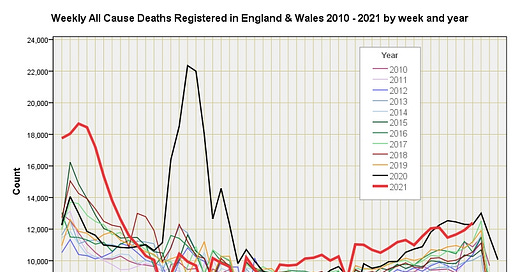
As I have explained in a series of three posts dated 12/6/21 - 15/6/21 estimating excess death using the 5-year baseline approach can be tricky because disease doesn’t carry a weekly diary and administrators who register deaths like to take it easy in the holidays. Thus an early or late flu season can play havoc with the figures, and a run of exceptionally mild years can foster a biased baseline. Whilst there are all sorts of ways to account for these wrinkles one of the simplest methods of getting an idea of what is and what is not going on is to get out the crayons.
In the attached slide you’ll find 624 weekly data points for the period 2010/w1 – 2021/w50 condensed into one colourful representation that reveals some interesting detail. We may note how the pandemic is characterised by a burst of deaths over the period 2020/w13 – 2020/w22 and not much else, and we may note that something was going on 2021/w1 – 2021/w8 that has since settled down. Another curiosity is the ramp of highe…


