An Enigma: Transmission Of Epidemic Influenza (part 5)
I attempt to shed light on the riddle that is seasonal influenza using my bag of spanners. Today I take a look at crude mortality 1901 - 2022
I am now sitting on a pile of freshly-churned mortality data (influenza deaths per 100k population) differentiated by sex and age group that is capable of yielding no less than 18 separate charts for trends in mortality over a 122-year span. Whilst this is most excellent and a terribly yummy position to be in I’m going to risk the throwing of squishy tomatoes and rotten cabbages from readers and start with a plot of crude mortality for deaths ascribed to influenza. There is a jolly good reason for this that will manifest later, so bear with me.
Here is that potentially disappointing plot:
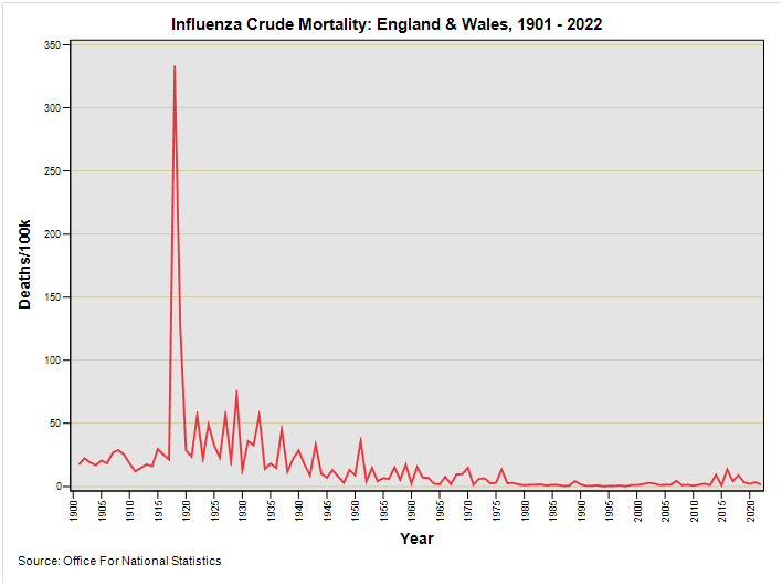
Those keen readers wot did their homework and went and read my five fabulous and utterly unctuous articles will be most familiar with this spiky slide. In eyeballing this variant we should note the lack of the pot holes arising from ONS experimentation with WHO Rule 3.
Because I’m a softie I’ll paste once again what I’ve already written about this bold swindling of cause of death coding…
WHO Rule 3
Officers at the Office for National Statistics tell me that implementation of WHO rule 3 generated historic coding changes and have kindly pointed me to a ONS national mortality status report that was laid before parliament back in 2006 that summarises the situation. I have secured a copy of this document, which may also be found here; and I once again present a few choice extracts for contemplation:
In general, the main change in introducing automated cause coding was in the interpretation of WHO Rule 3, one of the rules used to select the underlying cause of death. The interpretation of Rule 3 was broadened by OPCS in 1984, so that certain conditions that are often terminal, such as bronchopneumonia (ICD-9 485) or pulmonary embolism (ICD-9 415.1) could be considered a direct consequence of any more specific condition reported. The more specific condition would then be regarded as the underlying cause. This change in interpretation meant that deaths from certain conditions such as pneumonia declined in 1984, while deaths from conditions often mentioned in part II of the death certificate increased. The change in 1993 was thus to move back to the internationally accepted interpretation of Rule 3 operating in England and Wales before 1984. The effects of moving back to this earlier interpretation of Rule 3 have been discussed elsewhere. Deaths assigned to external causes were excluded from the Rule 3 change in 1984 because the procedures for assigning underlying cause of death based on coroners’ verdict were unaffected by WHO rules.
The rule that changes cause of death statistics most is Rule 3. In ICD-10 the list of conditions affected by Rule 3 is more clearly defined than in ICD-9 and is also broader in scope. Its impact is to reduce the number of deaths assigned to certain conditions such as pneumonia and to increase the number of deaths assigned to chronic debilitating diseases. In England and Wales, about 20 per cent of deaths mention pneumonia so the effect of the change in Rule 3 is large.
..so there you go (again)!
Back when I was looking at deaths from pneumonia I was left with a rather large headache of reconciling holes in the time series arising from rule changes, but this time round we don’t see an impact on counts of deaths ascribed to influenza alone. What we do see is the incredible impact of the 1918/19 ‘Spanish Flu’ that utterly dominates the plot. Let me crayon this again but starting in 1920:
It should be abundantly clear that mortality for influenza has been in decline for quite some time; and pretty much so since the great and terrible epidemic of 1918/19; that just so happens to be curiously coincident with the final days of WWI.
Wiki tells us that vaccination against influenza began in the 1930s, with large-scale availability in the United States beginning in 1945. Here’s what Brave Search A.I. has determined from trawling t’internet:
Influenza Vaccine UK History
The history of the influenza vaccine in the UK spans several decades, starting with the development of the first experimental vaccines in the 1930s. Here are key milestones in the UK's influenza vaccine history:
- **1930s**: The first experimental influenza vaccines were developed by researchers including Thomas Francis, Jonas Salk, Wilson Smith, and Macfarlane Burnet. These early vaccines were based on viral growth in embryonated hens' eggs, a method that has been used for vaccine production up to the present day.
- **1940s**: The US military developed the first approved inactivated influenza vaccines during World War II. These vaccines were used to protect military personnel and were a significant step in the widespread use of influenza vaccines.
- **1950s**: The egg-based technology for producing influenza vaccines was established in the 1950s, which became the standard method for vaccine production for many years.
- **1960s-1970s**: The UK continued to refine vaccine production techniques and improve the purity of the vaccines by developing processes to remove egg proteins and reduce systemic reactivity.
- **1980s-1990s**: The UK began to implement annual influenza vaccination campaigns, targeting high-risk groups such as the elderly, pregnant women, and individuals with chronic medical conditions.
- **2000s**: The UK expanded its vaccination programs to include children and healthcare workers. In 2013, a newly licensed live attenuated influenza virus (LAIV) vaccine was introduced for children aged 2 to 16 years, starting with children aged 2 and 3 years and gradually expanding to older age cohorts.
- **2010s**: The UK continued to improve its vaccination programs, including the introduction of cell-based and recombinant influenza vaccines. The intradermal vaccine was also reintroduced after being unavailable during the 2018-2019 and 2019-2020 influenza seasons.
- **2020s**: The UK has maintained its commitment to annual influenza vaccination campaigns, with a focus on increasing uptake among high-risk groups and frontline healthcare workers. The NHS provides free flu vaccinations to eligible individuals, and community pharmacies have been providing flu vaccinations since September 2015.
This history reflects the UK's ongoing efforts to protect its population from influenza through vaccination programs and the continuous improvement of vaccine technology.
OK, so I’ll tell you what I think after chewing on this information and eyeballing that slide…
It sure looks to me like deaths from influenza were already in decline before vaccines came into being, and certainly well before large-scale programmes of national distribution and refinement of methods dropped into the pot. It would seem, then, that those with vested interests in the industry are taking credit for a ball that was already rolling. Quelle surprise! Quelle ruse! We should further note that mortality ascribed to influenza as the primary cause of death had already bottomed-out at the beginning of the 1980s prior to implementation of mass vaccination campaigns.
Something else we should note is that modest sting in the tail of the time series that zings during 2014, 2016 and 2018. Despite best max-jab-the-masses efforts and super-duper new technology we observe recent mildly elevated rates for mortality. This is not exactly my idea of effective medicine.
But there are hidden skeletons in the closet as well as something nasty in the woodshed. Epluchons quelques couches de cet oignon...
Mortality Two Ways
Let’s go back and look at crude mortality for 1901 – 2022 broken down by sex:
This is one of those charts I produced by accident, but started wondering about the subtle differences we are seeing. Why did the pandemic of pandemics back in 1918-19 smack men harder than women? Could it be something to do with service and conditions encountered during WWI or is this simply fanciful thinking? And what’s going on with those recent red man-spikes? Why would men be singled out by anything viral? Interesting indeed, but more detective work is needed.
Let me now junk sex (for the differences aren’t exactly huge) and have a look at mortality by age band:
Now this slide got me sitting up and taking notice, I can tell you!
Let’s start with the red line for the 75+ age group, whose bodies and immune systems will not be functioning as they once did as whippersnappers. Do you see a significant peak during the 1918-19 pandemic? Neither do I.
Strange that, and it is equally strange that their very own pandemic of significance hit the mark during 1929… and after a steady spiky rise followed by a steady spiky fall. This is not exactly indicative of a hit-and-run mutating virus and is the sort of thing I’d expect arising from general health and welfare issues changing over time mixed in with something possibly pathogenic.
Let us now consider that whopping bright green spike denoting the 25 – 34 year age group sitting back in 1918-19. Back then these youngsters were being hammered by something that wasn’t hammering the most frail and elderly members of our population. To say this is strange is something of an understatement. Again, my mind wanders back to military matters surrounding WWI.
Though it’s not so easy to fathom from this plot we’ve got WWI spikes sticking up for all the youngest members of society, and especially the neonates and infants at 0 – 4 years, which were particularly vulnerable; and more so than the 5 – 14y age group. What we seek, therefore, is an agent that clobbered the youngest members of society whilst leaving the frail and elderly unscathed. Weird.
Hope-Simpson no doubt would have something to say at this point about acquired immunity. In his book you’ll find him mentioning epidemics that favoured the oldest members who were alive the last time a particular strain of nasties hit town (and who managed to survive). If we accept this to be the case then what stands out as rather odd are the events of 2020 that took out our elderly and infirm by surprise, and with surgical precision. Hope-Simpson in reverse, as it were. Once again nothing adds up.
One final thought… that sting in the tail of the time series: is it an early warning sign that we’re going back through some sort of ‘orrid serotype cycle once more? If so, a cycle of what, exactly? At this point I suggest we all cogitate avidly whilst I sharpen my crayons and oil my spanners.
Mortality Three Ways
We may as well make this a bumper issue with the addition of two more plots that stretch my crayons to the limit. Herewith mortality for influenza by age band and by sex for England & Wales over the period 1901 – 2022. Be prepared for a shocker:
We need to ask one really important question: what kind of virus attacks young men aged 25 – 34 years in preference to any other sector of the population by a long, long chalk? This smells fishier than the mackerel I like to stew with my egg noodles and I ought to try and get to the bottom of it.
BUT…
Now that is a really big but and the biggest ‘but’ I can muster from the style menu. We need a big but at this point because we are getting all excited and I’m churning out charts that stir the blood. The reason we need that big but is because we’ve gone and assumed consistency in diagnostic coding for influenza as a cause of death over a period of 122 years. This is like asking for the moon. What I’m inclined to do, therefore, is take a quick look at all cause mortality by age band and sex for the period 1901 – 2022. Here goes…
Now isn’t that just fabulously fascinating!
In fact, these two charts smacked my gob so much that I had to go back over the source data and spreadsheet formulae just to check I hadn’t made any silly errors. The thing about all cause death is that it isn’t subject to coding errors, coding sleight of hand, or processing whimsy (like WHO rule 3 wot nobbled pneumonia mortality). For sure it is subject to foibles like counts by date of registration instead of date of death but that isn’t going to matter too much over a data series whose resolution is the year. The wisest of analysts tend to focus on all cause because of the vagaries of coding, and here is yours truly strapping a pair on at last. And what a pair!
How about that no show for the 1918-19 pandemic of pandemics, eh? To be fair it does show for males aged 25 – 34y but other males not so much, and nothing for males aged 55 years and above. As for females we see mere pimples on the butt of time. This is mighty strange behaviour for a hyper-deadly novel influenza type A bug, innit?
What I’m going to park on the back burner for now is a massively detailed ARIMA run assessing the impact of the 1918-19 pandemic on all cause mortality for all 18 time series for males and females. At the same time we’ll look at WWII and the alleged 2020 global pandemic to get a feel for things. This promises to be a corker but the work will have to wait until I’ve served all of my dishes in the order in which I wish to serve them.
Kettle On!
So many good bites in this post. I'll come back and add more, but...re: the graphs under BUT...
A comp, courtesy of the NYC DOH. https://substack.com/profile/32813354-jessica-hockett/note/c-97993950?utm_source=notes-share-action&r=jjay2
I know you'll appreciate the title of that graph...
Oh very well plated! Fascinating and great graphs. One for my “good to have” archive indeed.