Bed Loss & Bedlam (part 4)
A look at bed occupancy within NHS England over the last 13 years
So far in this series I’ve presented evidence of a lagged correlation between bed loss and excess all cause and non-COVID death and we’ve seen substantial decline in bed occupancy at the onset of the first wave. Arguably more surprising than lowered occupancy was the discovery of a rapid and most substantial decline in bed availability which indicates managed withdrawal of beds at a time when computer simulations at Imperial College were predicting an incoming mega-wave of seriously sick folk. Wacko is the word!
A searching question that needs a decent answer is why did large numbers of beds get removed from service at a most critical time? When I say ‘large’ I mean gigantic, with an estimated 3,360,266 cumulative bed days withdrawn because of COVID-driven management policies.
Beds don’t take care of themselves so if staff levels drop beds will be closed in order that units remain within requirements for safe nurse to patient ratios. Thus loss of staff (either through genuine sickness or a positive test result) at the height of the pandemic may well have driven planned bed closure. That’s a logical assumption for sure but does the data support such thinking? I guess we better get that kettle on, put some toast under the grill and go find out…
Availability & Absence
I’m going to wade straight in with a scatterplot of quarterly estimates of mean daily bed availability (day and night beds across all specialities) against mean daily staff absence (COVID and non-COVID absence) for that quarter. If staff absence is high we should see bed availability drop (and vice versa), therefore we should see some sort of systematic negative relationship as the pandemic came and went. The interesting thing is that we partly see this but mostly we don’t:
Down in the right-hand corner we observe peak staff absence and peak bed loss for 2020/Q2 as anticipated, with lots of staff calling in sick and lots of beds being closed as the first wave hit. If we assume the staffing ‘norm’ to be mean staff absence across all periods apart from the rather exceptional 2020/Q2, then we arrive at a figure of 76,632 absences per day. In turn this suggests 2020/Q2 saw an excess of +39,570 absences above and beyond the norm. If we now take the 2020/Q1 available bed peak of 141,659 and subtract the 2020/Q2 low of 128,271 beds we find an estimated mean daily loss of 13,388 beds. In my book closure of 13,388 beds per day in order to cope with an excess absence of 39,570 staff per day is not bad going, especially for a service that runs near breaking point as a matter of course.
I admit that these are rough figures and the calculation is well and truly back-of-envelope but it is sufficient for me to conclude that staff absence is very likely the driver behind bed availability. In plain English managers had no choice other than to close beds if they wanted to maintain safe practice for the remaining patients. The question then becomes whether we should stick to safe practice guidelines during an exceptional global event and this is a bone I’d rather toss to others!
The Rule Of Thumb
Before we finish with this slide it is worth operating what my colleagues used to call the ‘rule of thumb’, the idea being to stick your thumb on a graph to cover a subset of points to see if the relationship you had proposed suddenly vanished. Whilst there are sophisticated methods of going about this the rule of thumb works a treat. And so we shall now place our thumbs over the data point for 2020/Q2 and ask what we now see.
We don’t see anything other than a seeming random scatter of points in which mean daily bed availability and mean daily staff absence bob about nonchalantly in a sea of variance. A Pearson bivariate correlation confirms this with a statistically insignificant r = 0.319 (p=0.402, n=9), but what does this mean in plain English? It means that, with the exception of 2020/Q2, there is no obvious relationship between staff absence and bed availability. This situation would come about if staff absences were normally running below a critical threshold; that is, if there were enough hands left on deck to manage the sheets without the need for strategic bed closure.
What we’re essentially looking at with this veritable plum pudding of points is a steady recovery of the service and gradual return to normal occupancy levels as elective procedures starting filling the books and folk regained the courage to step into a hospital.
Occupancy vs Availability
I am hoping that subscribers understand the difference between occupied and available beds. If there is an endless demand for staffed beds then suitably qualified nursing staff becomes the limiting factor and occupancy can be taken as a proxy for this. This is a rather handy realisation since we can then access a whole bunch of occupancy data even if we can’t get our hands on detailed staffing level data. Occupancy will, of course, also depend on many other factors such as catchment area, range of services provided, number of available theatres/treatment rooms, consultant head count as well as financial and contractual matters.
In an idle moment I drew up a scatterplot of mean daily occupancy against mean daily availability for the period 2010/Q2 - 2022/Q3 and got out my crayons. The result is one of those pleasing plots I enjoy cogitating on. Here it is:
As well as colouring the primary pandemic phases I have taken the liberty of adding three coloured lines representing levels of 90% occupancy (red), 80% occupancy (orange) and 70% occupancy (green). The curvy relationship we observe is rather splendid and from this we may glean that NHS managers have historically attempted to keep occupancy between 80% and 90%.
As the pandemic took hold we saw occupancy drop below 80% and even below 70% for 2020/Q2. Now this is interesting because we’ve just accepted closure of 13,388 beds per day in an attempt to cope with excess absence at 39,570 staff per day and have naturally assumed hospitals were really up against it. This presumably would lead to more beds being available than could be staffed and so occupancy would plummet, just as we see here.
This leads to the realisation of a paradox whereby beds were going empty not necessarily because of lack of demand but because of lack of staff. Depending on the catchment area and resilience of staff agencies and nursing banks - all being compounded by the range and nature of services provided - we may assume that some hospitals would have seriously felt the pinch whilst others enjoyed a rather more leisurely pandemic. The problem comes when folk try to force a simplistic national picture on what will essentially be a local (or regional) response.
Curves & Determinism
Any mathematically-minded soul, upon contemplating this curve, will reach for a deterministic concept of occupancy and availability being measures of a strongly dynamic and somewhat coherent system. Two horns on the same goat, as it were, with the decline in occupancy being a staff-driven smoothing function responding to an impulse rather than management causing havoc. In plain English, things ain’t random, nor were managers being beastly.
In many ways the trajectory down and back up is rather like an artillery shell made of rubber and fired from the canon of COVID, the impact of which will cause ripples to pass over the population for many years to come. Estimating these ripples, in terms of timing and influence, will be paramount if we are to get a clear stab at nailing vaccine harm and/or benefit.
Occupancy & Staffing
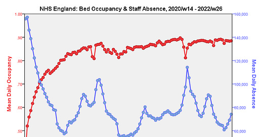
I’ve tried a few different ways of getting this relationship across and my favourite slide so far is this one:
Here we see a mirror-like dance of daily occupancy in red (total beds occupied / total beds available) with mean daily staff absence for weeks covering the period 2020/w14 - 2022/w26 that makes the point of staff = beds most eloquently. Those who like numbers may wish to note the Pearson bivariate correlation coefficient of r = -0.629 (p<0.001, n=820).
What I particularly like here is how the little seasonal dips in occupancy align with seasonal dips in absence. Also worth noting is that the occupancy drop appears to precede the staffing drop by around a week but this is may be artefact owing to the low resolution and dubious standing of bed availability data. Then again, occupancy will drop over the holiday period owing to the planned decline in routine and elective procedures, and it is intriguing that staffing levels fall shortly after this.
An alternative way of looking at this data is to produce a scatterplot of occupancy against staff absence and colour code it by pandemic phase. This is probably the funkiest plot I have rendered to date…
We now see that bed occupancy sits up in a multi-coloured cloud at the 80% - 90% mark for much of the pandemic period regardless of staff absence levels. This is as it should be, for if modest perturbations in staffing had a major knock-on effect for occupancy then the NHS wouldn’t be viable.
That cloud of sustainability starts to break down as we move back into the post first wave (light green) and first wave (red) periods. These are mighty interesting to contemplate, for during the post first wave period we observe normal levels of staff absence but depressed levels of occupancy. I am going to suggest this arises from a combination of fear (patients avoiding hospitals) and a necessarily gradual return to a full quota of routine services and elective procedures, the limiting factors being things like consultants, theatres and treatment rooms. The horseshoe shape of the main data cloud suggests service resilience at absence levels up to 120,000 staff per day, the ‘norm’ being 60,000 - 90,000 absences per day. It would be wonderful to plot this out for pre-pandemic periods for comparison but that data are not publicly available.
Where Are We At?
Where we are at is understanding a little more about the link between staff absence, bed occupancy and bed availability during the pandemic era, these three essentially being intertwined functions of each other. This understanding is necessary because I now need to start incorporating one or more of these factors in models of vaccine harm/benefit.
I’m pretty sure subscribers have come across mainstream and social media reports of the inexplicable rise in excess death. What I find inexplicable is that these are considered inexplicable at a time when millions of people have partaken in an almighty gene therapy experiment being passed off as vaccination.
Then again there are those who claim these excess deaths are merely the result of long-COVID, lockdown stress or health service closure. What I’m trying to do is quantify the latter by developing suitable service provision covariates for my ARIMA model, and that requires a look-see at the raw data before it gets crunched. With that done I’m now ready to plunge into part 10 of my Vaccines & Death series.
Kettle On!


Thank you for your continued examination of the “known - knowns” which seems to have coincidentally escaped media and government. By ignoring relevant data on their part, it leaves them free to both misinterpret and mislead almost everyone.
It’s clear that there was a plan to reduce bed availability during Q1, ejecting many thousands of patients from hospitals during this period is evidence. (You have previously referenced this). The Q2 huge surge in both care home and private home deaths was the consequence of this disastrous policy.
I simply cannot believe that transferring 30,000+ from the relatively safe environment of hospital to care homes, was not considered in advance. Those in authority had a special tool to accomplish this, the computer designed PCR test. This in silico design was achieved without ever having a “quantified” sample to work with. So they used a database of similarly designed virus sequences. https://www.fda.gov/media/134922/download#page68
Those who manage bed availability and NHS staff who went absent during Q2, weren’t solely to blame for the bed occupancy numbers. However many did take the opportunity to take 2 weeks paid leave, I have tweeted about the midweek packed shopping centre car parks.
Another curious question is whether original antigenic sin is at work. I think, but don't know, that we have never before given the same vaccine to an individual every few months. Assuming that this is true, then, in addition to mRNA, we might also be venturing in to unfamiliar original antigenic sin territory.