


Catastrophic Health Collapse (part 2)
In this article I derive standardised excess death figures for England to provide a refined estimate for deaths arising from COVID policies during spring 2020

In part 1 of this series I revealed what the time series for excess all cause death for England over the period 2010/w1 – 2020/w49 looks like if we surgically remove the catastrophic health collapse (CHEC) death spike that took place 2020/w13 – 2020/w22. In terms of excessive excess we’re looking at up to 55,755 deaths that could be attributed to misguided policies over this period rather than anything genuinely viral.
I mentioned something about standardisation and I mentioned something about an analysis of NHS trust data that confirmed a substantial rise in respiratory illness prior to the alleged outbreak, with very little to show for the ‘pandemic’ year of 2020. I guess it’s time to get that toast under the grill and get that kettle on…
Standardisation & Fairy Cakes
Standardisation of data to account for a changing national population is one of those epidemiological vehicles for a decidedly superior analytical journey that you’d wished you’d never looked under the bonnet at. We’re not very good at counting heads, even in a census year, and I should know because I was involved in the planning of the 2001 UK census back when a government suit advising the Office for National Statistics on behalf of my department. Then we have earnest bods in back rooms trying to model the bejesus out of what data we do have to produce mid-year estimates and forecasts by region and age band for a nation whose demographics are markedly shifting.
The net result is that you can start with a rather accurate number of precisely known deaths and then smear this delicacy into mush by dividing by a decidedly dodgy population estimate. Mortality rates (MR) are the thing, and age standardised mortality rates (ASMR) are the big thing but if you knew what went into those figures you’d probably not eat them again. This is why you’ll find me doing peculiar things with multivariate time series modelling of raw data, though I will churn out MR and ASMR and grimace into the bargain.
So let us do something very simple and that is take the raw weekly all cause death counts for England for the period 2010/w1 – 2020/w49 and subject them to standardisation based around ONS mid-year estimates (MYE). The cheap and cheerful way to do this is rely on annual mid-year estimates and projections for the years 2010 – 2022, and the colourful way is to use linear interpolation and/or time series modelling to derive weekly estimates. A numerical fairy cake, yes, but fairy cakes usually taste good and so this is what I decided to do to avoid the block-step artefact between annual estimates that you get otherwise. Below is what happens when you bake fairy cakes:

My reference year for the national population was 2020 which is why you can’t detect any difference between weekly counts during the heat of the pandemic. Back in 2010 the population was slightly smaller so we’d expect less deaths, which is why we see the observed series (red line) duck below the pale sea green line. Crude standardisation in this fashion increases the historic death count and will thus decrease estimates for excess death. However, since the baseline period for derivation of excess death for 2020 is the period 2015-2019 then we may guess that standardisation will make very little difference. We’d be right in a visual sense:
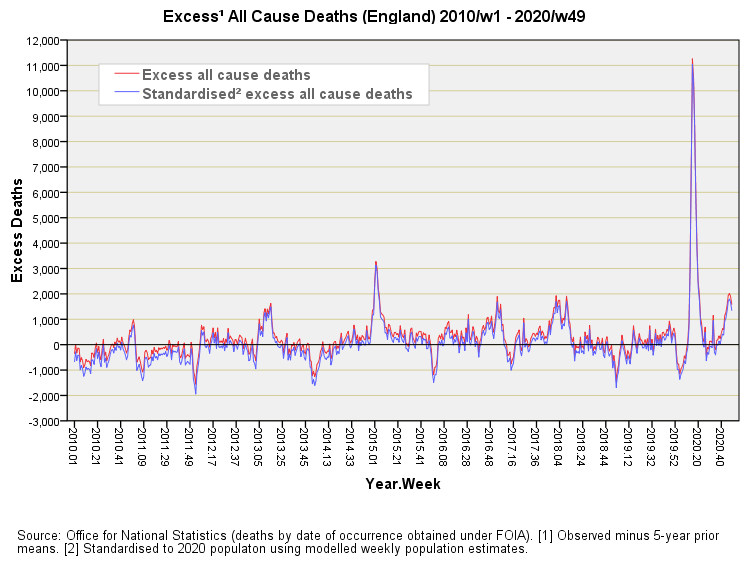
But our eyes are being fooled! If I tot up the tally for excess weekly deaths for this period I arrive at a net total of 159,327 excess deaths, whereas if I tot up the tally for standardised excess weekly deaths for this period I arrive at a net total of just 34,895 excess deaths, this representing a whopping great difference of 124,432 deaths. In terms of weekly mean excess this drops from 279.5 excess deaths per week to 61.2 standardised excess deaths per week. Not bad going for fairy cake!
Doing The Decent Thing
What we should do now is do the decent thing and re-calculate cumulative excess deaths using the standardised data and compare this to the original series. Here’s what this looks like: