COVID & non-COVID Care Home Deaths By Region (part 2)
Regional analysis of weekly COVID & non-COVID care home deaths in England & Wales 2020-2022 (rev 1.1)
Yesterday I focused in on the very first wave of the pandemic and we were able to compare regional mortality within the care homes of England & Wales on a week-by-week basis. Aside from outright peculiarity of non-COVID deaths peaking alongside COVID deaths there’s one other curious feature that I wish to address and that is the tendency of non-COVID deaths to peak before COVID deaths.
We can show this by resorting to a fabulous analytical tool called cross correlation. Most people are familiar with the concept of correlation and the Pearson product-moment correlation coefficient (a.k.a. Pearson bivariate correlation) in particular, this being an index of how closely the values of two sets of data agree. When it comes to things changing over time - as in a pandemic -then we can take this a step further and ask how closely the values of two sets of data agree when displaced in time.
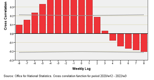
Let’s pull up a slide and work our way through what it means…
What I’ve done here is take the time series of 97 data point for all care home COVID deaths across England & Wales for the period 2020/w12 - 2022/w3 and run it through a cross correlation function that compares it to the time series for all care home non-COVID deaths for the same period. A weekly lag of zero means we are looking at the correlation between the two series as they stand in time (Pearson correlation with no frills), and we can see this reaches a value of r = 0.605.
What we can now do is displace one of the series such that we are comparing COVID deaths in, say, 2020/w13 with non-COVID deaths in 2020/w12. When we do this we arrive at r = 0.680, this representing the height of the bar at a lag of -1 week. We note that the correlation has got stronger.
Conversely, we may displace one of the series such that we are comparing COVID deaths in, say, 2020/w12 with non-COVID deaths in 2020/w13. When we do this we arrive at r = 0.403, this representing the height of the bar at a lag of +1 week. We note that the correlation has got weaker.
We can continue to displace the data such that we cover a range of positive and negative lag values (in this instance displacement is restricted to ±8 weeks). We can then step back and have a look at what cross correlation analysis has revealed. It should be pretty obvious that we are looking at a mound of positive correlation that largely sits to the left of zero. In plain English what this means is that over the period 2020/w12 to 2022/w3 the rise in non-COVID care home death across England & Wales has generally preceded the rise in COVID care home death.
Is that strange or what?
Joel Smalley (of Dead Man Talking) noticed this tendency in my last newsletter, which prompted him to comment:
Furthermore, if the non-COVID deaths were false-negatives, why would they peak one week before COVID? They would peak at the same time?
Food for thought indeed!
In part 3 I shall publish the cross correlation function plots for all 10 regions separately and we shall discover a remarkable agreement in that non-COVID cases tend to die 1 - 2 weeks before COVID cases. Meanwhile, I’m scouring the ONS website to see if I can obtain historic weekly figures for influenza/pneumonia in case this strangely synchronous regional behaviour is indicative of respiratory illness on a small island in a cold sea at latitude.
Kettle on!