Dying With Precision: Causal vs. Co-morbid Death
From The Office For Nobbled Statistics...
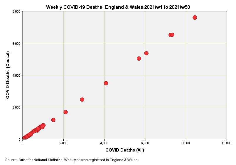
I’ve been updating my datafiles with the latest figures obtained from UK GOV coronavirus dashboard/ONS and have come across a most curious anomaly. The ONS usefully provide weekly counts of causal and co-morbid deaths for respiratory conditions (ICD10 J00-J99), influenza/pneumonia (ICD10 J09-J18) and COVID-19 (ICD10 U07.1, U07.2, U09.9, U10.9) occurring within England & Wales and I just so happened to pop out a scatterplot for COVID-19 causal against COVID-19 total weekly counts just to get a feel of the relationship. In doing so I nearly blurted out my cuppa!
In the first slide you can see a near-perfect linear relationship between causal and all COVID-19 death. Despite causal being a subset any honest physician will tell you that such perfection is indicative of numerical tripe. Pearson’s correlation coefficient fetches up at a whopping great r = 0.967 (p<0.001, n=50), which is the sort of value befitting the precise realm of atomic physics rather than medicine. My guess is that somebody is using an algorithm to generate the data rather than counting real people in a real world.
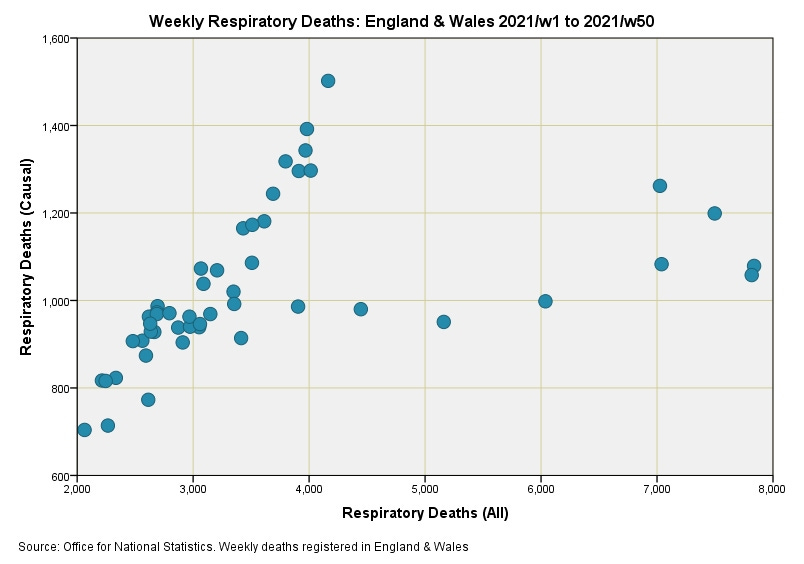
To give you some idea of what a real world scatterplot might look like I’ve done the same for all respiratory conditions (slide #2). Pearson’s correlation coefficient now drops to a modest r = 0.460 (p=0.001, n=50). Given the breadth of COVID-19 presentation (sore finger to DOA) and wobbliness of the PCR test I would suggest a real world COVID-19 scatterplot would look even woollier than this.


