
Emergency Department Admissions: Analysis of CDS Dataset (part 7)
I analyse an anonymised data dump of 1.9 million admissions records to the emergency departments of an undisclosed NHS Trust for the period June 2017 – September 2021

What I’d like to do in these next two episodes is examine time series data for a variety of variables to get a feel for what the pandemic was and was not in relation to the historic case profile. Thus I shall be looking at the whole dataset of 1,928,918 admissions for the period January 2017 – September 2021 but on a weekly basis to avoid scraping the barrel with counts.
Age At Admission
I’m going to start with mean age at admission:
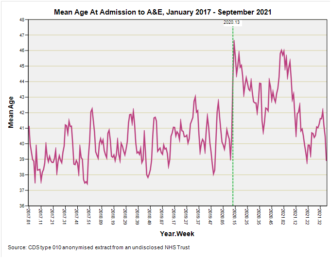
The giant leap for mankind around 2020/w13 (week ending 27 March) is intriguing. We have a sudden rush of older folk rather than a steady build we’d expect from the gradual spread of a novel and deadly virus, which points the finger at policy. It’s worth asking if these folk were arriving fresh from home or being ferried from care, residential and nursing homes where things were getting out of hand. And I don’t mean honest-to-goodness SARS-COV-2 infection neither. Also worthy of note is the steady ramp from 2017 onward, which is to be expected with an ageing population.
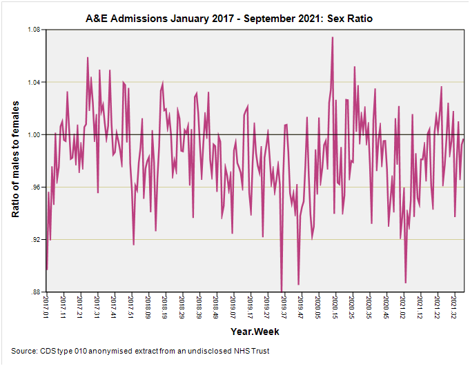
Sex Ratio
Nothing much of interest here other than an overall slight preponderance of females:
Arrival Mode
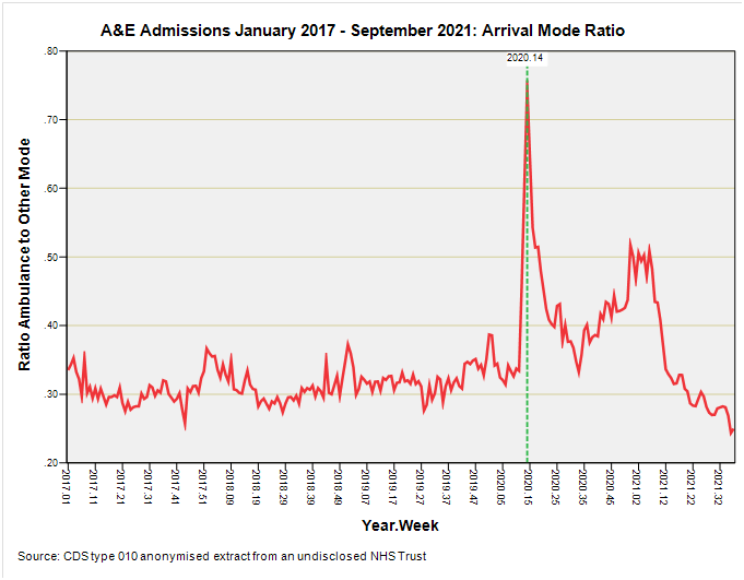
Now this is darned interesting. As we have noted in part 4 of this series private and public forms of transport are typically how the majority of people travel to their nearest A&E but this was decidedly not the case during 2020/w14 (week ending 3 April) when emergency ambulance use suddenly surged.
There’s that suddenly again.
Back in 2020/w11 we have a pretty typical ratio value of 0.33, then out of the blue we have a ratio of 0.61 in week 13 and 0.75 in week 14. This doesn’t make sense in terms of viral spread and disease development within the individual but it does make sense if we start thinking about policy and protocol changes. It’s worth noting at this juncture that, as we saw back in parts 1 - 3, respiratory conditions didn’t figure at this point in time and that a significant wave of respiratory illness had come and gone by January 2020. So what was going on such that older, non-respiratory cases needed ferrying by emergency ambulance?
Singing For Our Supper
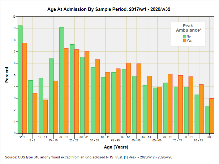
I decided to do a little digging by setting up an indicator for weeks 12 through 20 when emergency ambulance use was unusually high, then analysing data for 2017/w1 through to 2020/w32 to see if anything stood up and sang to me. This gave me a total sample size of 1,507,025 admissions with 40,498 (2.7%) falling into that critical nine week period.
The balance between males and females was pretty typical (p=0.436; Fisher’s Exact Test) as was the age profile save for under representation of the five youngest age groups and over representation of certain older age groups (as we may expect):
It was to be disposal route that tweeted a difference with a greater proportion requiring hospitalisation, and a lesser proportion being referred to a service provider at discharge. Herewith a slab of a table with all the gubbins:
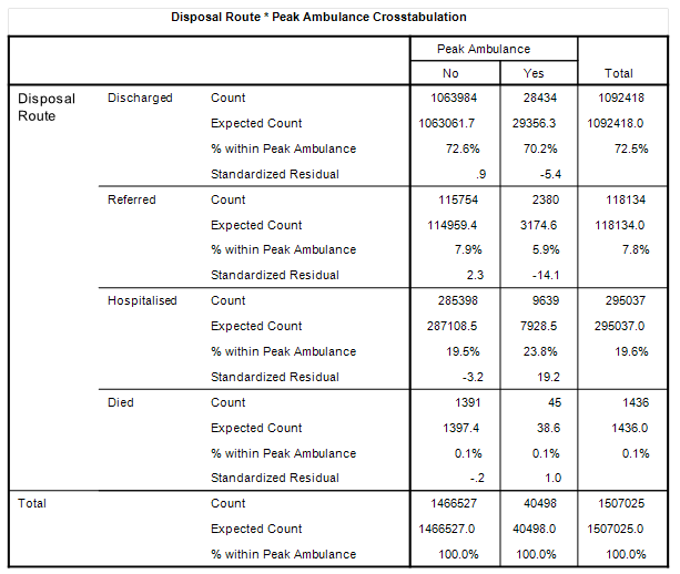
We observe a hospitalisation rate of 23.8% during that peak period for ambulance use compared to 19.5% when things are ‘normal’. We also observe a referral rate of 5.9% compared to 7.9%, the reluctance for which might be expected in the midst of a media frenzy, lockdown and service closure. Worthy of note are the identical death rates for those not making it beyond A&E so we’re not talking about anything lethal.
Diagnoses During Peak Ambulance
Crosstabulations of primary diagnostic category against the peak indicator didn’t reveal anything of great significance apart from the incidence of allergies and generalised inflammation whose admission rate plummeted from 6.8% of diagnosed admissions to 3.7% of diagnosed admissions:
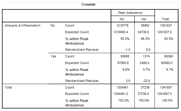
No doubt folk suffering these conditions either decided to stay home and self-medicate or were told to stay home by their GP and/or 111 service.
Treatments During Peak Ambulance
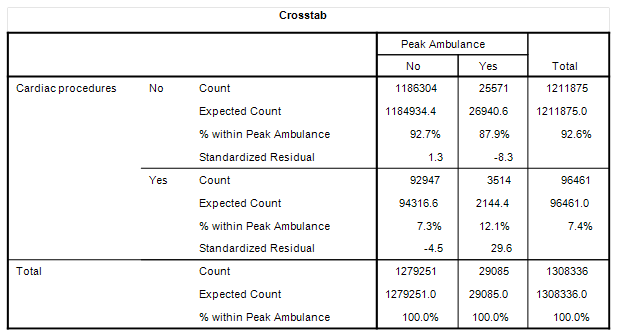
In terms of treatments administered in A&E during the peak period there are a quite few interesting points of note. Firstly, we observe an elevated requirement for cardiac procedures at 12.1% incidence rate compared to 7.3% (p<0.001), even though incidence of cardiac conditions changed very little from 5.6% outside of peak to 6.3% during peak:
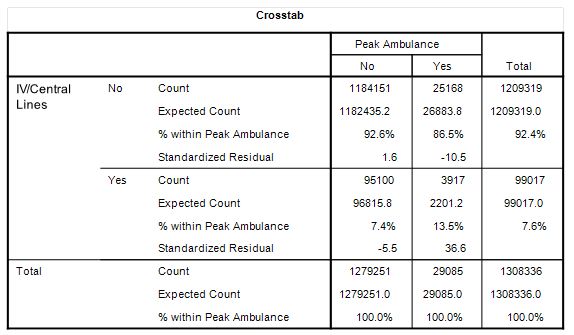
Then there is an elevated requirement for central lines and intravenous cannulation at 13.5% incidence rate compared to 7.4% (p<0.001):
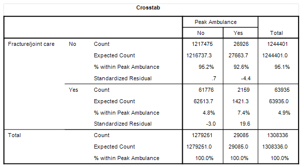
Then there is an elevated requirement for fracture and joint repair at 7.4% incidence rate compared to 4.8% (p<0.001):
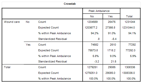
Then there is an elevated requirement for wound care at 9.0% incidence rate compared to 5.8% (p<0.001):
How much these changes in treatment reflect behavioural changes during the initial period of lockdown we cannot be certain but one thought that crosses my mind is that some folk were possibly rather more adventurous than not!
The other more sobering thought is that we’ve got a modest increase in cardiac diagnoses to the tune of a factor of 1.13x during the peak ambulance period, yet a sizeable increase in cardiac treatments to the tune of 1.66x. This situation is going to come about by people staying at home in fear with chest pain or palpitations instead of seeking treatment without delay.
GPs and cardiologists very early on sounded the alarm that patients were not appearing in the numbers that they should and, to quote one contact, “were likely dropping dead at home.” Lockdowns were always going to kill and injure, and if healthcare professionals knew that from day one then so did the government.
Kettle On!
"We have a sudden rush of older folk rather than a steady build we’d expect from the gradual spread of a novel and deadly virus, which points the finger at policy."
No, I would expect that as all the active younger folk were not taking risks, crashing motorbikes, and chopping their feet with chainsaws etc - lockdown prevented them.