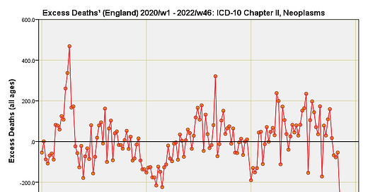
Excess Deaths by Cause, England 2020/w1 – 2022/w46 (part 1)
Statistical analysis of a dataset obtained under FOI by Joel Smalley. In this article I present excess deaths for ICD-10 chapter II (C00 – D48) Neoplasms.
This series follows on from my work with a custom ONS dataset obtained by Joel Smalley under FOIA; please see this initial article for background. Up to now I have been deriving mortality rates by cause and today I kick off a series revealing excess death by cause, starting with the most common cause of death: neoplasms.
Excess death has been derived in accordance with standard ONS procedures. That is to say I have calculated prior 5-year week-by-week means for the period 2015 – 2019 and subtracted these values from observed weekly counts for 2020. Unlike the ONS I have avoided the trap of using 2016 – 2020 data to derive excess for 2021, and of using 2017 – 2021 data to derive the excess for 2022. If you want to minimise excess death in a rather deceptive manner then the ONS method is the one for you, but I rather like to sleep at night.
A Quick Word About Excess Deaths
Subscribers will be familiar with my usual ranting about this commonly used but rather inadequate method of calculating excess death. I’m not going to bang on about this again other than to say disease doesn’t carry a diary, and neither does the weather or any pathogen that I know of. There is seasonality with certain disease groups, especially respiratory, but that seasonality is not rigid. Thus, something nasty arriving a week or two earlier or later than ‘normal’ is going to throw such a basic calculation and give rise to spurious spike. Aside from the sliding of seasonal effects we’ve got the issue of longer-term trends that will rest on a vast raft of factors. The presence of any long term trend makes a mockery of any baseline based on a 5-year mean.
Then there’s the issue of the population changing over time both in size and age profile. Normally we have to adjust for this to avoid bias but the ONS don’t bother. I would bother (and have done so for previous analyses) but my time pressures are immense right now and I want to present excess death using the same method as the ONS. If I can, I’ll scrape some time together to produce a set of revised slides that take into account the changing age profile of the nation. One thing I will say in defence of ONS’ inadequate method is most dying is done by the oldest age groups and these sub-populations haven’t changed much over the last 10 years. Comparisons I have made between age-adjusted and non age-adjusted excess (not published) reveal minor differences that are somewhat academic, but I may well pen an article that reveals this!
One thing very much worth ranting on about is the nature of excess death time series data. These time series are supposed to bounce up and down from positive to negative since people can only die once. Thus, a pathogen passing through a population will cause an initial rise in excess death followed by a fall into negative values. Over time we should see a set of rising and falling waves (all things being equal) around a series mean. If recent years are pretty much the same as the previous five years in terms of health and welfare of the nation then the series mean is going to be zero excess or thereabouts.
If things are not equal; for example, there is a change in policy, management, coding, treatment, diagnosis, service provision etc, then we may observe a steady drift upward/downward over time (things getting worse or better) or a persistent offset, both indicating a long-term disturbance rather than something fleeting like an outbreak of E. Coli.
More Deaths To Come
When viewing these slides please do bear in mind that delays in processing (largely due to involvement of the coroner) mean counts as far back as January 2022 are likely to be under-reported, especially for the younger age groups. Because of the volume of slides and limits to email delivery I will keep commenting to a minimum.
Neoplasms By Age Band
Just one comment here and that is to point out that hefty spike took place during 2020/w15 (w/e 10 April) – we’ve met this suspicious week before. I suspect the tail-off is due to incomplete certificate processing.
This is a distinctly odd series. Firstly, we have a persistent negative mean bias of -33.7 deaths per week suggesting less 60 – 69y neoplasm deaths from 2020 through to 2022 compared to the reference period of 2015 – 2019, and then we have a bit of a tail-off suggesting incomplete certificate processing. This bias is evident prior to the pandemic so it isn’t a question of COVID killing off this age group. Either something came along to decimate this section of the population prior to 2020 or this age group started exhibiting an unusual recovery from then on. There is also the possibility of coding fun and games, with neoplasm deaths in the 60 – 69y group going to prop up COVID-19 figures. Also note (once again) the spike during 2020/w15 (w/e 10 April) – we’re talking synchronised death.
There’s no hint of COVID coding fun and games with this age group since we now flip to a persistent mean positive bias of +35.4 deaths per week. The wave structure is as expected and repeats across all three years. The only query I have is that odd ‘death balloon’ centred on, yep… you’ve guessed it… 2020/w15 (w/e 10 April). Yet more synchronised death, and due to neoplasms to boot!
I guess you’ve noticed the 2020/w15 (w/e 10 April) synchronised death by neoplasm spike. There are four primary ways in which this extraordinary situation might come about:
A sudden switch in certificate coding by certifying physicians;
A sudden flip in certificate processing brought about by the MUSE automated causal coding software;
Death by iatrogenic causes (dangerous discharge, withdrawal of prescription drugs, toxic levels of medication, inappropriate EOL protocols).
Death by non-iatrogenic causes (e.g. people dying at home for fear of catching the virus in hospital; loss of social support systems for the frail and elderly).
More evidence of that unsavoury the 2020/w15 (w/e 10 April) death spike. Certificate processing for 2022 looks like it is incomplete, and I’m beginning to wonder about the persistent surge in positive excess from 2021 onward.
We arrive at the summary slide that clearly reveals the 2020/w15 death spike for synchronous neoplasms occurring in 50 – 59y, 60 – 69y, 70 -79y, 80 – 89y and +90y groups. Anybody thinking this can be passed off as a coincidence needs hitting over the head with wet haddock. Either these are COVID deaths (or some other transient pathogen) that were surreptitiously switched to neoplasms during automated cause processing at ONS’ end of things or we’re looking at iatrogenic/non-iatrogenic death. My money is on the latter but I’ll try not to think about it otherwise my blood will boil. I also need to concoct a suitably catchy acronym that captures a broader spectrum of meaning than ‘iatrogenic’ death.
Kettle On!
There seems to be some evidence that getting the flu may lead to reduced cancer mortality in the following years among the elderly. Fevers may sometimes be good. Though with covid who knows.