
Excess mortality 1975 – 2021 (part 1)
England & Wales monthly excess mortality by quinary age band & sex: males under 45y

In my previous post we looked at monthly excess mortality for the period 2018 – 2021. The pandemic glared at us through the older generations as did delays to processing of death certificates for the younger generations for the latter part of 2021. If we stick with looking through the equivalent of an epidemiological letterbox we are going to lose perspective and we are going to think the pandemic was a vast and terrible plague descending from out of the blue yonder that called for all manner of draconian measure. In the following series of 36 slides I am going to pull the focus back to the period 1970 – 2021 so we may determine whether SARS-COV-2 is something to be truly feared or whether dramatic hits on mortality from one contagious pathogen or another are par for the course.
In these slides the scatter of individual red dots will reveal general trends as well as seasonality, with outliers indicating disease outbreaks. The green wavy line is a LOESS smoothing function merely to guide the eye but can be thought of as a general measure of health and well-being for a particular age group. Interested folk can read about LOESS (locally estimated scatterplot smoothing) here. A summary of the methodology employed to obtain the monthly mortality rates by age-band and sex can be found here, here and here.
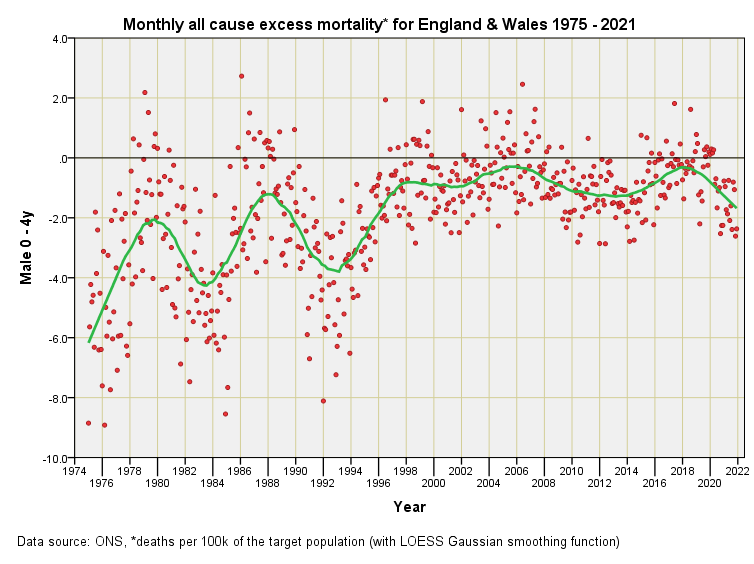
In this first slide of my latest series we see a substantially negative excess for 0 – 4y males that gradually erodes. Looking back through previous posts will reveal elevated mortality for infants during 1970 – 1974 that dramatically declined as a result of multiple measures. In all of these slides you’ll observe oscillations of that green line that are damped to varying degrees, an analogy being the response of a car wheel to bumps in the road with each ‘shock’ being a change in policy, law, regulation, standard, procedure, technique, medication, knowledge, practice, principle, pathogen or toxin. We may call these the perturbations of the real world and they are many!
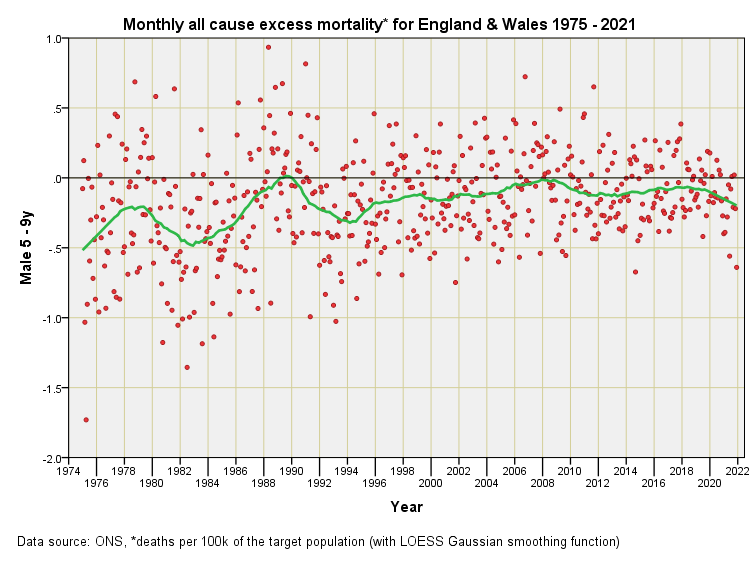
It should be obvious from this slide that SARS-COV-2 had no impact on mortality for 5 – 9y males such that this becomes discernible at the national level. Pathogens to worry about were those back in 2011, 2006, 1991 and 1988.
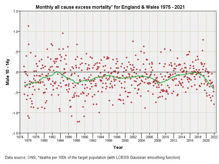
It should be equally obvious from this slide that SARS-COV-2 had no impact on mortality for 10 – 14y males such that this became discernible at the national level. Pathogens to worry about were those back in 2019, 2001, 1984 and 1976.
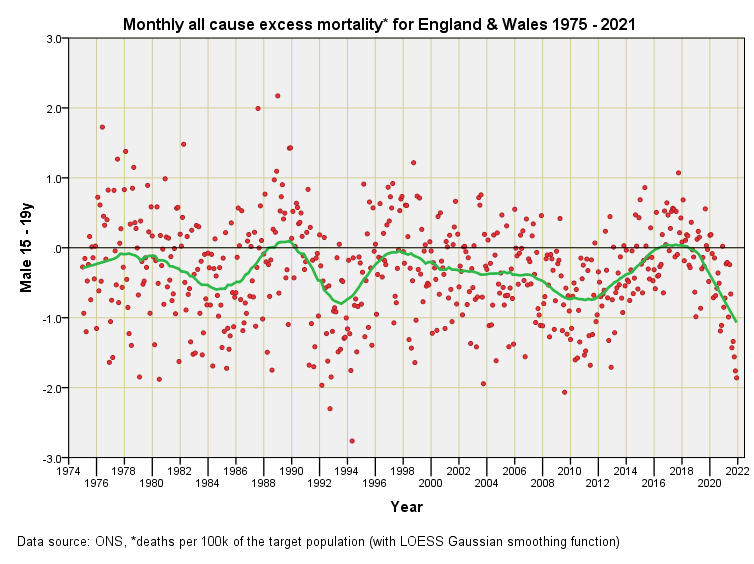
No evidence of the impact of SARS-COV-2 on 15 – 19y males either, with the most recent outlier popping up during Aug 2017. In fact, 2020 looks quiet in comparison to recent years, with a slightly negative excess.
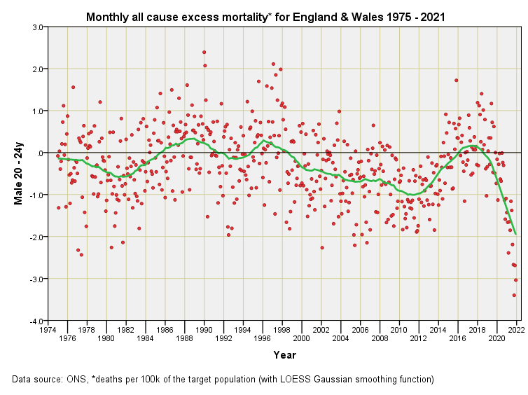
The most striking feature of this slide imho is the droopy tail from 2020 onward. This isn’t some magical benefit of vaccination but the ONS failing to process all death certificates. Please be wary of all claims of vaccine benefit for 20 -24y males, these being based upon incomplete data records. I don’t see any outliers during 2020 but I do see an outlier for Nov 2015.
The droopy tail for 2021 has now got to the point where it is falling off! I count 8 red dots in danger of being ridiculous which means processing of death certificates probably got to Apr 2021 at best. Why the delay? Are there so many young deaths hidden in the closet that the system is straining or are we looking at a deliberate decision to delay the data?
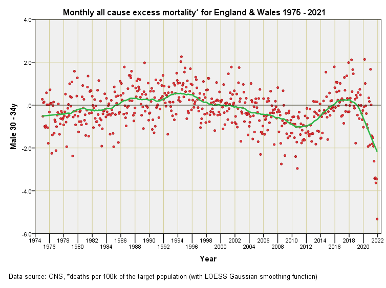
We appear to observe the first signs of the ‘pandemic’ proper for 30 – 34y males during Apr 2020 and Jan 2021, though these excesses are not unique, the greatest excess being reached during Jul 1994.
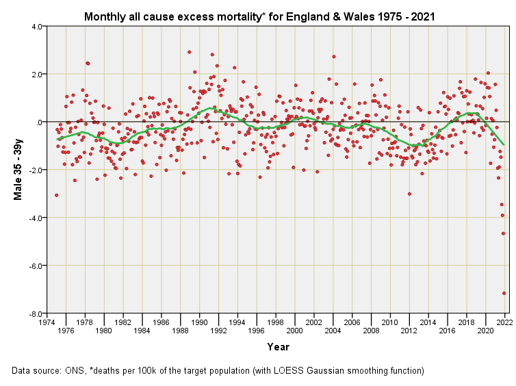
Apr 2020 is showing as an outlier for 35 – 39y males along with Jan 2021 but that’s about it. Neither reaches the levels of excess mortality attained during 2004, 1993, 1991, 1989, 1988 and 1978.
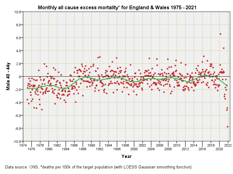
All changes for 40 - 44y males with Apr 2020 and Jan 2021 sticking out like a sore thumb and breaking historic records. Bizarrely, aside from these two months the pandemic evaporates into normality yet a novel virus is supposedly working its way through the entire population. What I find particularly intriguing is how an additional five years of life can make all the difference in response to a virus, which seems to be capable of recognising birth dates.
Fascinating, John - can't wait to see the rest of the series. Although you've highlighted the delay in processing death certificates for young males several times before, this series makes it hard to not entertain conspiratorial thinking. It's bizarre.
I would love to see a plot with all the red dots randomized by year/month. Hide the dates and have our public health geniuses pick out the scary pandemic.
Thanks for doing these. I've become fascinated with this type of data over the last few years. I'm amazed at how much mortality data is still missing from 2021. But in March 2020, Johns Hopkins put up a dashboard with "LIVE" world wide updates and everyone thought that was completely normal and not suspicious at all.