Hunting For Vaccine Benefit (part 1)
Using UK GOV Dashboard Data And Keeping It Plain And Simple
A fair few analysts are producing evidence of vaccine harm so this morning I decided to play the Devil’s avocado and go in search of some benefit. I wanted to keep this as simple as possible and avoid all that fancy ARIMA modelling so I opted for the humble cross correlation function plot (CCF), being a succinct visual summary of what is going on within time series data.
Vaccines are alleged to reduce the number of COVID cases so I thought it best to start with this premise. There’s also the issue of delays to benefit, in that our body is supposed to take a while to gear up to the presence of all that synthetic mRNA. Some say 14 days minimum, others say other things but the beauty of CCF is that we don’t need to worry about this for we can analyse all possible delays in one plot!
Then there’s that which we dare not speak of, so I shall hide a few shocking words in italics and shroud them using square brackets otherwise I’ll be declared a COVID change denier… [COVID cases could rise after vaccination rather than decline]. Cross-correlation will reveal this possibility also, for CCF - being pure dancing number - is free from dirty dogma. Neither am I in receipt of large grants or funding that forbids me from pressing the wrong buttons or coming to a financially incorrect conclusion. Not big and important enough in the pharmapolitical world to be a loose cannon, I shall declare myself to be a loose pea-shooter.
I suggest you make a cuppa, grab some cake (toast will do) and settle in for what may well be a roller coaster ride…
A Short Note On Methodology
Since I’m getting conflicting views on the time that must elapse for a dose to be deemed fully effective I opted for a safe grace period of 6 weeks. The start of the grace period was defined by the earliest date on which 5,000 daily doses were issued. For the initial dose this meant a study period of 554 days (19 Jan 2021 – 26 Jul 2022), for the second dose this meant a study period of 527 days (15 Feb 2021 – 26 Jul 2022) and for the third dose this meant a study period of 271 days (29 Oct 2021 – 26 Jul 2022). Dose dates were defined by date of vaccination rather than date of publication since date of publication is a political posing pouch. If anybody is unhappy with this arrangement we can change it in a jiffy but I doubt results will change that much.
As to daily COVID cases within the UK GOV coronavirus dashboard these come in three flavours: new cases by specimen date, new first episodes by specimen date and new reinfections by specimen date. Since new cases by specimen date is simply a combination of new first episodes and new reinfections I decided to ignore this catch-all.
Understanding
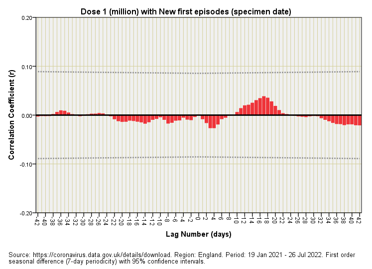
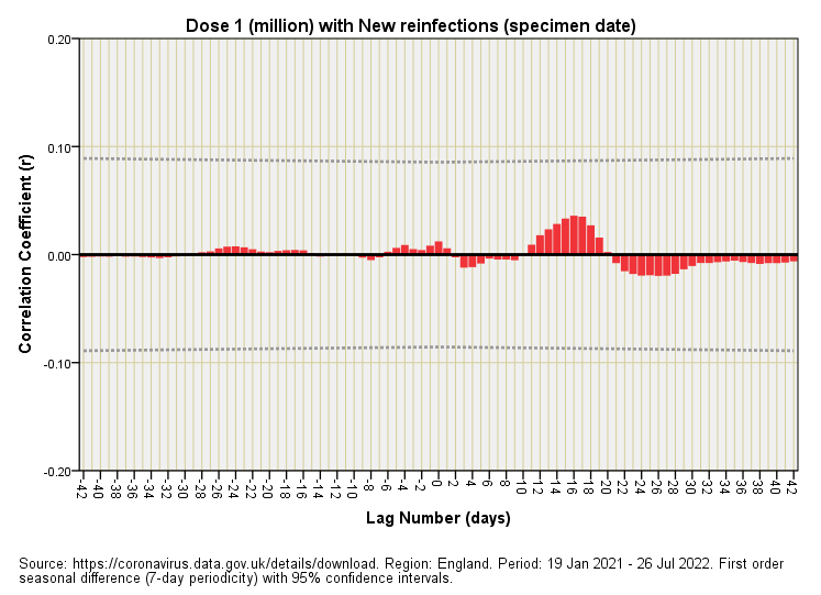
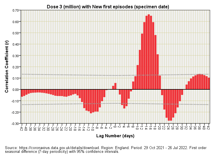
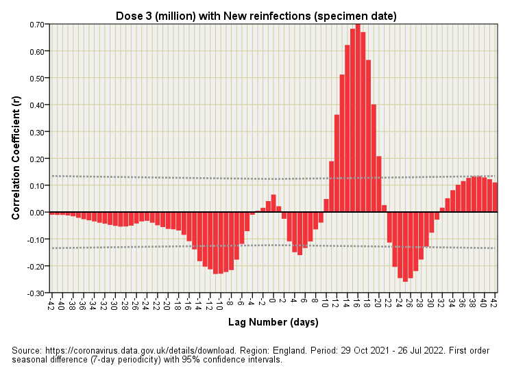
Anybody understanding the basic principles of correlation should find the CCF plots relatively easy to figure since they’re simply a series of repeated correlations made at different time lags. Lag zero means the time series for daily dose count is correlated with the time series for case count with no delay (i.e. we’re looking at an instant effect). Positive-going correlations at positive lags (big red bars sticking up to the right of lag zero) mean case counts were rising after dose counts were rising, this being potential evidence of vaccine harm. Negative-going correlations at positive lags (big red bars sticking down to the right of lag zero) mean case counts were falling after dose counts were rising, this being potential evidence of vaccine benefit.
Is My Bar Big Enough?
With statistical analysis of any flavour there’s always the issue of whether anything we observe is statistically significant in some way or other. In the case of CCF plots we need to ask if our bars are big enough or whether any lumps and bumps could have arisen by chance. This is where the 95% confidence interval comes in, this being a universal yet arbitrary cut-off point you’ll see thrown about in many papers. In the CCF plots that follow these interval boundaries are defined by dashed grey lines. Anything sticking beyond these is likely to be a real result and not some random artefact; anything sitting within these may be random garbage we can ignore.
That being said you can find some interesting bargains in the CCF garbage can, especially if they yield some sort of pattern. These can point to an underlying, genuine dynamic that hasn’t reached statistical significance because we simply don’t have enough data points in our sample.
Weebles Wobble But They Don’t Fall Down
Any bars to the left of lag zero in a CCF plot cannot be considered causal in the sense that changes to daily case counts were happening before changes to daily dose administration. You always get weird stuff like this when correlating two time series, and especially when two time series are oscillating periodically over time.
Think of this as periodic signals phasing in and out of sync. In the wonderful world of music these would be considered as beat frequencies. Tuning a guitar string against another string is a great example - that w-w-w-w-w-w-w-w wobble as they approach identical pitch is a beat frequency. The bumps, lumps and bars you’ll see in a CCF plot are beat frequencies, but with numerical values replacing air pressure on your eardrum. But enough of that, the results are in!
The Results Are In!
First Dose
OK, so nothing here managed to reach statistical significance so we may be looking at random garbage. If we sort though that garbage we may spot a positive-going red hump centred on a lag of +17 days. This translates into a rise in COVID cases 17 days after initial dosing, the effect being persistent for both first episodes and new reinfections. It is this identically-lagged persistence across two categories of case that makes me think something genuine is going on despite statistical insignificance. At this point it is worth stopping for some cogitation.
Some Cogitation
What we have here are COVID case counts over a fairly long time period. Over this time period the folk of England will have received various combinations of jab as well as two combinations of test result (true positive; false positive) as well as absolutely everything else that happens in the real world. This is akin to trying to tune in to Radio Caroline with an old-school AM radio on a warm summer evening back in 1973. It was never possible, and so we lay on the lush campus grass listening to whistling sounds, mushy sounds and various continental stations in different languages drifting in and out whilst trying to sing along to Seasons In The Sun by Terry Jacks.
What we have with the initial dose CCF plots is a similar situation, with a faint signal that seems to be telling us something important amongst the clutter. That something important is that initial dosing may well be causing COVID or triggering a positive test result.
Second Dose
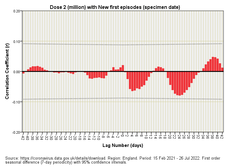
Now these are two curious plots indeed! Nothing reaches statistical significance yet there are rather interesting and rather different patterns down in the garbage. If we do the daring thing again of assuming causality there appears to be an initial net benefit to secondary dosing in terms of lowered first episodes that peaks around a week later, then again around 3 – 4 weeks later, which then flips 180° into vaccine harm at around 5 – 6 weeks.
These are supposed to be tried, tested and highly effective products. I’ve no doubt that as a big cannon I’d probably claim the same if I held a sizeable chunk of preferential shares. Money talks louder in medical research circles than people realise.
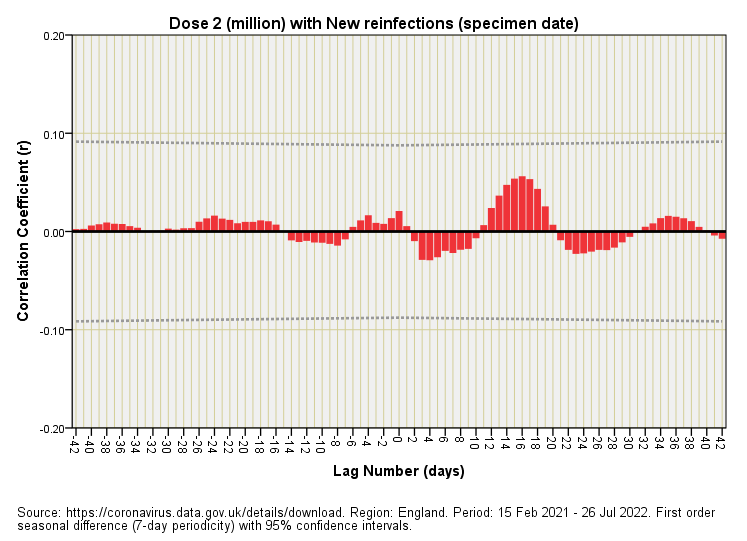
Moving along the bus to daily new reinfections there’s a hint of vaccine benefit after 1 week and after 3 - 4 weeks that is sandwiched by a dirty great hike in vaccine harm at the 2 week mark. Things really are bobbing about, with the series once again ending with evidence of harm at 5 – 6 weeks. Again, none of this reaches statistical significance so I could (as a big cannon) command that we dismiss these fanciful notions, but then again (as a pea-shooter) I could sing along to faint music on Radio Caroline laced with French news items even if I couldn’t tune into the station.
Third Dose
This calls for an exclamation of “oh my giddy aunt!” For the first time we see correlations pushing well beyond the lid of the 95% C.I. garbage can into the harsh light of statistical significance. And what correlations they are! We now have monster evidence of vaccine-induced COVID cases (or vaccine-induced positive test results) occurring around 2 weeks after the booster jab for both new first episodes and new reinfections. Also worth noting is the emergence of statistically significant temporary vaccine benefit at a lag of 3 – 4 weeks. No wonder analysts are arguing with one another as to whether the booster is harming or helping! This plot suggests a serving of both, with harm out-gunning benefit in terms of correlation score obtained.
In A Nutshell
I’ve unearthed evidence of both vaccine harm and vaccine benefit in terms of COVID case count dynamics following inoculation. This applies to all doses. The impact of initial dosing has been diluted by secondary and tertiary dosing, and the impact of secondary dosing has been diluted by tertiary dosing (among other things). In terms of signal processing issues only third dose dynamics are sufficiently strong and clear to yield statistically significant results.
Depending on how we handle data we can push analyses in favour of vaccine benefit or vaccine harm in terms of COVID case counts: all depends on our integrity as researchers. Though cases ‘proper’ are usually assumed (symptomatic presentation after vaccination) we also have to entertain the possibility that vaccines are triggering positive test results in otherwise healthy and virus-free people.
The complex time-dependent dynamic between vaccination and case is such that simplistic tabulations and analyses favoured by the authorities are entirely inappropriate; they can show vaccine benefit if they so desire and they can show vaccine harm if they so desire. I doubt that they’ll be permitted to focus on the latter.
In summary, we have a range of novel products that work for limited periods that are equally capable of inducing harm. As such they cannot sensibly form the basis of a long term health solution for a nation. Set against this we have to concede that they are going to make some fortunate people very rich indeed. I would suggest the primary benefit is to share holders.
Kettle On!


Brilliant John! Just to clarify your comment "Money speaks louder in medical research circles than people realise." After 33 years training and working in the job people should know that money is so damn loud it drowns out EVERY other voice in medical research.....
Just a brief very current issue showing this - significant original research indicating Alzheimer's caused by beta amyloid, based on which 99% of research for treatments has been directed at, turns out to be a FRAUD .... oooops!! https://www.science.org/content/blog-post/faked-beta-amyloid-data-what-does-it-mean
Very interesting, and highly amusing! I think you knocked some weebles down. Keep on shooting those peas.