Hunting For Vaccine Benefit (part 4)
Using UK GOV Dashboard Data And Keeping It Plain And Simple
In part 3 of this series I ended with the promise of going full-amalgam, which is not unlike going The full Monty, except in reverse; that is, we are going to put our clothes on, including Wellies and Gumby hats. My brain hurts, etc. To kick this off we are going to look at the time series for the daily count of dose 1, dose 2 and dose 3 combined:
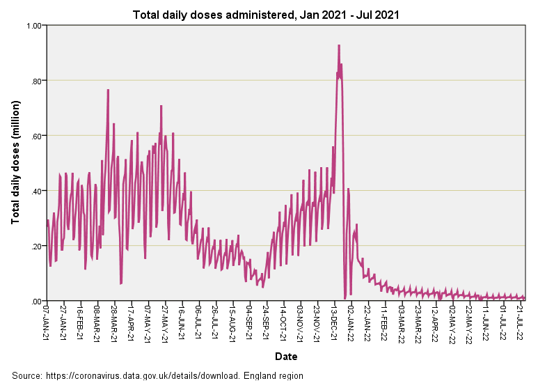
We are looking at a lot of jabbed people in this slide, and a lot of money. The weekly pattern is evident as that jagged saw-tooth and the first and second doses merge seamlessly into one large lump spread over several months. Not so with dose 3, such was the speed of issue that some people must have been dosed before they even realised it! Did this beacon of ‘healthcare’ policy shine like a radiant sun, bestowing grace and good health to all those kindly souls of the nation of England? Well, er… not quite:
Here’s one of those dual time series plots whereby we can eyeball two things at once. Along with our daily count for combined doses (blue corner) I’ve crayoned the time series for COVID cases per 100 viral tests, this being a handy rate for levelling things. So what can we make of all this?
Well, dose 1 and dose 2 rose like a mountain above an arid plain of not much going on during the summer months of 2021. Either the vaccines worked as claimed and suppressed a great deal of unpleasantness or they did nothing whatsoever whilst herd immunity built and the virus mutated into less virulent strains. There’s no way of telling unless we reach for some statistical tools.
The dose 3 mega-peak appears a couple of weeks before the case detection peak and again we face two possibilities: either the booster induced excess COVID cases (or possibly triggered positive test results) or the 2021/21 winter seasonal peak was always going to happen, in which case the booster was an innocent bystander. Again there are statistical tools we can apply to decide the matter. There are those who will claim “it would have been worse without the jab” and I’ll probably turn this issue into an investigative series in its own right.
We then come to an extraordinary situation post the 2021/22 seasonal peak when doses of any kind have evaporated into a mere trickle yet case detection rates are going serious yo-yo. Anybody who cares to think about this situation in terms of covariance will realise the virus is totally ignoring the vaccines and doing its own thing; either that or viral tests are doing their own thing and/or the vaccine is sulking. In sum, the virus-vaccine relationship breaks down at a time when it shouldn’t if vaccines worked as claimed. In the immortal words of Mr Praline, this vaccine is no more! It has ceased to be! It’s expired and gone to meet its maker.
Engage CCF!
This is the sort of moment to wheel out cross-correlation analysis once more. We have two time series that jiggle about that sometimes support the notion of an effective vaccine but mostly do not. Our eyeballs can be easily fooled and so it’s handy to have some sort of analytical final word on what exactly is going on in terms of temporal dynamics. Here it is:
Over this entire period the net effect of combined dosing has been to elicit what looks like an immediate benefit in terms of a lower COVID detection rate a few days after inoculation. This seems rather too quick to me but perhaps an expert can enlighten us! Things do a U-turn around the 2 week mark, when the detection rate rises, this being suggestive of vaccine harm in terms of vaccines inducing COVID or perhaps nobbling our immune system. There’s also the possibility of our immune system reacting to foreign substances, and synthetic mRNA covered in nano-tech at that. Quite what viral tests make of this in terms of performance (and specificity in particular) is anybody’s guess. Whatever the causal mechanism the plain fact is that cases rise after vaccination and that is not a good thing.
Coffee, Cogitation & Cake
If we consider that dual time series plot once more and ponder on the nature of covariance over time we may come to the conclusion that the vaccines are losing effectiveness (assuming they were effective in the first instance for periods stretching beyond a few weeks). We might thus derive a curve for detected cases per million doses that is adjusted for test activity so see what we may see. This calls for a clean apron and so it’s once again time…
Kettle On!


Thank you John Dee.
Just looking at 'Covid cases per 100 viral tests' in the second slide. Jan '21 - April '21 looks like the population of England recovering from the usual winter respiratory virus peak. The matching period (and beyond) in '22 looks like a population which is unable to repeat the feat 12 months later. Or am I misinterpreting this slide?