
Hunting For Vaccine Benefit (part 5)
Using UK GOV Coronavirus Dashboard & NHS England Hospital Activity Data And Keeping It Plain And Simple

In Hunting For Vaccine Benefit parts 1 - 4 I’ve used cross-correlation analysis to investigate the relationship between the rise and fall in COVID cases and the rise and fall in vaccination dosing over time. In the next few newsletters I am going to use the same methodology to study COVID admissions to hospital, COVID inpatients, COVID general bed use and COVID mechanical ventilation bed use (MV bed) across NHS England, source files and definitions for which may be obtained here.
Anybody understanding the basic principles of correlation should find the CCF plots relatively easy to understand since they’re simply a series of repeated correlations made at different time lags. Lag zero means the time series for daily dose count is correlated with the time series for COVID admission/bed use with no delay (i.e. we’re looking at an instant effect). Positive-going correlations at positive lags (big red bars sticking up to the right of lag zero) mean COVID admissions/bed use was rising after dose counts were rising, this being potential evidence of vaccine harm. Negative-going correlations at positive lags (big red bars sticking down to the right of lag zero) mean COVID admissions/bed use was falling after dose counts were rising, this being potential evidence of vaccine benefit.
With statistical analysis there’s always the issue of whether anything we observe is statistically significant or whether the result could have arisen by chance. In the case of CCF plots we need to ask if our bars are ‘big enough’. This is where the 95% confidence interval comes in, this being a universal yet arbitrary cut-off point you’ll see thrown about pretty much everywhere. In the plots that follow these interval boundaries are defined by dashed grey lines. Anything sticking beyond these is likely to be a real result and not some random artefact, anything sitting within these may be random garbage we can ignore.
That being said you can find some interesting results down in the CCF garbage area, especially if they yield some sort of pattern. These can point to an underlying, genuine dynamic that hasn’t reached statistical significance because we simply don’t have enough data points in our sample.
A Quick Word On Methodology
It’s always best to start in the right place. Initial roll-out started on 8th Dec 2020 and some experts claim benefits wouldn’t really show for at least 2 weeks, thus pushing the start date to 22nd Dec. Others have argued for longer delays to benefit, and then we have the curious claims of instant benefit and benefit for all manner of condition in addition to COVID-19. Either magic has indeed been happening or the pharmaceutical industry is awash with corruption.
Angels at the coal face have been telling me they’ve been treating adverse reactions of various sorts pretty much from 20 minutes onward, with a flurry of fallout within the first 2 weeks. The beauty of CCF is that we needn’t worry too much about this since all manner of lag can be assessed, but what we do need to worry about is whether doses were issued in sufficient number for benefit or harm to be detected within the clinical population of NHS England. As before I settled on start dates when daily doses administered consistently exceed the 100,000 mark, these being 7 Jan 2021 (dose 1), 24 Mar 2021 (dose 2) and 28 Sep 2021 (dose 3), with each analysis running to a 60-day window (check out the 60-day window results in part 3).
With all that said and done, let us take a look at some slides…
Admissions Face-to-Face
I always like to look the data in the face before pressing the big red button, so here’s the time series for the daily count of COVID admissions to service providers across NHS England. I use the phrase ‘service providers’ because admissions to hospital gives a false impression despite it being bandied about by experts and authorities alike. For example, anybody being admitted to a mental health facility will count as a COVID case if they happen to test positive, as will a healthy young woman being admitted to a gynaecology ward to give birth if she also happens to test positive.
Bizarre as it may seem COVID admissions to hospital doesn’t mean a person is sick with COVID-19 symptoms or carrying any virus (false positive). Even if they are carrying the virus and not feeling well they will not necessarily be treated for COVID and may even be sent home the same day. It’s a funny old world!
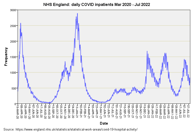
And so let us look at the time series for admissions to service providers of any sort for folk who may or may not be symptomatic and may or may not receive treatment for COVID:
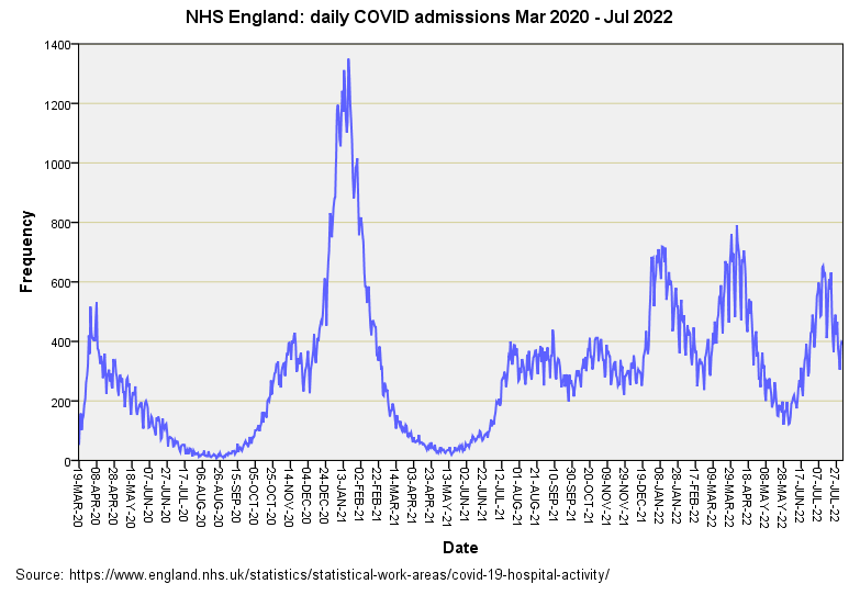
The mega peak of winter 2021/22 is pretty darn evident and pales in comparison to the first wave that locked us all down in spring of 2020. There’s that peculiar ramp again from Jul 2021 - Dec 2021, followed by the three wise peaks of extreme peculiarity. It wasn’t just cases at home bobbing about then but positive-testing folk going to a service provider for more or less any reason whatsoever. Let’s see what those 60-day windows bring by way of dosing effects…
Dose 1
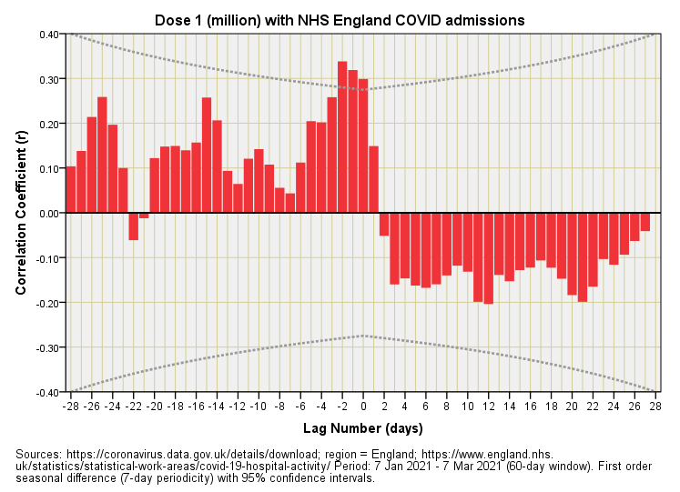
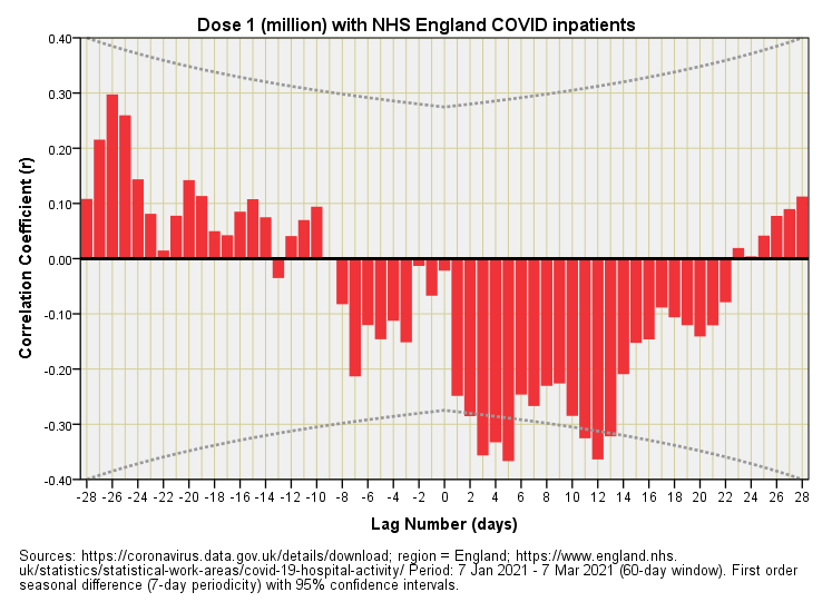
Well now, that’s interesting! Three red bars of statistical significance poke up at lags of -1, -2 and -3 days suggesting vaccine harm before folk got their first jab! Einstein and his space-time stuff isn’t going to allow this so we must be looking at one of those artefacts that arise when two oscillating time series are considered together. In this case folk must have been going to a service provider and testing positive on admission and then getting their first jab a few days later - quite possibly from some bustling nurse patrolling the wards and demanding they use the opened vials to avoid waste.
So what happens to folk who get jabbed first who then get admitted to a service provider? Well not a lot - there’s a palisade of negative bars that fail to reach statistical significance, and neither do they form any sort of interesting pattern. This would suggest lack of vaccine benefit, more specifically a lack of measurable benefit for NHS England’s intake as a whole. The phrase ‘damp squib’ springs to mind.
Dose 2
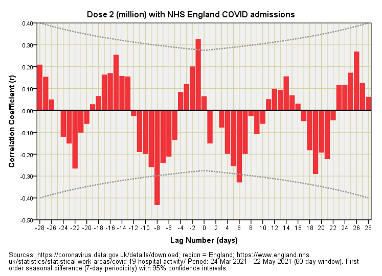
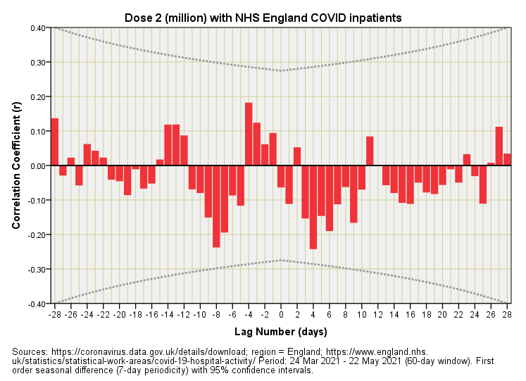
This is bat-sh*t crazy! Despite seasonal differencing (where ‘season’ means a week) we’ve still got a 7-day yo-yo running right through the plot. This sort of thing happens when time series data are close to being perfect sine waves. When two such time series are brought together you get this flip-flop phenomenon. This suggests admissions and COVID testing were running in lockstep during this period and puts us squarely into a chicken and egg situation in which it is impossible to determine which comes first! Let me illustrate the causal dilemma with some crayoning:
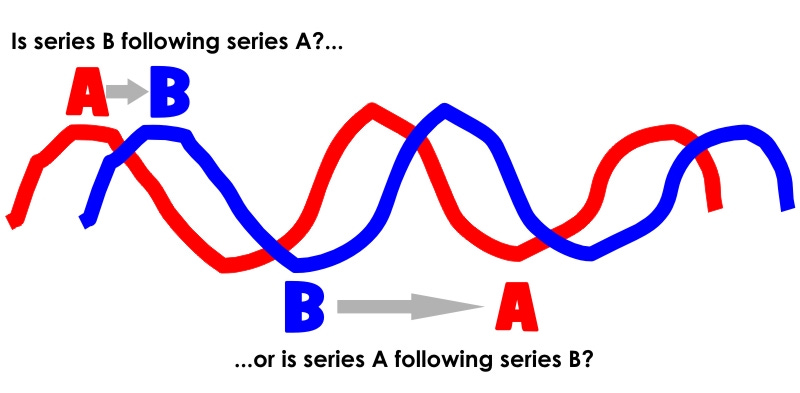
Thus, we can either claim vaccine benefit or vaccine harm since the relationship is intrinsically ambiguous (no prizes as to which spin the authorities prefer). Though wacko, the beauty of this slide is that it reveals just how illusory vaccine benefit and vaccine harm can be outside of a gold standard clinical trial, and I hope folk realise how impressive looking factual claims come to be generated using ‘hard data’. Here we have hard data producing an illusion before our very eyes!
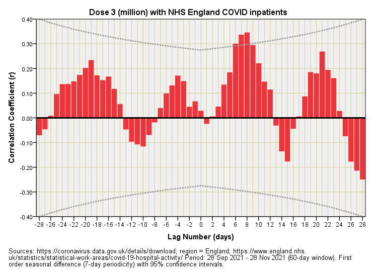
Dose 3
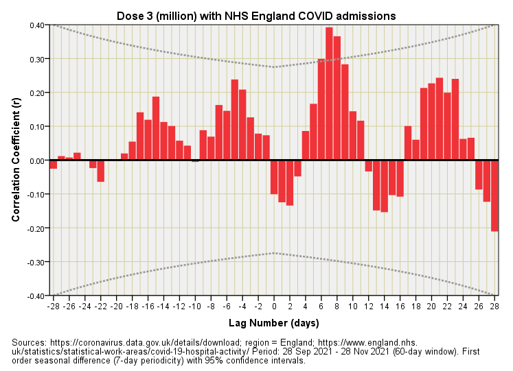
Aha! The statistically significant aspect of this plot are those bars sticking up at lags of +7 and +8 days, these being indicative of vaccine harm; that is, admissions to service providers across NHS England had a tendency to rise around 1 week after the booster. At the same time we could be looking at an artefact arising from mutual periodicity.
Inpatients Face-to-Face
Most people when asked what a hospital admission means will say, “well guv’nor, it’s somebody going to hospital, innit.” This is most logical indeed but to the data authorities an admission is also somebody already in hospital for the zillion-and-one things we go to hospital for who happens to test positive during their stay. They then become an admission for COVID whether or not they’re suffering from COVID-like symptoms and whether or not they are carrying any virus (false positive). Yes indeed, it’s a right funny old world, and make no mistake!
And so let us look at the time series for inpatients who become admissions:
This is pretty much the same as the plot for admissions with the notable exception of a bigger initial peak for spring 2020. This tells us that COVID started out very much as a nosocomial phenomenon.
Dose 1
None of that wacko yo-yo here, thank goodness! What we have is a palisade of negative bars at positive lags, this all being very sensible and indicative of vaccine benefit. Or is it?
The benefit accrues after a few days, peaking on day 5, then again after a dozen or so days. Those who’ve worked in a hospital will realise these time scales are reflective of the working week for elective admissions, with some procedures requiring two working weeks plus an intervening weekend. If you test folk when they get admitted then you’ll see a drop for COVID inpatient counts when they are discharged one and two working weeks later. Combine that with the offer of an initial dose of the elixir and there’s your illusory benefit right there.
Dose 2
Nothing much happening here. Nothing that is statistically significant and no strong patterns that fire the imagination! No benefit (illusory or real) and no harm (illusory or real). Nothing, nowt, nada except for inflating share values, perhaps.
Dose 3
There goes those bars sticking up at a lag of +7 and +8 days indicating that inpatients were tending to become COVID cases around 1 week after receiving their booster. The fact that these folk were already in hospital yet still display the same lagged effects as admissions proper suggests this is genuine harm.
Next Up
The next logical step is to have a look at hospital bed use and see how this relates to what we’ve observed today. Until then…
Kettle On!
The moral of the story seems to be don’t test!
Hopefully those cases are not seriously symptomatic