Mortality by month & year 2000 – 2021 (part 1)
England & Wales monthly mortality by quinary age band & sex: spaghetti plots for males under 45y
There’s nothing more exciting to a statistician specialising in time series analysis than a good-looking time series. Up to now I’ve presented a truck load of monthly time series plots for the period 1970 – 2021 and we’ve worked our way through red dots, wiggly green lines, smooth orange lines and smooth sea green lines. Not everybody is used to eyeballing such complex patterns within time so this morning I thought I’d switch from baking all manner of time-based confectionery to cooking spaghetti.
To do this I’ve sliced the contiguous time series data up by year and month and produced a series of what I shall call spaghetti plots for all 36 possible age and sex combinations. These should be fairly self-explanatory. Tuck your napkin in, grab the Parmesan and have a taste of these…
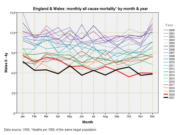
It would seem than 0 – 4y males are enjoying the safest two years in the last twenty!
We may expect that mortality rates would decline for 15 – 19y males owing to lockdown and restrictive social policies, so the thick red line for 2020 makes sense. What doesn’t make sense is the plummeting thick black line for the second half of 2021. My money is on delays to processing. Note the lack of a red hump representing the pandemic.
This slide makes it pretty clear that ONS are not counting all youthful deaths for 2021, yet this isn’t stopping experts churning out estimates of vaccine efficacy as though they are carved in stone. Note the lack of a red hump representing the pandemic of 2020.
Yet more missing deaths for 2021 and total lack of a pandemic hump! Lockdown seems to have prevented death much like prisoners don’t tend to die in road traffic accidents.
More missing deaths for 2021 (I wonder how many this is adding up to by now?). There’s a hint of a hump for April 2020 that nevertheless sits within the data cloud of historic mortality. We may note that there is absolutely no sign of a 2020 second or third wave, with mortality scraping the bottom of the barrel.
More missing deaths for 2021 and mortality for April 2020 is now beginning to match the worst of the historic levels. There is still absolutely no sign of a second or third wave with mortality still scraping the bottom of the barrel.
More missing deaths for 2021, and mortality for April 2020 is now standing proud of historic values for 40 - 44y males. Whilst the first wave is in evidence the second and third waves are not.


In the last graph (males 40-44) there's a very clear peak for Jan 2021, and also some evidence of peaks for 30-34 and 35-39 year-old males for Jan 2021. Presumably you missed them because of the discontinuity between December and January?