
Mortality Rate: A Curve-Ball
From The Office For Nobbled Statistics

When trying to understand the incidence of death over time we often resort to calculation of a crude rate such as deaths per 100k population. If we are lucky we can enhance this to age-adjusted mortality provided we have robust estimates of the age profile over the years. Though mightily ubiquitous these rate figures are based upon an assumption of linearity; that is to say if we get 10 deaths in 100,000 population (MR = 0.01%) we shall expect to see 20 deaths in 200,000 (MR = 0.01%) if nothing has changed other than the population increasing over time. But does that assumption of linearity necessarily hold true for a nation developing over a period of 50 years?
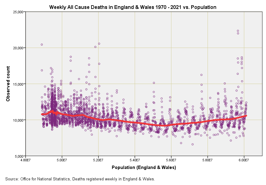
In the attached slide I’ve done something quite geeky and plotted out the weekly all cause death counts for England & Wales against the population estimate for that week. Many are going to ask how weekly population estimates were obtained and the answer is from ONS mid-year estimates for each year since 1970 that have been subject to a mix of linear interpolation and ARIMA time series modelling. A fudge indeed, but there’s no other way to obtain these estimates unless we run a national census every week (and ignore the errors with these!).
This is a fascinating slide for many reasons. The two outlier points over on the right represent w/b 11 Apr 2020 and w/b 18 Apr 2020 and no doubt members will want to comment on reasons for this other than the obvious. Place a thumb over them and the pandemic disappears. But this isn’t the key feature by any means – the key feature is that bendy red line (a Gaussian smoothing function) that kinks downward then kinks upward.
This kink reveals that the assumption of linearity is invalid and that crude mortality rates based on deaths per 100k population are an inadequate form of standardisation. The slope down means things were improving on the health front and this will be due to more reasons than I’ve had hot dinners including a change in the age profile. The slope upward starts around 2010, and again it will be impossible to list all possible reasons but my favourite would be austerity driven by economic policies. So things were getting worse before the pandemic hit.
So where does this leave us? Well it means we have to take all crude mortality figures with a pinch of salt, even those produced by experts. Imagine those purple blobs are glued to the red line and that the red line is a pipe cleaner. Visualise what will happen if we straighten out that pipe cleaner. We’d see a sizeable purple lump over on the left and pretty much nothing on the right apart from 2 weeks in April. Those 2 weeks have cost us our freedom, our rights, our economy and our national health service, which will shortly crumble into the private sector before our very eyes.
Just to throw another variable into the mix, since 2010 there has been increase in the percentage of our population who are Pakistanis which is sizeable enough to be significant. They suffer disproportionately from diabetes, which makes them vulnerable to Covid.
John, are you able to comment on whether the WHO's pandemic status, a Public Health Emergency of International Concern, is proportionate for Omicron? If we can bring down this legal construct then the national Emergency Powers lose their legal footing. With Emergency Powers in place Governments can legally manipulate messaging for "our own good". The WHO’s purpose and scope is “to prevent, protect against, control and provide a public health response to the international spread of disease in ways that are commensurate with and restricted to public health risks, and which avoid unnecessary interference with international traffic and trade.” International Health Regulations (2005): https://apps.who.int/iris/handle/10665/246107