NHS Bed Games
COVID as a nosocomial phenomenon
This morning I set about updating my stats database with the latest NHS England hospital activity data and sat bewildered for a while until I realised NHS digital have been revising outputs. After a bit of a rant I settled down into linking the necessary spreadsheets and thought the following four slides might proffer a lunchtime tasty treaty.
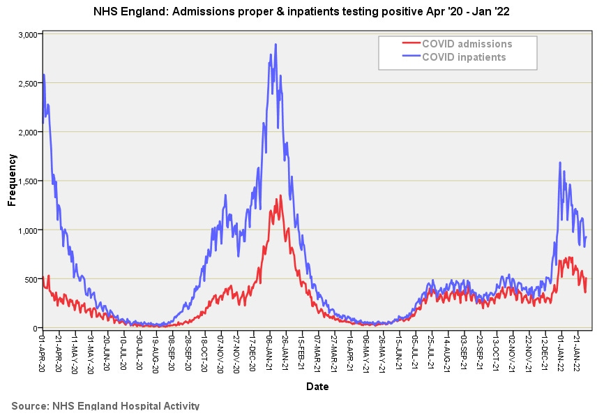
In this first slide we get to see daily COVID admissions proper (people coming in through the front door) and daily inpatients testing positive who are then classified as an ‘admission’ in figures blurted out by politicians, officials, experts and the legacy media. We may deduce that COVID is primarily a ‘back door’ disease – go to hospital for a hernia repair and come out with something a little extra special. The big assumption here is that PCR test is a reliable diagnostic tool. With this in mind we may note the explosive outbreak among inpatients just prior to 1st Jan ’22. Some are going to put this down to vaccines but it could also easily be a sudden burst of enthusiasm for poking patients up the nose. The ratio between these two curves will be mighty interesting to contemplate and I shall endeavour to undertake this shortly.
In the second slide we get a feel for incoming and outgoing COVID cases and may note the highly regular weekly discharge pattern. This pattern appears because hospitals don’t tend to discharge at weekends for a number of reasons. Discharges do not balance against admissions simply because they’ll include inpatients who tested positive.
This third slide takes us into the nitty-gritty territory of bed occupancy. The first thing I should mention here is that mechanical ventilation bed use doesn’t automatically mean the ventilation facility is used – a great deal depends on local bed management issues, politics and challenges as well as symptomatic severity. Since it is nigh on impossible to ring fence beds against trust-wide scavenging by bed managers some consultants/matrons will populate prized beds with people in order to keep them in their bed pool. Politics aside we may note general bed use managed to hit the 30% mark during the third wave, with MV bed use hitting 65% or thereabouts. It will be interesting to see how these curves align with daily case counts. The shape of the first, second and third wave curves feels very Gompertz (generalised logistic) and is the sort of shape I would expect to see following progression of a viral outbreak. Quite what has been happening between Jul ’21 and Jan ’22 is anybody’s guess! This doesn’t have the dynamic of a variant outbreak and seems to present a constant clinical load over an extended period of time.
The fourth slide is a newcomer to my collection after I realised there is a natty way to derive estimates for mean length of stay on a rolling basis. Members need to be careful in interpretation because going to the mortuary or being transferred to another hospital will shorten length of stay just as much as folk going home healthy and happy! I strongly suspect an early exit to the mortuary is behind the low figures at the beginning of Apr ‘20, though COVID bed use data for this period was also very patchy. So here’s the curious thing… extended lengths of stay are not observed during the pandemic peaks - lots of infected people does not necessarily equate to lots of very sick people. In the period after the first and third waves two week stays were pretty much the norm with stays now hovering at the week and a day level. We cannot be certain what these people were actually recovering from despite a positive test result and so a hike in stays over time could easily mark the return of elective surgery.
…Kettle on!


