ONS Vaccination Deaths Analysis (part 1)
Another poke at the vital dataset that should be error-free but is not.
Yesterday I hastily scribbled some initial notes on a peculiar finding. Before I got stuck into analysing the file of files I though I’d better check a few things, starting with comparison to the first release of this data on 6 Jul 2022. I expected figures to be pretty much the same for the overlapping months of Apr 2021 - May 2022, except they weren’t; the ONS had gone and found more deaths and their estimates of person years in their vaccination cohort had increased. I summarised the changes in a spreadsheet and noted an inexplicable pattern of what seemed to be artificially boosted ASMR for unvaccinated individuals. Funny that. I thought I’d better get stuck back in asap, so set my alarm for 5am.
Early Morning Consternation
Something that puzzles me in these early hours is how ONS have gone about deriving those Age-Standardised Mortality Rates (ASMR) - they don’t appear to have provided the data necessary for us to do this for ourselves. I thus decided to abandon ASMR for the time being, the reason being that they’re likely inaccurate. A summary of their failing can be found in a recent article by Igor Chudov, and - in a rather bizarre turn of events - they’ve also been slammed by ChatGPT. Bless my cotton socks, whatever next?!
It’s easy to get bamboozled so being slow of mind and sure of oven temperatures I decided to step back a stage and examine crude mortality (deaths per 100k population). Yes, I know this will be brimming with confounding bias but I like to start at the beginning and steadily refine things. This task requires a robust estimate of the population of England and robust estimates of vaccine uptake, ideally on a monthly basis, so we may deduce the number of unvaccinated souls. This is where the fun and games began.
Fun & Games
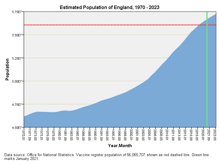
The ONS provide mid-year estimates for the historic population of England from 1970 right through to 2020, and these are easily converted to monthly values by judicious use of interpolation. With this monthly series in place it doesn’t take too much effort to estimate values beyond Jul 2020 using ARIMA time series modelling. The result looks like this:
On this slide I have marked Jan 2021 as the herald of the new vaccine era (green line) and crayoned in a red dashed line that represents the UKHSA declared estimate of 56,065,707 souls, being a figure that is used in the vaccine register (NIMS), the definition of which may be found here. Strangely, a figure of 56,550,138 is given in the ONS population analysis toolkit that may be found here, which is why my blue area exceeds the UKHSA declaration. Quite why the UKHSA have decided to abandon 484,431 souls is beyond me (I presume these are folk not on a GP register, or whose records cannot be traced/linked for some reason) so it’s worth bearing these fun and games in mind when looking at rate tables.
It’s also worth bearing in mind that these top line figures include COVID-19 vaccine ineligible souls under the age of five years, which amounted to 3,239,447 babies and toddlers, according to the ONS 2020 mid-year estimate. I could say this is a small wrinkle but I better not pun this early.
So then, that there is my best shot at predicting the growth of England’s population over time, so we now need to divide this into vaccinated and unvaccinated bods.
Dosing Up
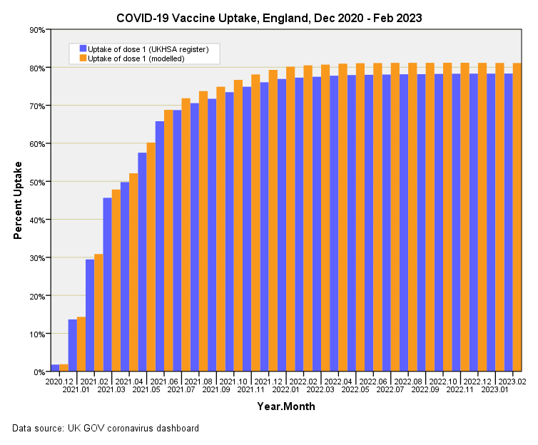
I decided to go straight in with figures obtained from the UK GOV dashboard for new people vaccinated with a first dose by vaccination date, this variable providing an estimate of the number of folk ‘ever vaccinated’. Bunging monthly counts of such into my monthly population spreadsheet enabled me to divide the population into vaccinated and unvaccinated cohorts and, being finicky, I decided to adjust for those little charmers who were not eligible whilst I was at it. Let us then have a look at the official UK GOV figures for vaccine uptake compared to my best effort:
Because I’ve adjusted for those less than five years of age my estimate for uptake slightly exceeds that offered by the UKHSA, with this month’s figures coming out as 81.1% and 78.3% respectively. I’m hoping that such diligence will be noted by those keen to label me an anti-vaxxer but, tbh, these days I don’t give a flying figroll.
The fly in the ointment here is that the UK GOV team only count those aged 12 years and above in the first dose data, which makes me wonder if the 5 – 12y group are left out of all statistics that might point to harm. Nothing is ever straightforward!
Estimates of Unvaccinated Eligible Population
We come to a crunch moment when I reveal my best effort at deriving monthly estimates for the number of unvaccinated souls living and breathing in the nation of England:
If we can ignore the Ukrainianesque colour scheme and the 5 – 12y wrinkle we arrive at my asymptotic guess of 10,231,978 as opposed the official head count of 12,143,513. I have no idea how accurate these figures are because we are relying on some pretty dodgy estimates of the total population and claims for first doses issued that I wouldn’t trust any more than Boris Johnson’s hairdresser. Hopefully an enterprising reader will drop a comment as to how I can improve on things (UKHSR GP register, maybe?)
COVID vs. Non-COVID Population
I’m not even going to try estimation of these sub-populations owing to the sheer futility of estimating how many people across England contracted COVID-19 in each month. Sure we’ve got official case counts but these are not even case counts, being mere positive test results (whether false positive or true positive). The bias within this data series will be extraordinary, with emphasis on those in education and those required to test themselves regularly for employment purposes. Neither do I trust surveys of disease prevalence, so I am going to lump COVID and non-COVID death together and go all cause mortality for simplicity’s (and sanity’s) sake.
The BIG ONE
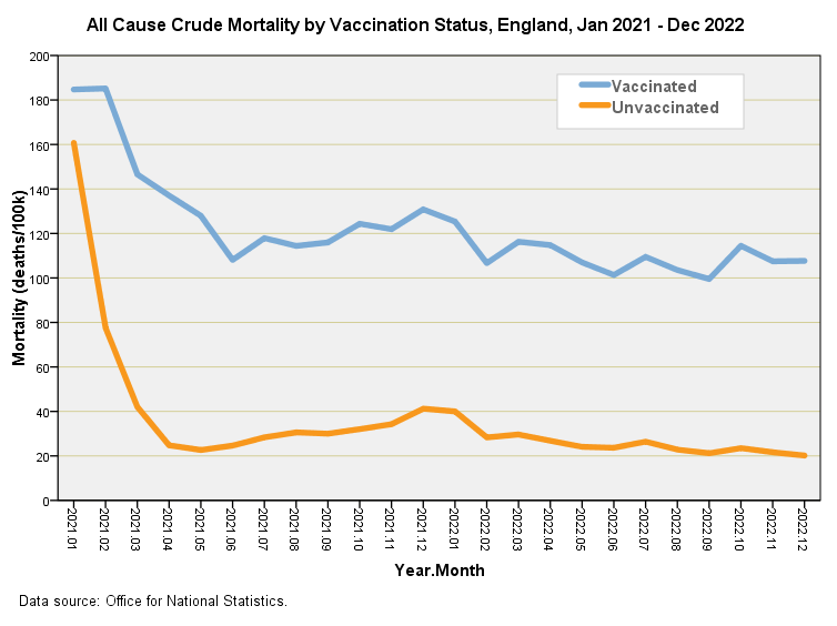
We arrive at the big one whereby I bring together my best estimate for the vaccinated and unvaccinated sub-populations for England over time and derive crude mortality (deaths per 100k) using the ONS vaccination deaths data from table 11. The pain here is that the ONS omitted figures for Jan 2021 – Mar 2021 in the second release of this vital dataset. Yes I know, but what can you do with an organisation like this that is clearly under orders from above?
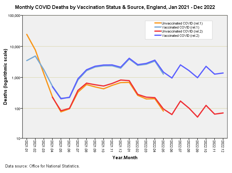
Well, what you can do is whip out the crayons and have a look at what data you do have. Herewith a slide of vaccinated and unvaccinated COVID deaths for the first and second releases of this data followed by the very same for non-COVID deaths:
These rather colourful slides give me a degree of confidence in merging the two datafiles to fill out those pesky holes, for we may note how the pairs of lines track each other rather well. The biggest discrepancy I can eyeball is that between first and second releases of non-COVID unvaccinated deaths (orange and red lines, lower slide). These start out in agreement and drift apart with the most recent release picking up proportionately more deaths of this type. This may well be due to delays in death certificate processing that were inherent in the earlier release.
We finally come to the big one. Here is my best guess at what is going on when we slash through the fields of obfuscation sewn by arcane use of ASMR based on unreliable population cohorts and clear a path to crude mortality. This is where ONS should have started before going on to bigger and better things:
Quite a shocker, isn’t it?
CAUTION!!! A quick reminder that what we are looking at in this final slide is crude mortality and crude mortality (deaths per 100,000 population) doesn’t take account of important confounding factors like age and health status. We see a difference and that difference may be due to vaccine harm and it may not.
For example, what if the vaccinated sub-population were all very elderly and sick in comparison to the unvaccinated? If we adjusted for age differences would those two curves come together or even swap over?
Whilst age standardisation is handy for adjustment between differing sub-populations it doesn’t really tell us about underlying health issues. Yes indeed, these generally increase with age but that’s not my point. What if the unvaccinated sub-population was peppered with younger folk who were chronically, critically or terminally ill? What if pretty sick folk of any age decided to pass over being pronged before passing away? What then? Well, this situation would serve to heighten the difference between these two curves.
So yes, we could set about age standardisation like the ONS and their sophisticated ASMR based on person years but we’d have to concede we’re missing a vital piece of information, which may be summed up in the question: just how well are unvaccinated folk in the first place compared to vaccinated? Until this and many other issues are fully addressed we’re still in epidemiological limbo.
Kettle On!
Tables 1 - 4 do not include all deaths for these are the souls that ONS was able to link to the 2021 census dataset. The only table displaying the Full Monty is table 5.


Astonishing work as ever. Will take some time to digest.
Quick question: are the keys correct on all the graphs? The first and third have unvaccinated in red/orange and vaccinated in blue green, but the second is keyed as unvaccinated in blue/green and vaccinated as red/yellow. Might need a quick check between brews.
Lunch has cheered me up, so I have summarised my plans of taking this work to stage 2 (age standardisation) and stage 3 (health standardisation) in a final section called 'hope'. The basic idea is to try and trash the difference we see with crude mortality.