Spectral Analysis Of All Cause Death (part 1)
I utilise an engineering tool to investigate periodicity for all cause death within England & Wales by date of death for the period 1st June 2014 – 31st July 2023
I rather enjoyed taking us all for a crazy spin last week, so much so that I fancied another crazy bake today using national statistics for England & Wales. As Joel Smalley over at Dead Man Talking has pointed out on more than one occasion, the usual fayre proffered by ONS is deaths by date of registration and not date of death, which mangles the time series somewhat owing to administrative delays and shunting of counts arising from weekends. Not only that but the ONS rarely bothers with daily counts and tends to clump folk into age bands that are particularly unhelpful. If you want the good stuff then you have to pay handsomely for it, and this is what Joel and others have done. Anybody wanting daily counts of all cause death across England & Wales by date of death by single year of age – i.e. the really useful stuff - can find the fabulous user requested (and paid for) file lurking here.
You may ask why citizens have to pay for files like this, and you may equally ask why tabulations by date of death are not the de facto standard for all ONS outputs. I asked an officer the latter question once and got a load of old flannel. Chances are that in the distant past some very senior officer decided to run with date of registration since this was the more reliable field at the time. These days we can’t have the public questioning data reliability, hence the flannel.
Anyways, on with the bake…
After tugging my beard a few times I decided to condense the 91 year-of-age fields from zero to 90+ years into five fat bands: 0 – 17y, 18 - 39y, 40 – 59y, 60 - 79y, +80y. We can change these if readers so desire but my thinking was to distinguish between children and young adults aged 18 years and over then distinguish between mature and extra mature adults that form the backbone of the working population. I’ve yet to see much difference in the clinical profiles of those beyond 80 years of age so lumped elderly deaths together just to get the ball rolling and the bake baking.
Another distinction I wished to make was between the pre- and post-pandemic periods and for this I opted to split the data into lumps covering 1 June 2014 – 31 December 2019 and 1 January 2020 – 31 July 2023. Yes indeed this is also rather crude and we can refine things but my experience of 39 years tells me that sort of fiddling isn’t going to offer much; on top of that I’m a very lazy statistician.
My fingers and thumbs tell me that these distinctions are going to yield ten spectral plots and these are presented below. Before we eyeball these I’ll just mention that the reason we use daily data to confirm weekly periodicity and weekly or monthly data to confirm annual periodicity is because of the Nyquist limit (a.k.a. Nyquist frequency). This is very geeky stuff but it all boils down to limits as what frequencies we can detect within a time series.
I also have to confess to going all journo and using the phrase ‘foul play’ to describe 7-day and 14-day periodicity. In reality 7-day and 14-day dips in the death count will yield a periodic signal as will 7-day and 14-day spikes. In addition 7-day and 14-day dips followed by spikes will also yield a periodic signal as will 7-day and 14-day spikes followed by dips. What we are essentially talking about is a regularity in the signal that shouldn’t be there if folk are allowed to die in a stochastic manner. Nerds might venture the phrase deterministic death and, having an interest in chaos theory, I quite like this.
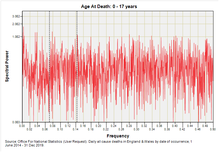
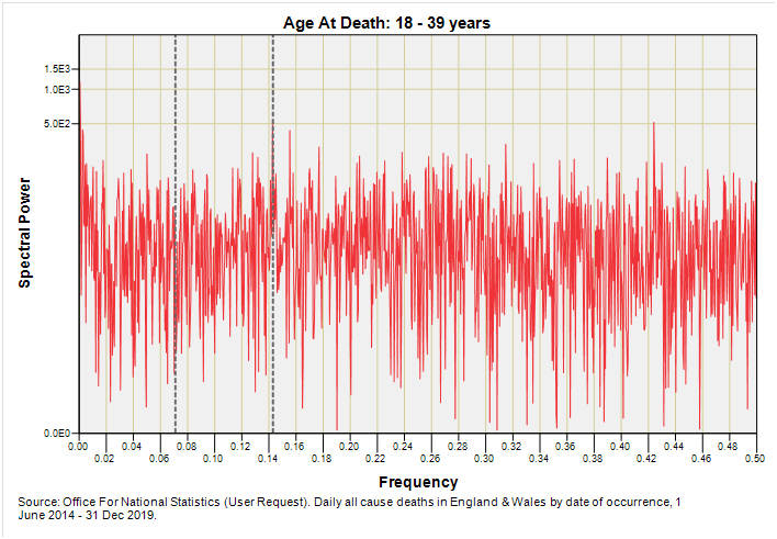
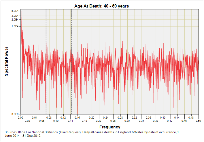
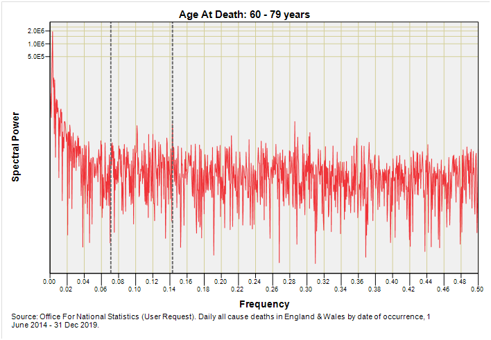
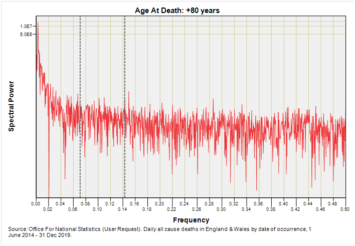
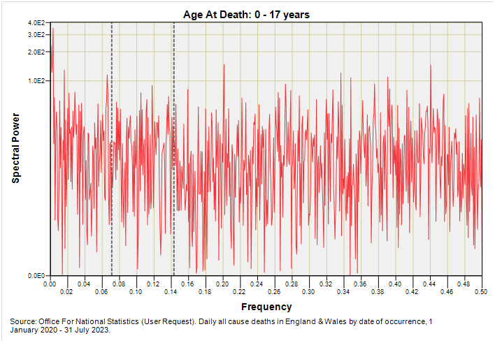
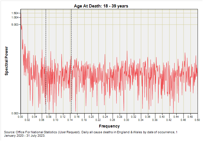
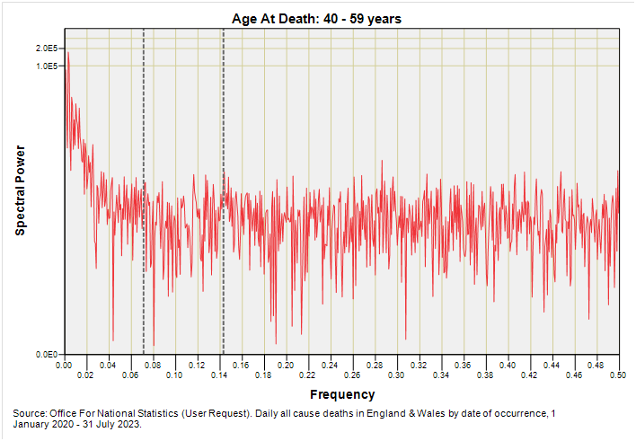
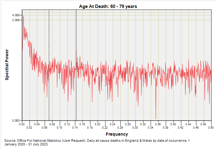
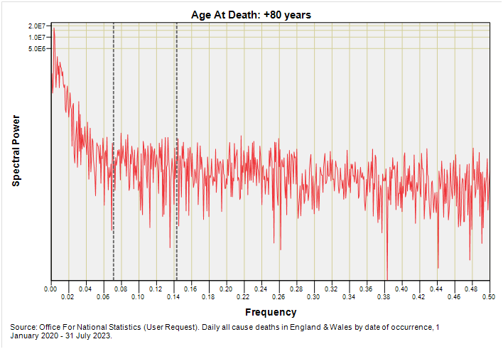
Let us then, with cream bun in hand, determine if we can spot signs of deterministic 7-day and 14-day death among those ten telling charts. To guide the eye I have plonked down grey dashed lines marking out 7-day (f = 0.143) and 14-day (f = 0.071) periodicities.
Pre-Pandemic Series
Readers might be wondering if that spike that appears to mark 7-day periodicity for 0 – 17 year deaths means anything. To answer this take a look at spikes to the left and right which reveal the level of random noise that is inherent in this series. They all look pretty similar to me so I’m going to assume this is coincidental noise. However, there is a situation when weekly periodicity might rear its head in this age group and that is in new born and neonatal deaths that are induced and/or delivered by Caesarean section. This is something I can take a look at if I can find time.
There’s another of those coincidental 7-day spikes in the 18 – 39 year grouping that is starting to look interesting. I would urge folk not to narrowly think in terms of vaccine damage when the post-pandemic version appears below but start thinking in terms of sporting fixtures, weekend binges of alcohol and/or drugs and young things tearing up the tarmac on Friday night.
With mature adults the weekly signal, whether genuine or nay, has vanished to be replaced with the vaguest notion of 14-day periodicity, though my ancient eyeballs are suggesting this is just coincidental noise.
There is no hint of 7-day or 14-day periodicity for the extra mature adults but I’d like to draw attention in this slide to the substantial peak that is squashed down next to zero. If we expand the x-axis we discover this is centred on f = 0.00274 which represents the year. Annual periodicity it is then, and we are talking primarily respiratory causes.
Annual periodicity is a feature for the oldest age group as we may expect but ideally I should flip to weekly resolution to see if we can detect sub-annual periodicities, hence part 2!
Post-Pandemic Series
Note the noise level! Noise is brimming over owing to the shorter time window and consequentially fewer deaths (12,348 in total for this age group compared to 22,362 for the pre pandemic period). There’s nowt here but noise!
Noise has settled down owing to the larger sample (33,150 as opposed to 12,348 deaths) but I don’t see anything that is particularly interesting.
Again nothing of great interest apart from the detection of annual periodicity down at f = 0.00274.
Ditto.
Ditto the ditto. We are talking annual periodicity and that’s it. If we were going to detect foul play it would have been in this group but then again any such foul play on a particular sub-sample (e.g. care home deaths) would likely have got lost in the sheer size of the national sample that is now up at 1,166,241 deaths for this age group.
Kettle On!


If you want the full, official "flannel" in response to the ONS inadequacies of data capture and presentation, here it is! https://www.whatdotheyknow.com/request/availability_of_real_time_access
Just working with some mushy concepts: Is it possible to construct synthetic years, where each year's time zero starts on a date of interest such as the announcement of a booster or a new variant? And then somehow detrend from that the "real" periodicity? Not sure if that makes sense, and not sure if that would be any different from a natural experiment.