
Toward age-adjusted mortality (part 2)
A rummage in the Office for National Statistics' pantry...

Yesterday I summarised my efforts to obtain population estimates by quinary age band (5-year) from zero upward by sex by year going all the way back to 1970, explaining how this information wasn’t sitting on a shelf somewhere despite it being pretty basic stuff. This morning we are going to take a look at some rather interesting population trends.
I’ve 36 time series to show in total (18 age bands by sex) which would look a bit messy all lumped together so I’ve opted for teasing out 6 series at a time. The idea here is to print them all out and paste them onto a large piece of cardboard entitled ‘My Project’ using that runny white glue that was handed out back when classrooms were full of dangerous things like scissors, paint, ink and crayons.
Let us start with the males…

In this slide over at the top left and skimming 2.1 million souls we get to see the procession of a sizeable and well-defined hump that are the baby boomers as they mature over time, these being the result of fecundity and prosperity during the 1960s. The series for males 25-29y shows a smaller red hump prior to this centred on 1975. A quick stab at my trusty hand held calculator yields a birth year of 1946 or thereabouts suggesting the end of WWII was celebrated in several ways. From 2005 onward that red line creeps to a peak around 2017, yielding a birth year of 1988 or thereabouts and the onset of the millennials.
What is most curious is that the millennial hump series starts nice and smooth and orderly but kicks up for the 20-24y and 25-29y age groups around 2010. I’m wondering if this is an artefact arising from different methods of estimation for different age groups, in which case we have one of those flies buzzing in the ointment! The critical question here is whether 2020-21 estimates for 25 to 29 year-old males are accurate or over-egged. If over-egged we may expect to see conservative and somewhat misleading mortality rates. All that being said, there may well be a jolly good reason why the curves for older males are leaping up and this will be explained below.
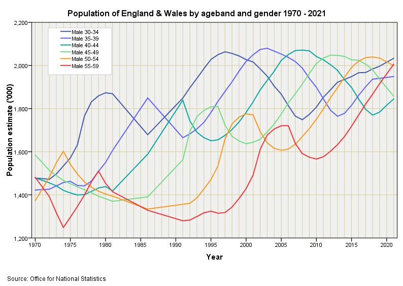
In this slide we get to see the progression of the fruits of WWII celebrations, being a smaller hump that slides from 1.9 million souls down to 1.7 million souls over the period 1980 - 2005. We also observe some spikiness in earlier years that is going to be an artefact of estimation. If squint at 2021 we get to see pretty much equal proportions among the 6 more mature male age bands - a situation that hasn’t been encountered since 1970.
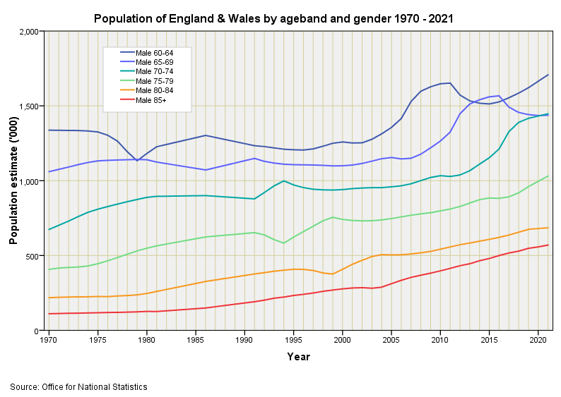
The final slide for males reveals the residual WWII celebratory hump in the older age bands and some kinky spikes that are likely artefact. A male conscript joining the armed forces at the tender age of 20 years in order to fight for king and country in 1915 would reach the ripe old age of 85 years in 1980 if they managed to survive, which gives us a fix for the impact of WWI on birth rates (seeming lack thereof). Equally, a male conscript joining the armed forces at the tender age of 20 years in order to fight for king and country again in 1945 would reach the exceedingly ripe old age of 95 years in 2020 if they managed to survive.
And now for the women-folk1…
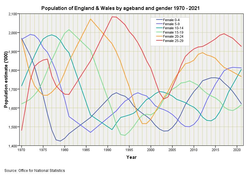
Here we have a slide that is very similar to that for the men-folk. Again we see the series for 20-24y and 25-29y females playing up and jumping ahead of the pack. The gradual rise in the baby boomer peaks is curious - we have more 25-29y females in 1991 than we have 10-14y females in 1981: somehow we are synthesising females!
By way of worked example, in 1992 we observe 1.681 million 0-4y females, whereas twenty years later in 2012 we observe 1.894 million 0-4y females. How is it possible to gain 0.213 million females if they haven’t been born? The answer, of course, is immigration (assuming estimation methods are robust). After a bit of cogitation we come to the realisation that any unexpected leaping upward of curves as they progress in time is easily explained by influx of folk who were not born in England & Wales; hence my leaping males. Sorted! By eyeballing curves we may conclude that 20-24y and 25-29y males and females are the primary source of this influx, which started to surge from around 2005 onward.
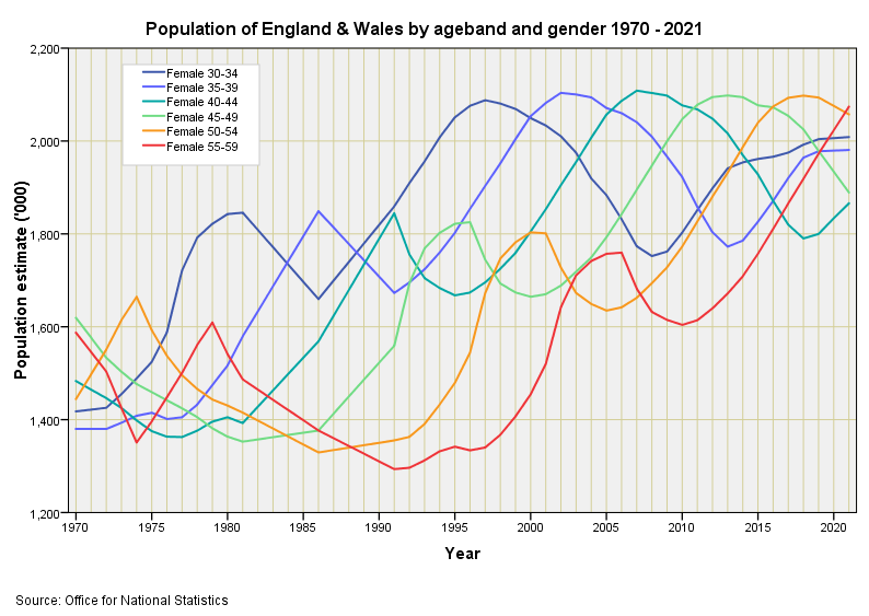
Not much to say here other than the progression of peaks for the post-war mini-boom and 1960s baby boom are pretty even, which suggests deaths of those born in England & Wales have been largely balanced by immigration for these age bands.
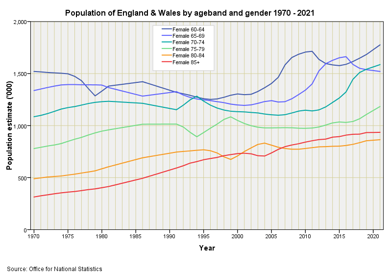
One of those slides that reminds us that the population is ageing. Right now the increase in the number of our most elderly residents is largely the result of the post-war mini-boom. A quick squizz at the prior slide reveals the sort of substantial leap we may expect in numbers as the baby boomers reach the riper ages. I wonder what our loving and most trustworthy government has got planned for us all?
I have a degree in biology so can determine these things.