
Using ARIMA To Investigate COVID Death (part 2)
Cranking the handle on the latest daily data sitting in the UK GOV coronavirus dashboard

In the first part of this series I produced an ARIMA model for the prediction of new daily certified COVID deaths during the first wave of the pandemic in England using new daily COVID case counts as an independent predictor. This turned out to be highly statistically significant as we may expect (p<0.001) but yielded a modest effect size, with the coefficient of determination estimated at R-square = 0.190; that is to say some 19% of the variation in the daily death count can be explained by variation in the daily case count.
A Notion
This morning I had the notion of using the basic model I produced for part 1 of this series to investigate what we may call ‘delay to death’. That is to say, once folk who are rather ill have been identified as COVID positive, how many days will then pass until the point of death. There are numerous clinical reports for onset of death ranging from days to weeks but I wanted to get a feel for the population level picture for England during the first wave.
To assess this I decided to use RMSE (Root Mean Square Error) as my guide. This is a measure of what variance is left over after an ARIMA model has run through the data. We may think of it as a number that reveals what has been left unexplained. If a model is a poor fit then RMSE will be large; if a model is a cracking fit then RMSE will be small.
What we can do is note the value of RMSE as we alter the delay between test result and death, and the lowest values will reveal those moments when case counts are most strongly linked to death counts, thereby revealing the general delay in test result to death. I appreciate this may hurt some subscriber brains but we’ll soon get to an illuminating moment!
An illuminating moment
Here it is…
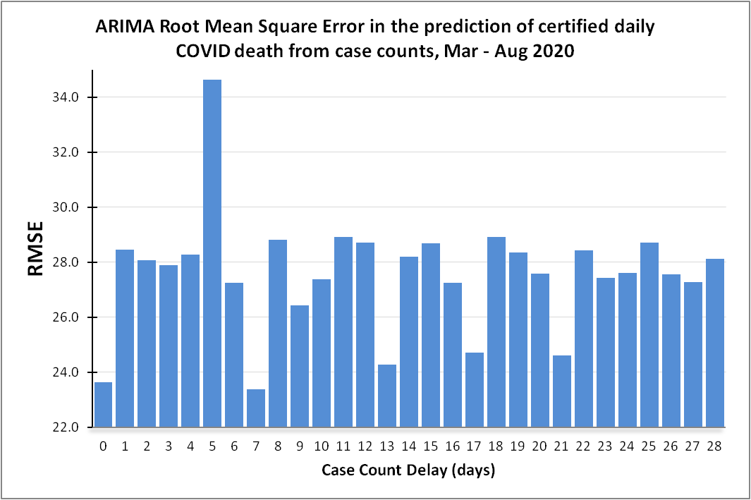
That weeny blue bar at a delay of 7 days reveals the ARIMA model for linking case counts to certified deaths is doing the very best job of squeezing the juice when we allow a 7-day delay from test result to death. There are a few other low value bars revealing life (or death) isn’t that simple.
There’s a fascinating weeny bar at lag zero that suggests folk were dying the same day they were tested, which is an intriguing insight into the strange protocols and games played over the period Mar - Aug 2020. Thirteen will be an unlucky delay for some, and the last small bar appears at 21 days, suggesting that’s generally about the length of time poorly folk will linger.
Identification of an optimum lag of 7 days from case identification to death means I’ll be able to squeeze even more juice out of ARIMA when I come to look at the second and third waves. Until then…
Kettle on!