
Using ARIMA To Investigate COVID Death (part 5)
Cranking the handle on the latest daily data sitting in the UK GOV coronavirus dashboard

We arrive at a potentially juicy piece of analysis, being ARIMA modelling of daily certified COVID death across England for the period 23 May 2021 - 12 Jul 2022. Let’s start with a plot of the dependent variable:

Now that is the strangest time series for deaths I have ever seen! In addition to the expected 2021/22 winter peak we’ve got a summer peak, autumn peak, spring peak, and what appears to be the beginning of a second summer peak. Assuming these deaths were appropriately certified by experienced physicians working according to training rather than management whimsy, and assuming emphasis hasn’t been placed on test results, then we may conclude that we’re looking at a strangely cyclic catastrophe.
I say ‘strange’ because some but not all of these peaks in daily deaths can attributed to a rise in COVID cases as the following dual time series plot reveals:
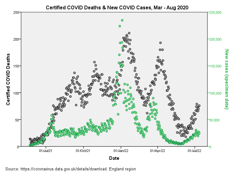
The puzzle here are the two pre-seasonal peaks in COVID certified deaths that are not reflected by corresponding hikes in case counts. Curious, very curious. Let us have a look at doses and deaths…
Doses & Deaths
Dose 1
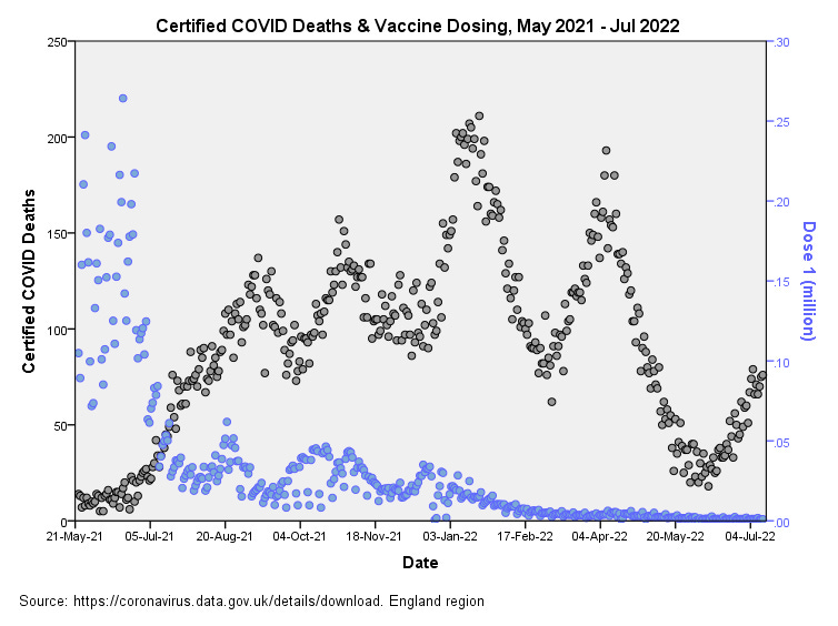
There’s a hint of a correspondence between dose 1 and the three peaks for certified COVID death from 5 Jul 21 onward with a lag around 3 weeks This is interesting because late dose 1 uptake will have been among the youngest age groups, but we shall see what ARIMA makes of this.
Dose 2
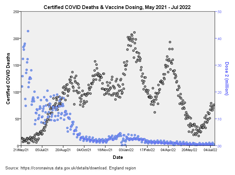
There’s not much by way of correspondence for dose 2 apart from a bit of a hump in late dose 2 uptake and the hike in summer COVID deaths following a lag of around 6 weeks.
Dose 3
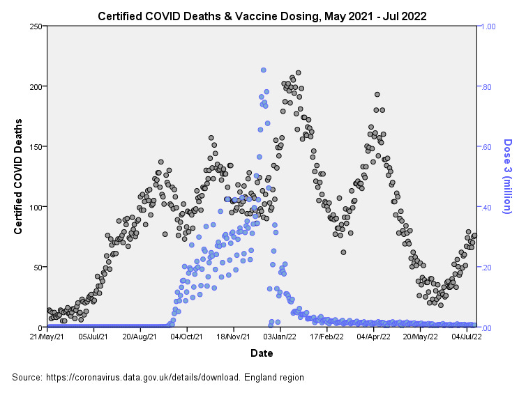
The correspondence for dose 3 certainly raises an eyebrow, with peak COVID death occurring around 4 weeks after peak dosing, but we shall see what ARIMA brings to the table!
ARIMA Results
To cut a long story short a large number of models were run incorporating case counts, lagged case counts (lags of 14, 21, 28, 35 and 42 days), doses and lagged doses (lags of 21, 28, 35 and 42 days) as independent variables. Surprisingly, daily case counts were not found to be a statistically significant predictor of daily certified COVID death at the 95% level of confidence (p>0.05), with the best fit yielding p=0.079 for cases with a 14 day lag. This begs the question of why daily case counts were not translating into deaths during this period, which brings us back to that puzzle of hikes in deaths not being mirrored by a hike in cases. We eyeballed it first and now ARIMA modelling has confirmed it: we’re looking at hikes in COVID death without corresponding hikes in COVID cases!
Instant Dosing
The three best fitting models incorporating the jab were arrived at without the need for lagged effects, which surprised me somewhat. Here are the three key tables:
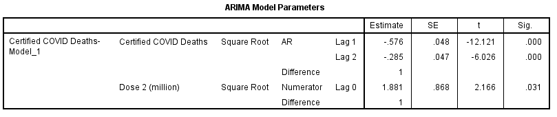
Dose 1

The first dose comes storming in with a highly statistically significant p-value of p=0.009, making this time series a useful predictor for certified daily COVID death. Some would argue that jabs were given to old folk who were going to die anyway. This was certainly the situation back in early 2021, but this analysis is looking at the tail end of initial dosing that was aimed at the young, strong and healthy. Those three ripples in late phase initial dosing that we eyeballed back in the third slide do indeed pass statistical muster – that correspondence is no coincidence!
Statistical significance is one thing and effect size is another. The very modest coefficient of determination for this model fetched-up at R-square = 0.022 which means 2.2% of the daily variation in certified deaths can be explained by variation in daily initial dosing.
Dose 2
The second dose is a little shy in coming forward, reaching a p-value of p=0.031. I didn’t expect anything from the second dose so this was a pleasant surprise! As we may have already gathered the effect size is pretty small with R-square = 0.015; that is, 1.5% of the daily variation on certified death can be explained by variation in secondary dosing.
Dose 3
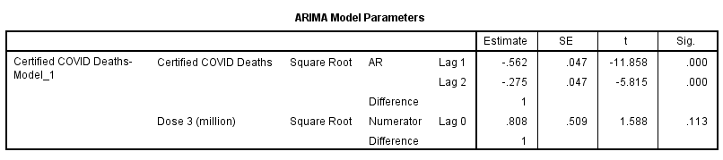
The third dose, which promised so much visually, failed to make the grade with p=0.113. There are many reasons for this starting with the fact that the third dose didn’t really get going until Sep 2021, so I may have to re-run the model using a more pertinent period.
Pertinent Periods
I trust that folk can understand why an ARIMA model can be clobbered by using a lousy data period. In the case of the third dose ‘lousy’ means starting the series with a whole bunch of zeroes. Another form of lousy is to try and model time series data that slices though the periodic winter hike in respiratory deaths without attempting to adjust for seasonality (itself a very tricky thing to accomplish effectively). I am minded, therefore, to get out my cook’s knife and slice a juicy period that avoids the winter deaths issue and run the whole thing over again. Until then…
Kettle On!