Weekly Deaths Update (part 10)
Excess all cause deaths in England & Wales 1970 – 2022
Calculating excess deaths by subtracting a baseline figure (usually the prior 5-year mean count) from observed counts on a week-by-week basis is an easy thing to do and the method favoured by the Office for National Statistics who provide 5-year means for this very purpose. The problem with this method is that pathogens don’t wear watches and don’t heed our neatly constructed 52 week years (53 weeks on occasion). If seasonal influenza comes 6 weeks early one year compared to the mean historic trend then our excess becomes a debatable figure. The same happens if seasonal influenza decides to arrive later than usual. Then we’ve got the perpetual headache of administrative delays skewing the figures (deaths are by registration date and not date of death). We may feel double the pain when we realise a regime change during any one year may scupper the delicate synchronisation if processing is delayed or advanced when compared to previous years. Into this pot of troubles we have to throw changes within the population and changes within society that serve to mess with our figures.
In a nutshell the assumption underlying the calculation of excess death is that nothing of substance changes temporally when obviously it does, though we are expected to believe week 37 of 1987 was effectively the same week as week 37 of 2007 in terms of the registration process. It may well be, but what if 50% more staff were employed to process death certificates back in 1978 thus bringing registration dates forward by 3 weeks? The excesses we observe are thus not necessarily due to more (or less) people dying during the very same week or an outbreak of something nasty – to establish this we’d need excess based on date of death and not date of registration.
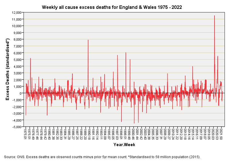
With these issues swilling around our bowl let’s take a look at weekly all cause excess death for England & Wales for the period 1975/w2 to 2022/w13:
There’s no doubting where the peak of the pandemic came but see how sharply defined it is. A peak of 11,524 standardised deaths was attained during 2020 week 16, with a peak of 11,217 standardised deaths coming a close second during 2020 week 17. The interesting thing here is that we now have to leap back to 1989/w51 to find the third peak of 7,901 standardised deaths. Erase those two extremes during 2020 using the rule of thumb and we’d be hard pushed to determine when the pandemic descended using weekly excess as our measure.
I’ve been looking at graphs of excess deaths in various fields of study for 38 years now and my eyeballs tell me something rather interesting is going on with the series for 2020/w3 onward. Ignore the peaks and have a good look at the overall pattern. Compare the density of this weekly pattern with earlier outbreaks of something nasty and you’ll see a more ‘open’ structure to the wave form, as though death registration has opened out over time. Either people are dying with a different temporal dynamic or the processing of death certificates is following a different temporal dynamic (possibly both).
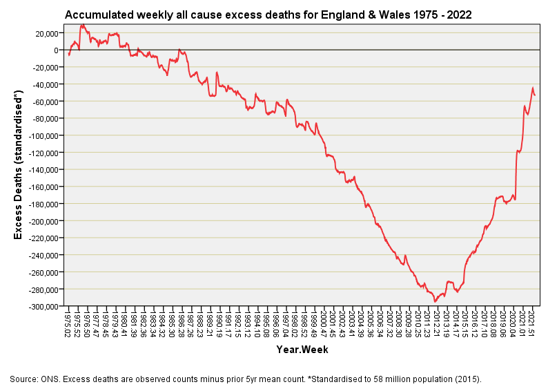
There are a number of ways to get a handle on this and I decided to set out by looking at accumulated weekly all cause excess death. The following slide is worth deep cogitation with a cuppa for it acts as a proxy for the general health of the nation. If nothing ever changed (no seat belt laws, no technological progress, no wonder drugs etc) then we’d expect the red line to bob about the zero value on the y-axis. It certainly does this up to 1987, from which point onward we see a general improvement as we slide into ever increasing negative excess.
So what on Earth happened in 2012 aside from the Mayan long count calendar ending? Here we have a critical turning point that set the nation back on the road to poorer health well before the 2020 pandemic. This trend back up falters slightly during 2018/19 before hitting the sheer cliff face that marks the pandemic. What policies were put in place during the first decade of the new millennium that turned a sustained improvement in the health of the nation into a slide backwards? Is this sort of dynamic inevitable; that is to say, are we always going to get runs of improvement followed by runs of deterioration given the dependency of the calculation on historic values? All very interesting indeed and worth a rummage in the biscuit tin and a fresh pot!


