
Weekly Deaths Update (part 2)
Registered weekly deaths in England & Wales 2010 - 2022

Yesterday we started out by eyeballing the all cause mortality rate (deaths per 100k population) for England & Wales for the period 2010/w1 to 2022/w13 as one long sausage. This morning we are going to look at the same data after it has been passed through the bacon slicer:
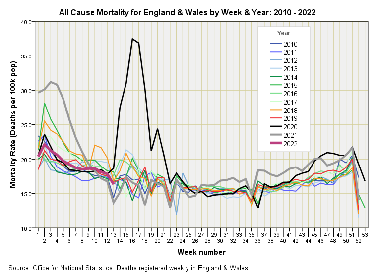
Whilst this is the most colourful graph I produce, enabling me to use all my crayons, it tells us a few darn interesting things. First up, it tells us how neat and tidy registered death generally is across the year despite the potential for influenza outbreaks to come early or late and for office staff to get behind with processing, either messing up synchronisation based on a rigid weekly numbering system.
Second up, it tells us that the pandemic only really got into its stride during weeks 14 to 21 of 2020; a period during which old and frail folk were being shunted out of hospital beds into nursing and care homes to be greeted with end of life care pathways incorporating nil by mouth, DNR and Midazolam cocktails. I did a little work on this debacle back in Aug ‘21 and confess to boiling over when I produced this slide:
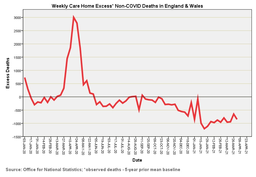
There’s your week 14 to 21 excess death peak once more but for old and frail folk who never tested positive for COVID. Dangerous discharge from hospital, withdrawal of medications and criminal use of end of life care pathways even for those nowhere near death are likely what has driven this surge but I doubt we’ll ever get a public enquiry. The lesson here is not to go assuming all bumps are necessarily deaths from the virus alone.
Setting aside a politically convenient and somewhat scary spring death bump what else do we see? Well, we see the rest of 2020 settling down to normality until weeks 42 - 50 when we observe a slight seasonal hike in figures. Arguably more interesting is the scary start to 2021 (weeks 1 to 7) when vaccines were supposed to be magically solving matters. Again all settles down into normality until week 30, when we start to see a mysterious but modest hike in all cause death that inexplicably exceeds the rate for virus-stricken 2020. Funny that.
So where are we heading now? The extra juicy purple squiggle suggests 2022 is doing what most other years do for weeks 1 to 13 in terms of all cause death for all age groups who have managed to survive yet another year.
I calculated more than 50,000 premature deaths due to policy to dicharge hospital patients to care homes.
I have text and charts to show this analysis, But can't add pdf file or Image to this post. Can send by email.