
Weekly Deaths Update (part 5)
Registered weekly deaths in England & Wales 2020 - 2022

Today we are going to shorten the time series to 2020/w1 to 2022/w13 in order to take advantage of higher resolution age banding (5-year bands). I’m also going to split the data by gender for good measure (see what I did there?). After some thought and a cuppa I decided to split the weekly all cause data into COVID and non-COVID deaths, this approach giving us a total of 152 time series to consider. This is more than Substack can handle so part 5 will consider non-COVID data for those up to 49 years of age at death, and part 6 will consider non-COVID data for those aged 50 and over at death. Parts 7 & 8 will repeat the process for COVID cases. Get the kettle on and biscuits opened because we are going to look at a stream of 20 slides then break for a cuppa and a bit of chat, finishing with a tangy non-parametric test for randomness (runs test).
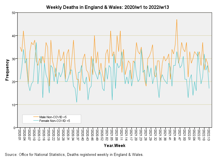
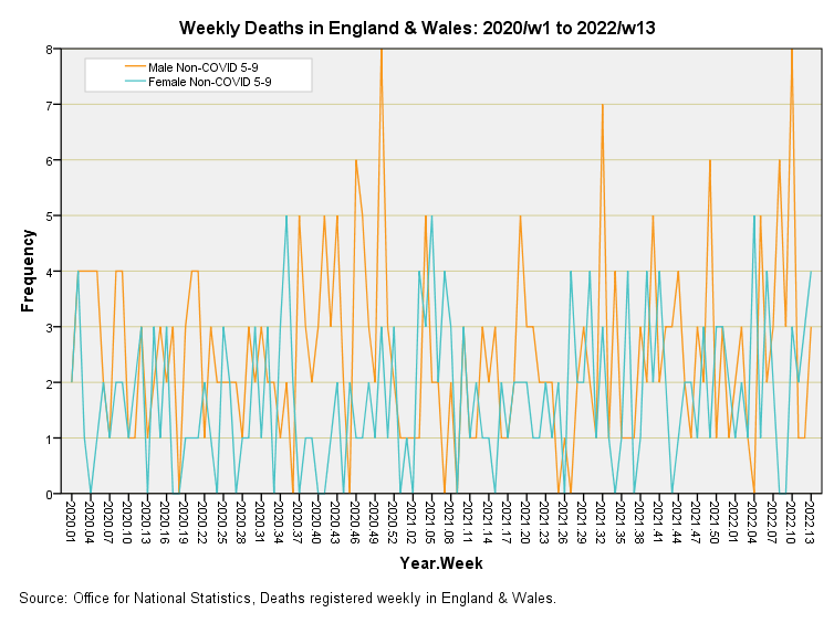
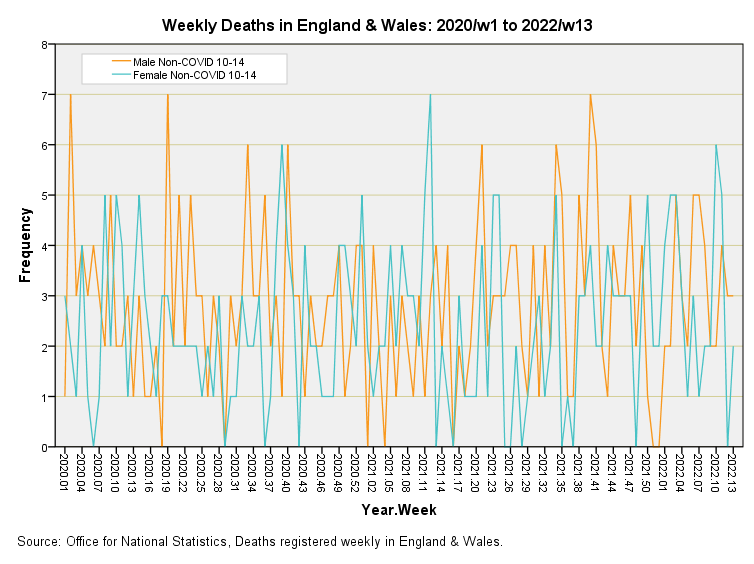
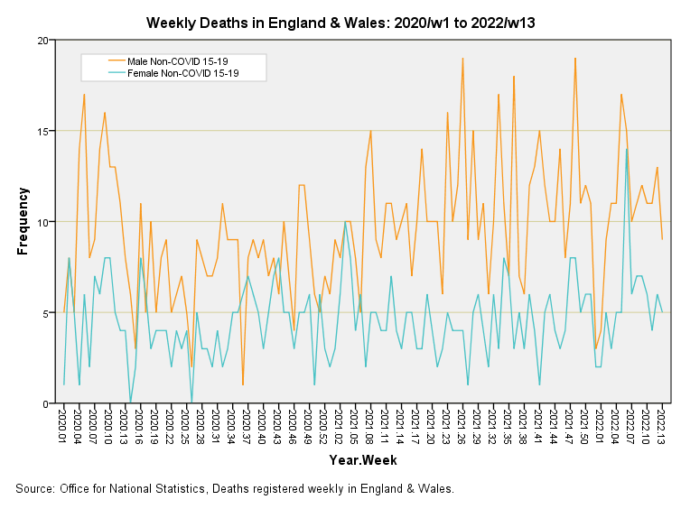
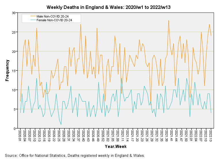
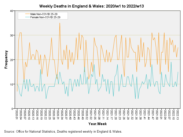
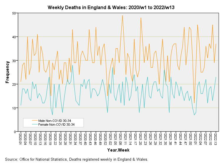
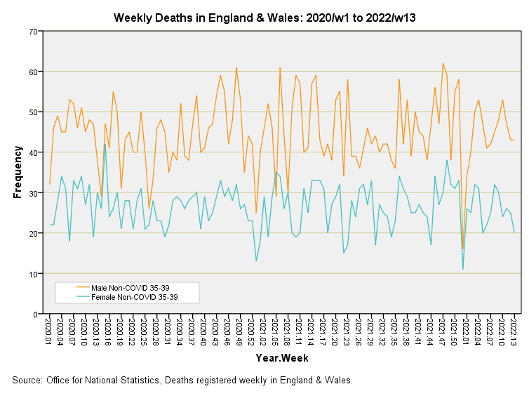
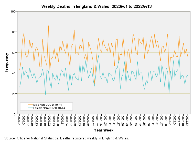
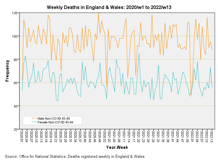
As you eyeball these slides keep one eye on the scale of the y-axis since this varies considerably from 8 deaths per week to 120 deaths per week. The other eye can be kept on the relative counts for males and females for which we observe a distinct separation from 15 - 19y onward, with males being more likely to show in the death statistics. Remember that these are deaths listed by registration date and not date of death, and will be subject to administrative delays which can be substantial at times. Peaks and troughs may reflect what is going on in the registration office more so than the real world, so please be cautious if something looks exciting or doesn’t live up to expectation. With data as enigmatic as this what we should be looking for are sustained trends rather than blips and blops.
Random & non-random walks
To help us in our assessment of trends we can use a number of statistical tools the most popular of which is ordinary least squares regression (OLSR) that slams a straight line down through the data. We can also fit curvy lines using polynomial and other methods. My favourite quick and easy method is to rely on a non-parametric test for randomness (runs test), which gives us a half decent clue as to which time series are random walks and which series have some sort of shape. In the table below any series that fails to reach statistical significant at the 95% level of confidence (p>0.05) is considered to be nothing more than a random walk. Any series that manages to better p<0.01 or p<0.001 in the probability stakes needs our full and immediate attention!
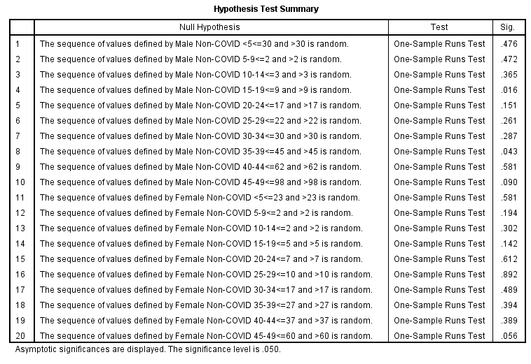
Squinting at the p-values in the right-hand column I note the series for males non-COVID 15 - 19y hits a tasty looking p=0.016 so let us consider this slide without delay! What this result is drawing our attention to is the initial fall then rise in young male deaths to a plateau starting around 2021/w23. We may well ask why the death rate for young males was increasing during the latter half of 2020 when the death rate for 15 - 19y females was pretty much exhibiting a random walk (p=0.142). Aside from this bit of drama nothing else seems to stand out in any way (we must ignore any sharp spikes or dips because they are very likely to be processing artefact).
Excellent analysis! Pretty much confirms the findings I have seen elsewhere <claps hands>