
A step toward understanding (part 2)
Using factor analysis to get a handle on the pandemic

In A step toward understanding (part 1) I kicked off by boiling down 38 pandemically-flavoured independent variables into a mélange of just 5 orthogonal factors I called nationwide testing, COVID cases + clinical tests, COVID deaths, prevalence + CFR, and in-hospital test rate. These five beauties explained 93.4% of the variation available in the 38-dimension dataset and glistened like edible jewels in the sun.
This morning I am going to repeat the exercise for variables garnered from NHS England COVID-19 Hospital Activity pages, which may be found here. As before, the raw variables on official offer have been corrected and embellished by my good self, and here are all 27 of them for the period 1st Mar - 7th Dec ‘21 (i.e. pre-vaccine):

There are delights to be had in considering just this table of descriptive statistics alone; for example, a personal favourite is a daily mean of 550 COVID inpatients (inpatients already in hospital for other reasons that happened to test positive during their stay) compared to a daily mean of 250 COVID admissions proper (folk coming in through the front door, but not necessarily because of COVID symptoms; a positive test is merely that). This is why I call the pandemic out as a nosocomial phenomenon.
The grand mean of just 7.2% of beds occupied by COVID cases is also noteworthy, with the grand mean for mechanically ventilated (MV) beds fetching up at 23.8%. It is worth pausing to note that occupation of a mechanically ventilated bed does not mean the ventilation system is in use; neither does use of any bed mean a COVID case is there because they are suffering COVID symptoms. Again, a positive test is merely that: the proof of the pudding will be in the treatment received; though neither does shovelling antivirals into somebody prove anything other than prophylaxis by protocol. Is that the sound of a cash register I can hear?
Factor analysis
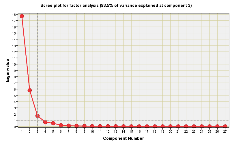
To bake this cake I once more opted for the classic approach of principal components extraction for eigenvalues greater than 1.00 with varimax rotation of the solution1. I struck lucky again because only 3 orthogonal components were needed to explain 93.5% of the total variance within the 27-dimension dataset. Here is a another corker of a scree plot with a well-defined elbow:
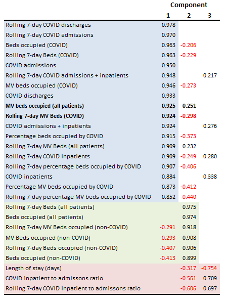
The rotated solution offers intriguing insights for which we may munch our way through a few more biscuits. I’ve highlighted the key sections in fetching pastels starting with pale blue for what is a fine collection of all those variables connected with COVID. I have called this component ‘COVID workload’. The pale green section brings together everything non-COVID, hence I have called this component ‘non-COVID workload‘. The pink rear is largely defined by the COVID inpatient to admissions ratio, the title of which I shall offer up as ‘Case balance’.
All would seem fine, square and dandy but there is a slight wrinkle in the tablecloth! Note the raw variable MV beds occupied (all patients) and its embellished Rolling 7-day MV Beds (all patients) that are sitting in the blue section with all the COVID data. This is telling us that mechanical ventilation bed use has indeed been dominated by COVID cases, and a quick look at the table above reveals the maximum daily usage hit 73.0%: a figure that was reached on 31st Mar 2020 at a time when ventilation was considered the go-to treatment (though clotted lungs and machines don’t really mix).
The dessert trolley
We started with 27 raw variables and ended with 3 orthogonal factors that explain 93.5% of the variance structure. That ain’t bad going either! Herewith a colourful plot of how these factors vary over time:
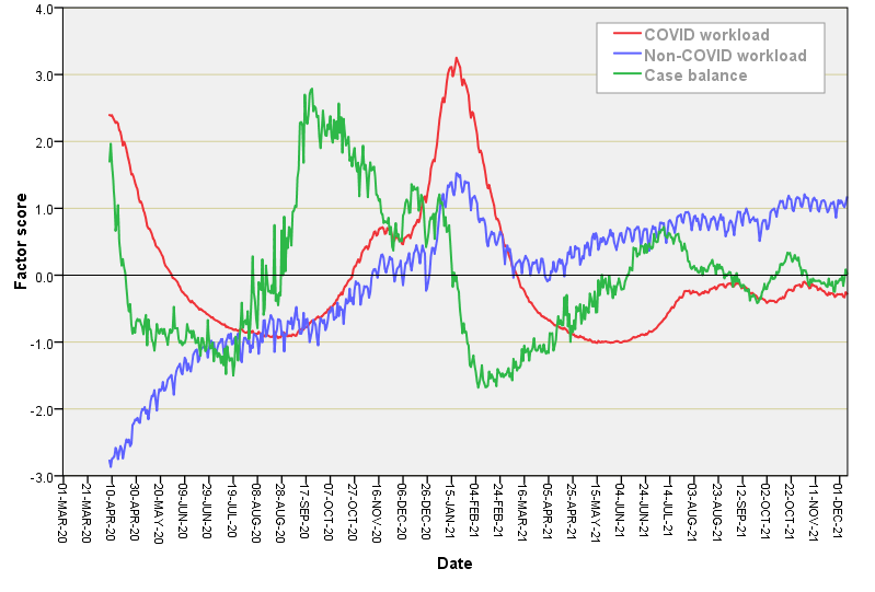
The multi-humped COVID workload factor shouldn’t surprise us since it follows more or less what we’ve seen and heard these last two years. The non-COVID workload reflects the sudden closure and steady re-opening of ward beds (many of which remained empty, but that is another story for another day). Arguably, the most interesting series here is the green series for case balance that leaves us in no doubt that the pandemic started out as nosocomial infection, with a dirty great surge in nosocomial infection during the second wave of Sep - Nov.
Coming up next…
In my next newsletter in this series I shall be bringing all 8 orthogonal factors together as covariates in a staged multivariate logistic regression of in-hospital deaths in an attempt to answer the question just what was COVID meant to be?
With Kaiser normalisation, naturally!