


An Enigma: Transmission Of Epidemic Influenza (part 11)
I attempt to shed light on the riddle that is seasonal influenza using my bag of spanners. Today I check out the percentage of influenza to all cause death and find some oddities

The thing with mortality (usually defined as deaths per 100,000 population) is that estimating that population is darn tricky, and especially so if you try to narrow this down to five-year age bands within a single year. Then there’s the whole can of worms of what exactly constitutes a ‘population’. Nothing is fixed, nothing is definite and nothing is reliable no matter how hard the boffins may try. Even the national census isn’t immune, and I should know coz I was one of the government suits involved in planning the 2001 national census. Sub-population estimation will always be a problem - and a really big problem at that – but it’s one of those skeletons that the authorities and experts alike like to sweep under the carpet in the stable. To stand up and boldly declare that all mortality rates are questionable statistics in the first instance isn’t going to win you any research grants or lead to papers in the carefully curated peer-reviewed press. During WWII we were urged to Keep Calm And Carry On; when it comes to mortality analysis we are required to Keep Quiet And Carry On. Been there, done that, got the carrier bag.
One benefit of retirement from government service is that I can afford the luxury of mouthing-off. I can even stamp on my own work if so desired, as I once stamped angrily on a particularly difficult-to-work short pastry. Unfortunately Mrs Dee caught me in the act and I have been banned from making pastry ever since. Today I am going to stamp on my influenza mortality analyses (not out of anger, I might add) because – and quite frankly – I don’t trust the sub-population estimates baked by the Office For National Statistics. TBH I don’t exactly trust the counts of influenza deaths even without the charade that is WHO Rule 3. It’s easy to fathom why if you sit down with a switched-on and totally honest GP and chew the cud over death certification for a while. Same goes for chewing with hospital registrars and senior house officers: cause of death should give analysts cause for concern if they dare think about it,
Plat Du Jour
Today I am going to handle a pastry that I’ve already part-worked in this series and that is influenza mortality as a percentage of all cause death. The natty thing with this statistic is that it circumvents sub-population estimates and effectively normalises for those many factors that go to impact on the well-being of the nation. Examples might include severe winters, damp and fungus-ridden autumns, shortage of favoured antibiotics, marketing of new drugs, introduction of NICE guidelines, local authority funding shortfalls, closure of services, passing of seat belt laws, economic downturns, ageing population, war, smoking bans, health & safety reforms and so forth and so on.
We’ve already seen a time series for this measure broken down by sex for the period 1901 – 2022, and we’ve also seen a couple of slides broken down by sex and age band for the period 1990 – 2022 that pointed to some peculiar differences between males and females as well as a strange rise in cases in recent years. What I’d like to do next is to explore this statistic using my ARIMA spanner, but before we get stuck into that head-banging stuff I’m going to do something very simple indeed… I am going to crayon scatterplots of the percentage for females against the percentage for males for all nine age bands.
What we should see is the percentage mortality for females generally going hand-in-hand with that for males over the 103-year period that is 1920 – 2022. There will be some scatter, of course, and I’m sure we can all think of a zillion reasons why we might see some sex differences. What we shouldn’t see is anything downright weird, or any systematic deviation from the equity function X = Y.
I confess to being darn curious, so let’s start out with the first plots. In these you’ll see a black line denoting the equity function X = Y, and I’ve labelled a few of the wayward points…
Influenza as a percentage of all cause death

OK, so here is the youngest of the nine groups that includes deaths in newborns over the period 1920 - 2022. We should note the maximum rate of 3% of all cause deaths for for both sexes within this age group, and we should note the tight, and largely symmetrical scatter along the X = Y function. This is all as it should be. There’s a bit of an outlier for 2008 when the influenza death rate for males under 5 years was running at 4.03 times the rate for females. I find this most odd.

Now this is downright peculiar. There’s the infamous year of 1957, with females aged 5 - 14 years suffering a rate of 12.98% of all cause deaths, with males of the same age group down at 6.41% - representing a factor difference of 2.02. How is it possible for a rudimentary virus to selectively kill young females in preference to males of the same age? I don’t see how this is biologically possible! We see this peculiar imbalance again in 2018 as well as 2021. To make matters even more surreal is the fatal swing to young males during 2017.
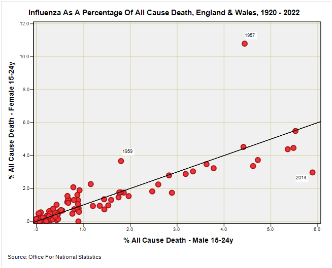
There goes 1957 again, this time with females aged 15 – 24 years dying from influenza at a rate of 2.43 to 1 male. How bizarre is that? There’s a hint of a similar imbalance for 1959, and we see another of those fatal swings to young males during 2014.

Less wacky perhaps and we still see 1957 persisting as an unpleasant year for young females, though 1922 was particularly nasty for both sexes. It is interesting to see the pandemic year of 2020 pop up as an imbalance across the sexes even thought the overall rate is low owing to the alleged disappearance of the flu virus. Yeah, right. I might be cabbage looking but I’m not that green!

Another better behaved plot with 1933 proving to be a horrid year for males and females of serving age, and 2002 sticking out with an utterly crazy imbalance. What we have there is a percentage rate of 8.42% for females and 1.71% for males, this imbalance generating a whopping great factor of 4.9! How is it possible that the influenza death rate for females reaches the giddy heights of five times that for males during this year?

OK, so if you thought an imbalance of five times was bad try this one for size. A nice, well-behaved plot for the most part – yes indeed – but up in the top left corner is a data point for 2017 marking 9.84% for females and 0.18% for males, this generating a factor of 54.7 times. Yes, you read that right – nearly fifty five times the rate dear readers! I cannot even begin to conceive how such as result across the nations of England & Wales is possible unless a Royal decree went out:
Thou shalt count the expired females among them as gracious influenza;
yet the males shall be exalted as pneumoconiosis, for they snorted the very dirt of the land
Yer Limits Innit?
And so we reach the limits of the Substack email system and I must reserve the last three slides for next time. This is not a bad place to pause for breath, though, because things change at this point. At risk of spoiling the ending you are going to see less wayward data points, a tighter clustering around the X = Y line, and a new and rather puzzling feature that I am going to keep as a surprise.
I trust by now that folk are beginning to realise that influenza isn’t what we’ve been sold these many years. Here’s a fresh-baked loaf to munch on (I am permitted to handle dough)…

Kettle On!
With all that seeing, I am going back to Hope-Simpsons and for me the most likely explanation is a sleeping virus reactivated in the following season by ??? As we don't have serials intervals and anything similar to a viral infection with incubation period etc..
Strange indeed. Would you suspect data corruption for some of these outliers? Could influenza somehow be sex-related?