
Counting Deaths (Part 3)
A comparison of official counts all cause deaths by date of registration (England) with counts by date of occurrence

This article was written for crunchers who analyse weekly all cause deaths for England (or England & Wales), being a rather dry and boring exploration of the adequacy of T4253H smoothing in overcoming the administrative hiccoughs with counts by date of registration. In short, I shall explore using of smoothing of date of registration data in an attempt to produce a time series more akin to date of occurrence data. I suggest strong coffee and a packet of Bourbons to munch as I crunch!
What’s It All About, Alfie?
I am going to regurgitate my spiel on T4253H smoothing that was first discussed in this article:
For those not familiar the T4253H smoothing function the process kicks off with a running median of 4, which is centred by a running median of 2. It then re-smooths these values by applying a running median of 5, a running median of 3, and ending with Hanning running weighted averages (span 3). Residuals are computed by subtracting the smoothed series from the original series, and this whole process is then repeated on the computed residuals. Finally, the smoothed residuals are computed by subtracting the smoothed values obtained the first time through the process. A bit of a head banger I admit, but there is a useful summary here with nowt to be found on Wiki!
Getting Stuck In
Without further ado herewith a time series plot for weekly all cause deaths in England by date of registration (DOR) for the pandemic period of 2020/w12 – 2022/w40, together with the T4253H smoothed version:
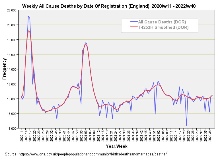
The artificial first wave peaks have been ironed out to more realistic levels and we’ve avoid the artefact induced by holiday periods. This is a good thing since these pulled the rug from under my modelling attempts in the series Vaccines & Death by giving the illusion of vaccine benefit; here is a good place to start for a refresher. Kinks can get us into trouble when it comes to time series analysis!
At this point I can run a related-samples Wilcoxon signed rank test to analyse the positive and negative differences between the two series, the null hypothesis being a zero value for the median of differences. This test revealed 70 negative differences and 64 positive differences, with a p-value of p=0.693; that is, the two series show a similar number of positive and negative excursions indicating lack of bias that may arising within the smoothing procedure.
Regarding difference summary statistics, herewith a modest little table:
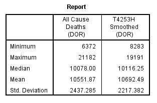
The most notable differences lie with minima and maxima and, as expected, the smoothing function has pulled in the reins, as it were, with a larger minimum and smaller maximum. The median is arguably a more important statistic and we may note a difference of just 38.25 deaths (0.38%), with the mean offering a difference of 140.62 deaths (1.33%). These are minor differences I reckon I could live with, with a paired samples t-test indicating borderline significance for mean differences (p=0.055).
The Next Step
An obvious next step is to compare the T4253H smoothed curve for date of registration counts (DOR) with the reference curve for counts by date of death (DOD). Try this for flavour:
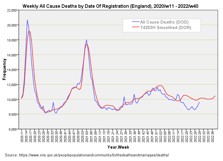
We need to ignore discrepancies for 2022/w1 onward owing to delays in certificate processing that came to light in part 2. It’s a shame the sharp peak of the first wave has been blunted, and we’ve lost those three little spikes in death that are most curious. What would cause a sudden increase in all cause death that appears not to be related to viral infection – a burst of vaccine-related deaths perhaps? If any subscriber would like to do a spot of sleuthing then I can reveal that 2020/w33, 2021/w29 and 2021/w36 are the weeks in question and the regularity may be a clue.
A related-samples Wilcoxon signed rank test revealed 31 negative differences and 64 positive differences, with a p-value of p=0.010; that is, the two series show a dissimilar number of positive and negative excursions that reaches statistical significance. This is a shame because the summary stats look rather tasty:
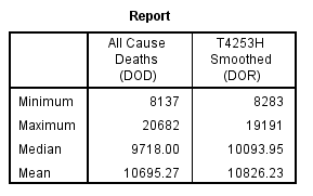
That being said a paired samples t-test yielded a non-significant difference for means (p=0.074), so the technique may be a goer. The bottom line for me is that I think that some form of smoothing of date of registration data might be advisable when it comes to time series modelling if date of occurrence data cannot be obtained (or afforded!).
One final quick and dirty analysis is to run out a correlation matrix to see how the three series compare:
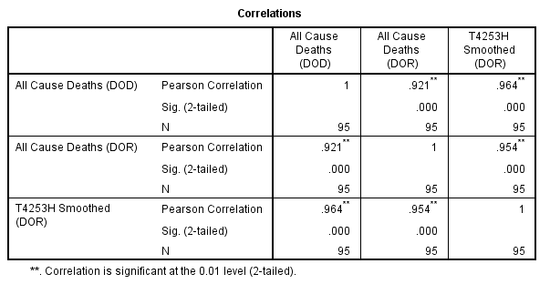
If I had to pick a series to mimic date of death data based on the correlation coefficient alone it would be the T4253H smoothed series (r = 0.964, p<0.001, n=95). With that I’ll put my pen down and go try our new toaster.
Kettle On!
Okay, clever smoothing of the death data seems to help lay the data out in a sensible way. However, this may well lead you down the garden path where you massage this data and that data and then analyze everything and draw some conclusion that seems reasonable. Why is this any different than the ONS misanalysing (is that a word?) the data?
Watching you wrestle with the excess death data indicates finding a real signal in the noisy data is going to be hard. Do you think it will be possible to draw a conclusion about vaccines and excess deaths? Or is the existing data just to noisy/complicated/filled with artifacts?