
Vaccines & Death (part 7)
Further investigation into delayed death following vaccination

In part 6 of this series I investigated use of NHS staff absence records as a predictor of weekly non-COVID excess deaths on the assumption that staff sickness could be a handy proxy for long COVID as well as the stresses and strains of lockdown despite this being a highly unrepresentative sample that would also be contaminated with vaccine harm. You gotta start somewhere!
We observed a noteworthy initial result in that levels of staff absence were far higher for the first wave of COVID back in spring 2020 than they were for the third wave case mega-peak of winter 2020/21, this being indicative of many things but especially of an overly zealous DIY testing regime for folk that were completely healthy. This got the nation nowhere, though it did make some people very rich indeed and I shall analyse this matter in a little more detail in a future article
ARIMA time series modelling revealed the weekly staff absence count to be a statistically significant predictor of excess non-COVID death over the period 2020/w50 - 2022/w30 (p=0.018) and thus a useful independent variable to be considered in future modelling work, though we’ll need to exercise caution in interpreting results. Long COVID will be in there but so will the kitchen sink!
I ended the article with an unpleasant plot twist, this being the revelation of a negative relationship between excess non-COVID death and the time series for combined weekly doses when lagged by 23 weeks precisely. In just one paragraph I went from seemingly providing evidence of vaccine harm to seemingly providing evidence of vaccine benefit. The key word here is seemingly, for it is possible to use the very same data in support of these two opposing outcomes: all depends on the fine detail of the methodology employed.
This brought the ONS method of derivation of excess death into question, this being an estimate based on subtraction of historic 5-year means from observed counts on a week-by-week basis. If disease was a clockwork mechanism, ticking along with digital precision, this would be an eminently suitable and splendidly simple method. Since disease of any kind doesn’t carry a diary or recognise the numbered weeks of the calendar year we may arrive at estimates that are sufficiently meaningless. For example, if the flu season arrives two weeks later than ‘usual’ then excess death will rocket during those two historically naïve weeks, leaving a gaping hole in the preceding two weeks. We thus find ourselves trying to model data that is bouncing up and down on a trampoline and doesn’t want to come in for supper. Imagine your carefully crafted results are a beverage that you are holding in your hand on that trampoline and you’ll get some idea of the mess we can get into!
In this article I am going to explore alternatives to excess death as it is currently derived, and shall start out by taking a closer look at the counts that we use as raw ingredients. I’ve no idea what I’ll find so I suggest we carefully suck any and all results up through a straw. With that said, let’s have a fiddle with T4253H smoothing to iron the crumpled bed sheets of death certificate processing…
Dashing Away With The T4253H Smoothing Iron
The T4253H smoothing function kicks off with a running median of 4, which is centred by a running median of 2. It then re-smoothes these values by applying a running median of 5, a running median of 3, ending with Hanning running weighted averages (span 3). Residuals are computed by subtracting the smoothed series from the original series, and this whole process is then repeated on the computed residuals. Finally, the smoothed residuals are computed by subtracting the smoothed values obtained the first time through the process. A bit of a head banger I admit, but there is a partially useful summary here with nowt to be found on Wiki.
So what does the weekly death tally look like before and after it has been subject to T4253H smoothing? All cause death within England over the period 2020/w50 - 2022/w33 looks like this:
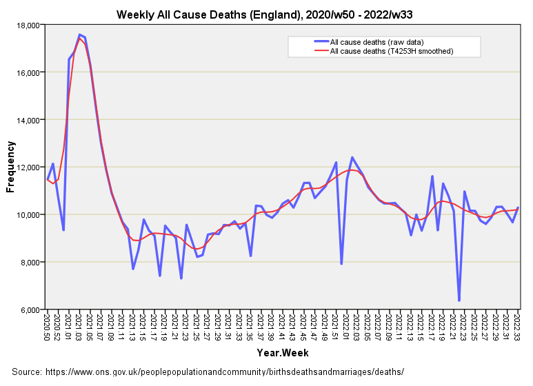
Those rather sharp blue spikes pointing down are nothing to do with less death and everything to do with less folk available to process certificates during holiday periods. Hence weeks 1, 51 and 52 of each year get hammered, as do weeks running through Easter and the bank holidays. T4253H smoothing is a bit like a magic wand that leaves the nuances but deals with spiky stuff. As a result ARIMA will have an easier ride.
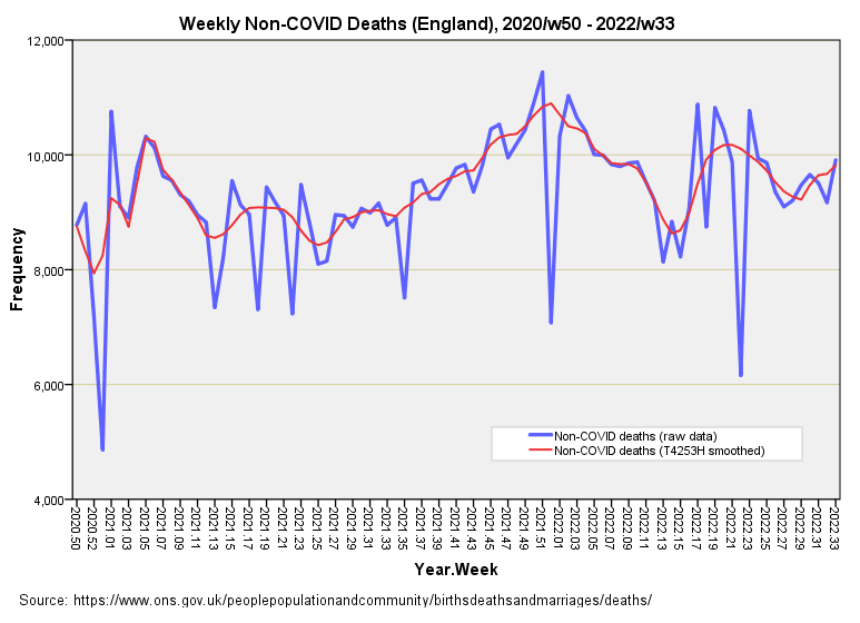
The time series for non-COVID deaths, from which I derived excess deaths based on 10-year means, is even spikier; this is what this now looks like with the magic wand applied:
I Ain’t Falling For That Again!
So what to do about the thorny issue of estimating excess deaths? Even with silky smooth time series data, and even with 10-year instead of 5-year baseline means we are going to run headlong into the headache caused by asynchronous disease outbreaks for COVID and anything else that came along during 2020 - 2022. Another way of looking at this is to ask if historic levels of death are an appropriate baseline with which to judge pandemic era counts, being a period when everything changed and not just the nation’s health. I suspect not, in which case we ought to get 2020 - 2022 to refer to itself!
Whilst self-referral sounds crazy, use of covariate variables to level the playing field has been around ever since the art of statistics got born. A covariate is a variable that has a relationship with the dependent variable of interest that we need to adjust or account for, an example being adjustment for age and sex in a model that attempts to predict outcomes for a clinical procedure.
So what about the distinction between COVID and non-COVID deaths? Well, we’ve discovered that death certification is by no means perfect and relying on non-COVID death to mean non-COVID death and only non-COVID could get us into another tangle. I ain't falling for that again! How about we use the time series for the case detection rate (CDR1) as a covariate in the prediction of all cause death? Does this sound sufficiently tasty?
All Jabbed Up
Back in part 5 I confessed to not being able to secure daily dosing data beyond the third injection/first booster since this was not available via the UK GOV coronavirus dashboard download facility. Neither had NHS England cobbled together a time series for doses 1 to 5 over on its vaccine pages. Prompted by a kind and knowledgeable colleague I decided to plough through the archived COVID-19 daily announced vaccinations XLS files to arrive at precisely what I wanted.
Herewith the complete dosing profile for the nation of England since 2020/w50, followed by a slide for the combined dosing profile:
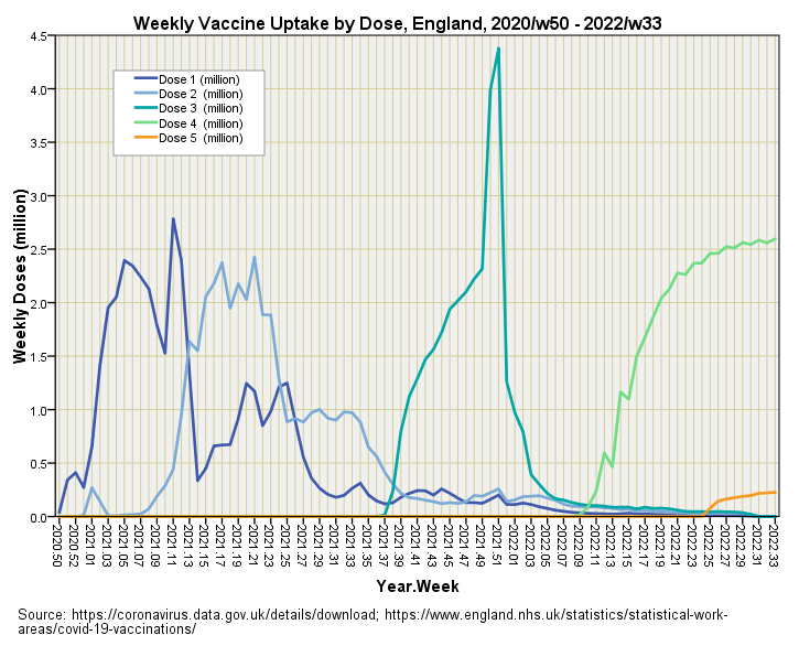
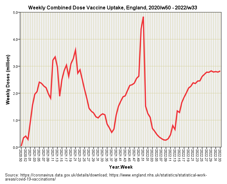
Not only are we all smoothed out but we’re all jabbed up, and I cannot wait to start bolting together a multivariate ARIMA model in the prediction of all cause death, upon which the last and most critical layer shall be the combined weekly series for doses 1 through 5.
Kettle On!
COVID cases per 100 viral tests.
Do you have a series of 'expected deaths' in the UK?
Here in Sweden, 2019 was a huge outlier in terms of expected deaths. Hardly anybody died. The magnitude was greater than anything we ever saw, including covid, by which I mean that the number of people who were expected to die in 2019 but were still around early 2020 is much larger than the number of people who were expected to be alive in 2021 but died in 2020.
Tommy Lennhamn who has been tracking such things here has this article from a year ago about why how you calculate the baseline matters. https://softwaredevelopmentperestroika.wordpress.com/2021/08/09/sweden-all-cause-deaths-a-trendy-topic-expected-observed-excess/
It seems to be more reasonable to break your years in the middle of low season for respiratory infections than in January, the middle of high season for Northern Europe. The deadliness of a respiratory infection that killed half of the people in December and the other half in January should be compared on even ground with an infection that killed everbody in November and December. The idea that the first one is 'half as deadly' is a measuring artifact of binning by calendar year, and not season for diseases that are seasonal.
The thing is, Tommy's latest chart of Swedish excess mortality, https://softwaredevelopmentperestroika.wordpress.com/2022/09/08/sweden-alarming-raise-in-covid-deaths-past-6-weeks/ (which is making fun of the newspapers who think the raise is alarming even though the sheer numbers of sick people remain low) isn't showing us all falling over dead with vaccine caused problems that show up later. And this needs some explaining, if you believe that the deaths are due to the vax, given that this is a well-vaccinated place. Of course, we didn't vaccinate kids, and we quickly stopped using the AZ vaccine, and then the Moderna one, and we aren't recommending it for young adults now.
Something seems amiss. Dose 4 looks to have a higher cumulative count than dose 3. Should be lower, no? Perhaps you plotted dose 4 and 5 as cumulative curves on accident? Or maybe at some date someone decided to just start counting new doses as dose 4, declaring dose 3 to be "over"?
Are you gonna recrunch the ARIMA excess-death method for all 5 doses and compare to the new method?