
Emergency Department Admissions: Analysis of CDS Dataset (part 8)
I analyse an anonymised data dump of 1.9 million admissions records to the emergency departments of an undisclosed NHS Trust for the period June 2017 – September 2021

In part 7 of this series I got side-tracked by something I called peak ambulance, this being a most peculiar and well-defined peak for arrival by ambulance for 2020/w14 (week ending 3 April). As we noted back in part 4 private and public forms of transport were typically how the majority of people got to the emergency departments of this NHS Trust during the study period but this was decidedly not the case during 2020/w14. What I’d like to do today is get back to looking at trends over time, so let’s get stuck straight in with three slides revealing the percentage of discharges, referrals and admissions for 2017/w1 – 2021/w37 (please see part 4 for definitions of disposal route):
Discharged Home/Elsewhere

We are looking at green for go (home) and this is fascinating! If we assume people are behaving as the always do, and accidents and disease are happening as they always do (with the exception of seasonal effects and bad weather), then we are left scratching our heads as to why discharge home suddenly became a favoured route to disposal back in autumn of 2017. A number of factors spring to mind that we might group under the heading of protocol and policy, but there are also the headings of finance, staffing, bed availability, transportation, and the development of primary care and home care networks for starters. Short of grilling the Trust Directors we can only guess as to why patients were suddenly finding themselves going home with increased likelihood.
The same scratching of the head applies to those peculiar surges and falls over the 2018/19 winter period, and again during the 2019/20 winter period; though I suspect what we are looking at here is the impact of seasonal influenza and other bugs that invariably end with guidance only along the lines of, “go home, drink plenty of fluids, rest as much as you can and take paracetamol. See your doctor if symptoms persist.” Assuming this to be the case we may note the absence of the 2020/21 peak for folk will have avoided visits to hospital whenever possible.
Referred To Clinic/GP/Outpatients/Other Service At Discharge
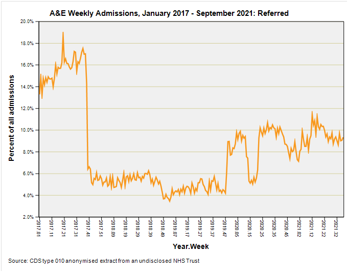
Just to clarify what we’re looking at here, these are folk who’ve visited A&E who were eventually discharged after treatment, with a recommendation/referral for them to go see another healthcare provider. A common destination is the outpatient department of the same hospital, but it could also be physiotherapy, a referral for follow-up with their GP and so on. We’re talking continued management of a disease or condition in primary and secondary care, hence the orange = amber colour.
Admitted to Hospital
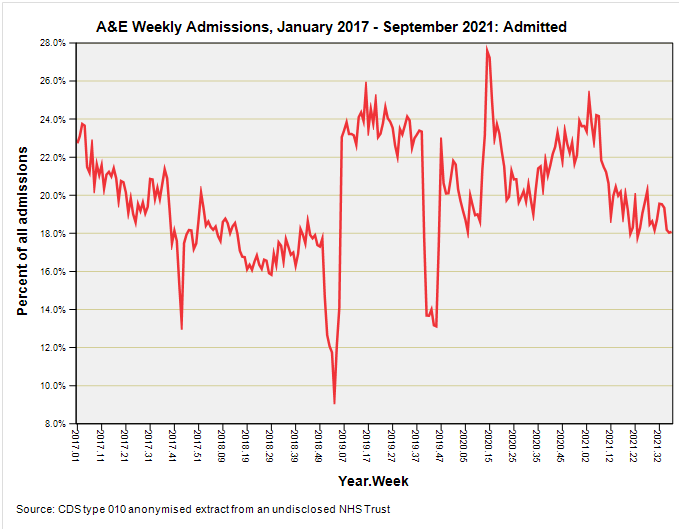
Those sudden dips prior to the pandemic are rather interesting with the first occurring 2017/w44 (w/e 3 November 2017), the second occurring 2019/w2 (w/e 11 January 2019) and the third occurring 2019/w43 (w/e 25 October 2019). I would have put good money on these being Christmas weeks or New Year but I’d have lost that bet! As a consequence I’m grasping at unseasonably good weather by way of explanation, or perhaps folk glued to the telly and spraining the remote control finger. Then again it could easily be outbreaks of something rather mild.
The big pandemic bump is centred on 2020/w14 (w/e 3 April 2020) and I’m wondering how much is this is genuine respiratory illness and how much down to the impact of draconian policies. I’m pretty sure that fear and panic will also have been a driver for some folk. If we ignore the extreme spikes then you can’t really discern any signs of the spread of a novel and deadly virus, with the biggest ‘bump’ occurring back in spring of 2019, with another rising back in early 2021 after vaccination rollout. Is the latter an indication of vaccine harm?
Arrival Mode
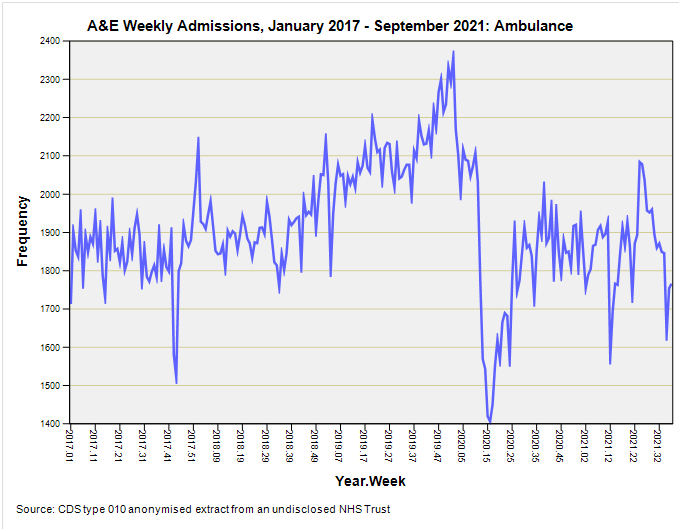
Back in part 7 we took a look at the ratio of ambulance to private transport as a means of arrival but I thought some of you might like to see the raw counts of weekly arrivals by ambulance. This is not what the news portrayed is it?
If we take arrivals by ambulance as a proxy of the health of the nation then that peak between 2019/w37 (w/e 13 September 2019) and 2020/w2 (w/e 10 January 2020) is where the action was. IMHO that was the pandemic proper, as many readers will testify, myself and family included. That’s when a nasty flu-like illness was circulating in the UK and yes, my toes went purple for a while as well as my sense of smell and taste being affected. Whatever that was ripped through my wife’s school in around a couple of weeks with half of the kids going down with fever.
The horse had already bolted when Boris stood up on his rostrum to announce measures aimed at promoting fear, destroying businesses and smashing society. You can now see why all those ambulances were lined-up outside hospitals whilst TV crews had them posing with blue lights ablaze for the nightly news bulletins. It was all show folks, with healthcare professionals learning dance routines inside. Even now only a few medics have courage enough to speak out but here it all is in the ambulance stats.
Kettle On!
" The horse had already bolted when Boris stood up on his rostrum to announce measures aimed at promoting fear, destroying businesses and smashing society. "
I gather he's a globalist, which could account for it.
So, did Boris fake his own illness - that is the question? I note the two nurses who looked after him were Portuguese and Kiwi - were they foreign disinformation agents? The mind boggles!!