Estimating Daily People Tested (part 3)
Estimation of the number of people undergoing virus tests in England prior to de-duplication of data records (rev 1.0)
In my previous post in this series I had a stab at filling the holes created by removing the Monday morning negative book keeping entries in the variable…
uniquePeopleTestedBySpecimenDateRollingSum
…this being the de-duplicated count of people tested on a daily basis across the nation of England that we can download from the UK GOV coronavirus dashboard. I did ask the UK GOV coronavirus dashboard team a while ago to clarify this bizarre variable and its negative Monday entries and they promised to do so after studying my spreadsheet. I’m still waiting for that reply and today marks my 401st day of waiting!
Although I ended up sitting on some crude but promising estimates I decided to double check these against figures within the Test & Trace England weekly reports just ensure I was heading in the right direction. Today’s newsletter will talk subscribers through this process and will end with a curveball. Once again we’ll ask what the fudge is going on with the official statistics?!!
Why Bother?
Why bother with all this tricky fiddling, why not eat fresh baked Battenberg instead and enjoy the early morning sunshine? The answer is because the data authorities are playing a game called de-duplication which removes a vast number of negative test results thus making the pandemic look bigger than it really was, and is.
The Weekly To Daily Shuffle
Over in these pages you can download all sorts of Test & Trace statistics which is a wonderful thing. What is not so wonderful is that I’m trying to nail daily counts of people tested. I could flip to using weekly figures and make life easy but I decided to make life hard and stick to a daily series. The principle reason for doing this is that government officials are in the habit of announcing extreme values that crop up through daily variation.
There are fancy ways to push the resolution of a weekly time series down to a synthetic daily series but I decided to opt for the simplest and quickest method and that is to divide weekly counts by 7 and assume a rectangular distribution. In plain English a weekly count of 700 peopled tested would result in counts of 100 per day from Monday through to Sunday. Simples! This extremely crude approach is nothing to write home about but it will at least give me some idea of whether I’m in the right ball park and that’s all I need for the time being.
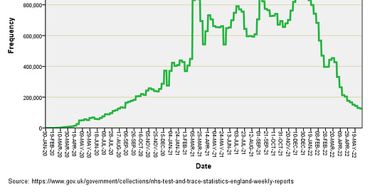
Let us then open that first packet of biscuits and have a look at what the latest England Test & Trace data for the number of (de-duplicated) folk tested under pillar 1 (clinical need and frontline workers) and pillar 2 (wider community) schemes looks like when smeared across 7 days:
You can see the impact of assuming a rectangular weekly distribution for the number of people tested because it results in a castellated curve rather than a noisy mush. We observe a peak of 1,182,364 unique persons per day during the week beginning 30 Dec 2021 and a remarkable tail-off after this high point. It sure seems like the authorities are no longer keen on pursuing hot cases like there’s no tomorrow.
Another anomaly of interest is the scramble for case numbers back in March 2021. A quick squizz at the source data reveals this hike was within the wider community (pillar 2). In fact, this entire green curve is dominated by pillar 2 testing as we may expect following the introduction of home kits and lateral flow devices that folk stuck up their nose like there’s no tomorrow.
Comparison Of Data Sources
So far so good but the idea here is to see how the unique people tested series from UK GOV aligns with unique people tested from England Test & Trace. Lots of small print tells us the figures will be different for all manner of reason but at the end of the day these are supposed to be the same people undergoing the same test regime regardless of the reporting week; that is to say we expect a match at some level even if the fine detail is a little wonky. Except it is a lot wonky:
Here is the daily series derived from the UK GOV unique people series without the negative book keeping entries (blue line) together with a 7-day centred moving average for these daily counts (red line) with the England Test & Trace daily equivalent counts stuck on top (green line). They all start off in perfect agreement then, when repeat weekly testing of individuals kicks in, we see significant divergence between the two data sources with the UK GOV figures distinctly lacking in comparison to the England Test & Trace counts. Whoops! That March 2021 big green peak is also notably absent from the UK GOV data. Oh dear; it would seem we are not able to count people that well!
Which Data To Trust?
Well that is the BIG question right now. My money is on the England Test & Trace data since the UK GOV dashboard team couldn’t fathom my simple query and the dashboard team must obtain their data from the Test & Trace mob.
White Flag Moment
At this point I was ready to surrender and adopt the Test & Trace weekly data series as being the more robust estimate for people tested across England, albeit on a de-duplicated basis; that is to say, one test result logged per person per week regardless of how many tests they actually undertook: such basic data is nowhere to be seen, funny that! As I reached for the blueberry muffin tin it dawned on me I could tinker with some statistical modelling of the Test & Trace data series to see what factors impinged but that story will be told in part 4.
Kettle On!
So for me, the crayon fan, the long and short seems to be the numbers pushed out of our TVs and newspapers weren’t just a bit wrong. They were REALLY wrong!
At the time I instinctively knew it was a crock based in my very unscientific observations of acquaintances grabbing boxes of ‘free’ tests and testing like loons as though they wanted to be included in the positive figures. Some queer badge of honour. Can’t guess at the number of colleagues who’ve tested positive multiple times and been paid to be off work whilst Hubby in the whole 2 and a bit years had 3 day ‘sickness’ with cluster migraine, he got hauled in for sickness verbal warning! The world has gone mad John.