
Exploring Excess Death (part 7)
I put down ONS weekly all cause registered death data for 2010/w1 – 2023/w52 and pick up daily in-hospital death data for 2017/w1 – 2021/w36 for an undisclosed NHS Trust once more

Back in part 1 of this series I kicked-off by looking at daily adult all cause in-hospital deaths held within an anonymised EPR extract I had been given from an undisclosed NHS Trust, the idea being to derive an estimate of ‘internal’ excess death. The results pleased me somewhat and so I ventured out on an exploration of weekly registered deaths for the nations of England & Wales, thence to derive several estimates of excess death using different techniques. Today I want to come full circle and go back to the EPR extract with a view to estimating excess death for acute respiratory conditions over the period 2017/w1 – 2021/w36. This is not my idea, mind, but the genius idea of a keen subscriber!
Folk are bound to ask what I mean by acute respiratory conditions and the answer to this has been given many times in several articles, suffice it to say it means life-threatening stuff like pneumonia, respiratory failure, respiratory arrest and ARDS (acute respiratory distress syndrome). It does not mean long-term chronic diseases such as asthma, emphysema or COPD (chronic obstructive pulmonary disease) unless these have led to acute respiratory states.
As we have seen many times in previous articles that have provided gory details of various predictive logistic regression models, incidence of COVID-19 and incidence of acute respiratory conditions go hand-in-glove, cap-in-hand and chicken-with-egg, so any attempt to derive excess deaths for acute respiratory conditions prior to death is likely to be most illuminating, constructive and tasty. Let us then begin at the beginning…
The Beginning
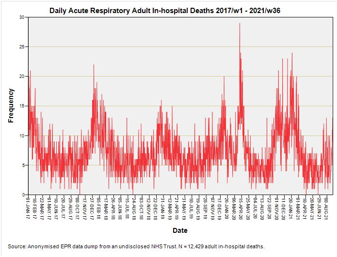
Here we have a time series plot of 12,429 adult in-hospital deaths with mention of acute respiratory conditions for the period 2017/w1 – 2021/w36. Please note that phrase ‘with mention of’; we’re not necessarily looking at cause of death for these cases could have recovered from their acute respiratory phase only to die of sepsis, liver failure, kidney failure, stroke or cardiac arrest.
How sharp is that peak? Blooming sharp if you ask me, for we observe no less than 29 such deaths on one day (Saturday 4 April 2020). That being said we also observe 22 deaths on Thursday 4 January 2018 and 21 deaths on Thursday 12 January 2017, so that needle is only 7 deaths beyond the pale.
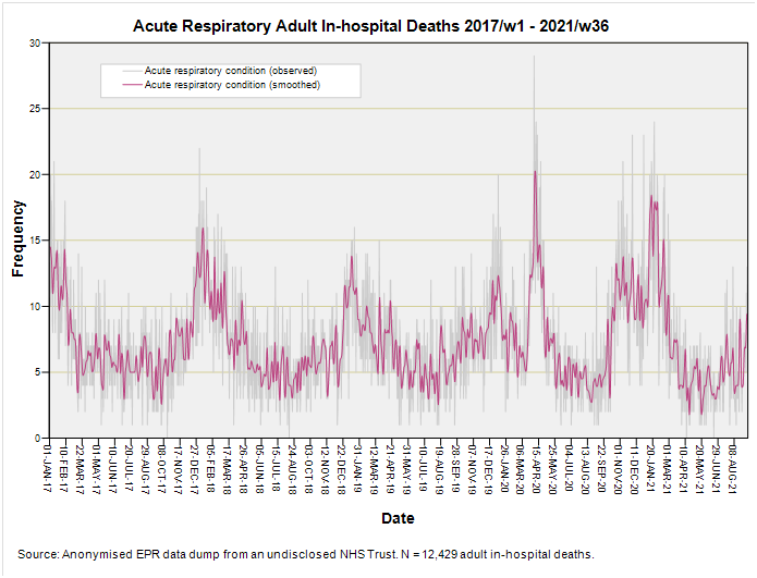
But there are seasonal effects also and my job now is to derive the seasonal mean for acute respiratory conditions using the period 2017 – 2019 to provide the baseline I’m calling the seasonal mean. This recipe starts by running a T4253H filter over the raw daily counts to smooth the jitter a little:
I then derive daily means for the smoothed series for the period 1 January 2017 – 31 December 2019, which are then stitched together ad infinitum to produce the seasonal mean thus:
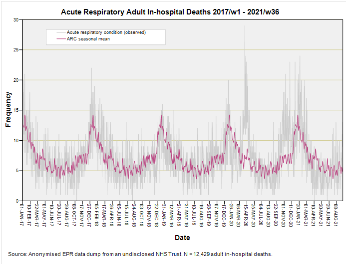
At this stage in the recipe we have a very tasty seasonal mean baseline for acute respiratory conditions that is, in time series lingo, what we call stationary; that is it chugs along horizontally in cyclical fashion without veering upward or downward. This is all fine and dandy unless the daily tally for acute respiratory conditions is exhibiting some sort of trend. To check this (and avoid getting our wrists slapped) we have to run an autoregressive procedure rather than stick one of those linear regressions through the data cloud owing to a thing called autocorrelation (a.k.a. serial correlation). Here’s one I baked earlier:
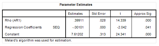
See that there entry called Rho (AR1)? That is telling us that the time series exhibits a decent degree of serial correlation. This sounds proper job head-bangin’ until you realise that serial correlation simply means tomorrow’s death tally is going to reflect today’s death tally. If we account for this self-correlation (self=auto) then we see that the daily sequence from 1 January 2017 – 31 December 2019 is likely in a very slight decline of -0.00101 deaths per day (p=0.041). That’s not a lot and amounts to a bias of around 1.84 deaths over the period 2017 – 2021. These are but crumbs at our table and I’m not going to bother with a correction!
Excess Deaths: Acute Respiratory Conditions
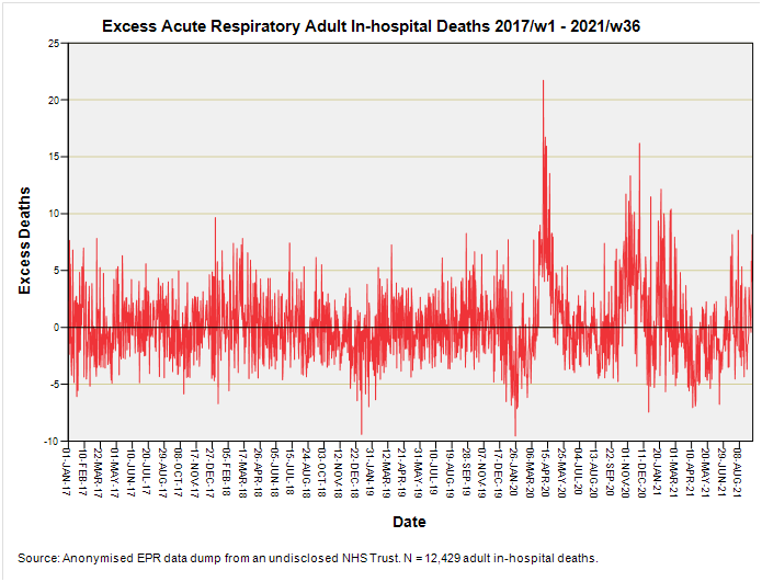
Well there it is – my estimate of excess acute respiratory death (whether or not causal). A curious feature emerges and that is the dip below the zero axis just prior to the onset of the pandemic. This is not unique for we see similar in the 2018/19 post-Christmas winter season, though the 2019/20 post-Christmas dip looks a little more pronounced. Aside from the first wave of 2020 what is also evident is the winter 2020/21 peak prior to vaccination rollout along with that second peak within the first few weeks of jabbing folk. I guess we better look at the cumulative excess:
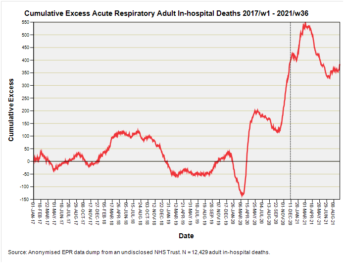
So here’s something I didn’t bank on – a sudden and sharp decline in cumulative excess deaths with mention of acute respiratory conditions just prior to the start of the pandemic. This leads straight in to the brick wall of sudden and certain death during the period I’ve labelled catastrophic health collapse. This strikes me as mighty odd - why would in-patients recovering from acute respiratory conditions one week to be plunged into a fatal epoch the next? Was something else going on that we should know about?
The second oddity is the relative mildness of the first wave compared to the second and third waves, with the third oddity being that peak that appears around 3 months after commencement of vaccination (8 December 2020 is marked with a grey dashed line). Wasn’t the vaccine supposed to reduce the risk of hospitalisation with acute respiratory symptoms? It sure looks to me like it did little, if anything, to alleviate matters.
And why does the time series for cumulative excess death end on a high of 350 – 400 additional deaths instead of declining back down to zero excess or thereabouts? What is keeping those deaths up there? Yet again we find the evidence not supporting the narrative, so I guess it’s time to munch on a biscuit or two and have a think.
Kettle On!
Is the somewhat non-independent nature of the samples as indicated by AR1 due in part or in whole to the T4253H filter? (The effect that today’s sample reflects yesterday’s sample, to some degree.) A question that may elucidate this is whether the the AR1 value is sensitive to the use of different bandwidth settings when filtering the daily data (or, how sensitive, to avoid a yes/no formulation). As you mentioned, maybe not something that leads to the need for a correction, but, curious minds like nooks and crannies, especially when filled with glorious butter.
Pulling back from nooks and crannies, were there any definitional changes or procedural changes, that might affect how events were classified and counted, in Dec/19 timeframe preceding the plunge to the Mar/20 nadir?