Exploring Excess Death (part 1)
I investigate a sample of 57,557 adult in-hospital deaths for the period 2017/w1 – 2021/w36 for an undisclosed NHS Trust with a view to estimating ‘internal’ excess death
Estimating excess death is tricky and an analyst acutely aware of this more than any other is Joel Smalley of Dead Man Talking. I recommend subscribers seek out his many excellent articles explaining how and why the authorities such as the Office for National Statistics (ONS) have got their underwear in a twist when it comes to producing estimates for the nation.
The super keen may wish to rummage through my own work in this area that kicked off in January 2022 with this article. Since then I’ve penned quite a few related articles including this series, this series, this series, this series, this series, this series, this series, and this series. You could say that I am a serial thriller. Perhaps not; it’s too early in the day for that!
An angle I thought I’d try this time round is to estimate excess death for the sample of 57,557 adult in-hospital deaths that I’m sitting on that cover the period 2017/w1 through to 2021/w36. I admit that adult in-hospital deaths within a single NHS Trust somewhere in England is not necessarily going to be representative of the nation as a whole but curiosity got the better of me, and I fancied the challenge of devising a method that was a cut above what the ONS achieve with their common or garden subtract-the-prior-five-year-mean approach.
Let us begin…
From Cases To Days
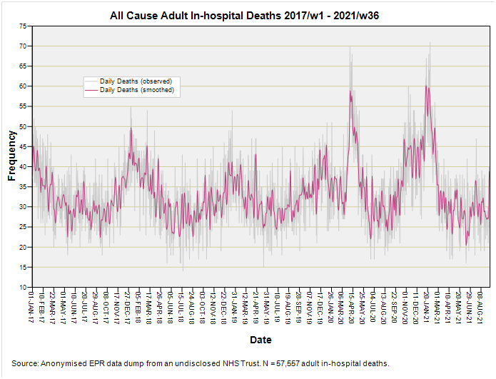
We’ve got to turn those 57,5557 anonymised electronic patient records into a time series of daily counts based on the date of death. This is water off a duck’s back for my stats package which went on to produce this hairy beauty:
I think we can guess when the pandemic arrived in this Trust, and when it reared its ugly head again just prior to (and especially after) vaccine rollout. There’s a bit of tasty analysis I can undertake on this alone but that will have to wait because I want to try and establish a sensible baseline.
Establishing A Sensible Baseline
You can’t have excess death without first establishing a baseline of some sort. This much is clear, but what is decidedly not clear is how best to go about this. The ONS favour subtracting prior 5-year means from observed counts on a matched week-by-week basis. This is splendidly intuitive and easy to do but what if your pathogen arrives two weeks early or three weeks late? What if the last five years were not ‘normal’?
What analysts are trying to do with baselines is capture how things have been, and we can use five or even ten year historic spans in order to achieve this. We can use weekly or monthly means and, if we fancy, we can apply mathematical functions like polynomials to scoop up underlying trends. All these methods come with advantages and disadvantages, but what do we do when we’ve got daily data going back just three years like this hairy lot?
We could aggregate it to a weekly time series like the ONS and loose resolution by swapping just over n=1,000 daily records for a mere n=21 weeks, or… we could keep the raw and rather wild hairy stuff and tame it with a classic T4253H smoothing filter to dampen some of the daily jitter. Here’s what the T4253H smoothed daily series looks like in comparison:
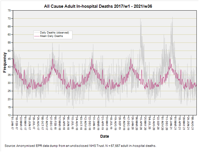
As you can see the utterly fabulous T4253H filter has ironed out some of the spikiness but has still left sufficient detail. What I can do now is to average those smoothed values on a matched day-by-day basis for the period 1 January 2017 through to 31 December 2019 to yield a single year-long ‘template’ that can be stitched in sequence ad infinitum much like a patchwork quilt. This provides a stable (a.k.a. stationary) baseline I’m calling mean daily deaths. Here’s what this looks like plotted in purple against the greyed-out raw data:
I don’t know about you folk out there but I’m finding this rather pleasing for it has turned a lean scrap of daily data into a decent feast! We can now either do the ONS thing and subtract the mean daily death series from observed counts to yield an excess or we could reach for a shiny spanner and do something altogether more subtle.
ARIMA: A Shiny Spanner
What we’ve got in the last slide are two time series, one representing what actually happened and the other representing the underlying seasonal pattern as estimated using the years 2017 – 2019. This is when a little bulb went BING! in my head as I realised the underlying seasonal pattern could be submitted as an independent variable in ARIMA modelling of the observed data to yield a predicted set of counts that utilise the time-dependent variation from both series. If this kind of talk hurts anyone’s brain think of the mean daily death series as the scaffolding we’re going to use in order to build the building.
Geeks amongst us may relish the following ARIMA(1,0,1) outputs:
This is not the best-fitting model in the world but it’s doing a reasonable job of tracking the observed daily counts which, come to think of it, is a pretty tall order! We should note the pandemic proper sticking out well above the upper 95% confidence limit (UCL) for model predictions, and we should be thankful that the confidence envelope hasn’t exploded exponentially; this fortunate fact pointing to a stable system.
With those ARIMA-modelled predictions in the pot what we need to do now is derive the excess by subtracting them from the raw daily count in order to furnish the pudding.
The Pudding
Have a taste of this:
I’m loving just how stable this series is (no long term positive or negative bias), which suggests I’ve nailed the underlying dynamics with my cookery. The pandemic stands proud and comes in three lumps, the final lump of which lands in the controversial post-vaccine period. We might ask why there is a lump of excess death in the post-vaccine period if the experimental gene therapy is indeed ‘safe and effective’ and supposed to alleviate the ravages of COVID.
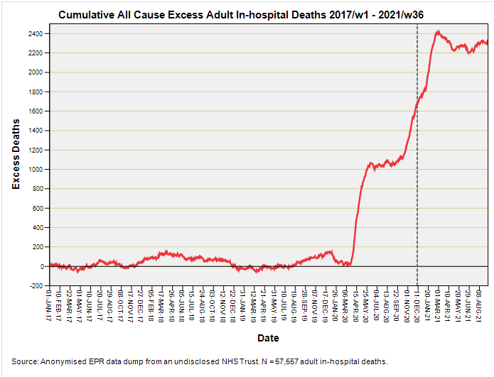
What I can do with this time series is convert it to cumulative excess, and this is where it gets really funky, fruity and full of flava. Try this for size:
We’ve a rather lovely snaky bit that sneaks along the zero axis right up until all hell broke loose in late March 2020. This is good news because it means my method has ironed out seasonal peaks and general jibble-wobble for 2017 through to 2019.
That wall of death taunts us with a conundrum in that it sure looks like a sudden burst from a novel and deadly pathogen that mysteriously hit everybody all in the same instant, but this strange nastiness didn’t last. Things simmer down over the summer of 2020 to a stable excess fixed at around +1,000 deaths as though the virus no longer existed (or at least wasn’t any different to historic pathogens).
The virus starts to get evil again come autumn 2020, with a mounting excess right through to spring 2021. I’ve dropped a grey dashed line down to mark the start of the vaccine rollout on 8 December 2020 that had absolutely no impact for a couple of months.
Is that strange or is it me being too demanding?
Neither did the initial rollout significantly lessen the rate of accumulating excess, as that climbing red line clearly shows: whatever was killing folk from autumn 2020 onward continued unabated.
We finally arrive at a plateau during spring/summer of 2021 just like we arrived at a plateau during spring/summer 2020. Interesting. And this was supposed to be down to vaccine efficacy following the second dose only was it? H’mmm…
Unfortunately that’s where my data dump stops, so we’ll never know if cumulative excess started to decline - as we may expect with the passing of a genuine pathogen - or whether it stayed at alarming levels (or even grew) as the “unequivocally safe” therapy trundled along.
With my appetite now whetted I am inclined to use this baking recipe on the ONS weekly data stretching back to 2010 and see what this brings. Until then…
Kettle On!
Pssst! Before you go I need to don my bonnet and do a spot of tin rattling…
Being self-employed these days means the time I can dedicate to data preparation, analysis and article writing is directly proportional to the income I derive from subscriptions. My substack channel has to pay its way, and remains viable only if there are sufficient subscribers. My grateful thanks to those who have supported this project thus far.


JD, I wonder if you have seen the February 2024 ONS rethink on excess deaths:
https://www.ons.gov.uk/peoplepopulationandcommunity/healthandsocialcare/causesofdeath/articles/estimatingexcessdeathsintheukmethodologychanges/latest
How they love to impress us, the unwashed!
Peter Norman
That's a really impressive analysis - now excited to see what the ARIMA approach can bring to the ONS data.
Joel Smalley has often cautioned on the use of the ONS data because it uses date of registration rather than date of death. Will you be able to use the data of death data series?
As an aside, I just wish I had known about the T4235H smoothing filter years ago - lots of smoothing with no phase shift.