Exploring Vaccine Harm (part 1)
A possible method for the assessment of relative vaccine harm in younger people
This week I have been updating my statistical database with counts of weekly all cause death in England & Wales by quinary age band and sex, source files of which may be found here. Up until 2020 the Office for National Statistics has diligently published weekly counts of registered deaths in seven rather broad bands of: under 1y, 1 – 14y, 15 – 44y, 45 – 64y, 65 – 74y, 75 – 84y , 85+y, with the band of 15 – 44y being singularly useless for analytical purposes. From 2020 onward these counts were expanded to cover under 1y, then quinary banding from 1 – 4y up to 85 – 89y, with 90+y offering the final count.
It was during updating of these quinary counts that I hit upon the idea of running out a scatterplot of deaths in persons aged 15 – 19 years against deaths in persons aged 80 years and above. Under normal circumstances we may expect a great deal of scatter with the elderly deaths storming ahead of younger deaths in the winter seasonal peak. This would appear as a clustering of points in the bottom right hand corner of an X-Y plot of younger against older deaths. Thus, a clustering of points in the top left-hand corner would indicate a surplus of younger deaths compared to older, this deserving further consideration.
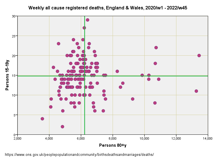
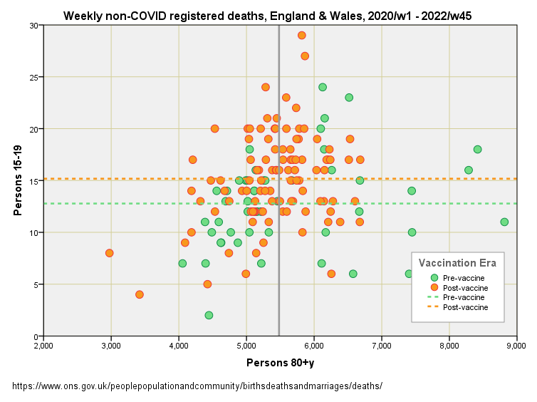
Herewith a scatterplot of weekly all cause registered deaths in England & Wales for the period 2020/w1 – 2022/w45 showing persons 15 – 19y against persons 80+y. Green lines represent overall means:
There’s our bottom right-hand quadrant with older deaths storming ahead of younger deaths, and there’s our top left hand quadrant of unusually high numbers of younger deaths compared to older. There is no evidence of an overall relationship, with r = 0.083 (p=0.312, n=150), but that’s not what we are here to consider. What we are here to consider is what is causing that top left-hand quadrant to populate with blobs.
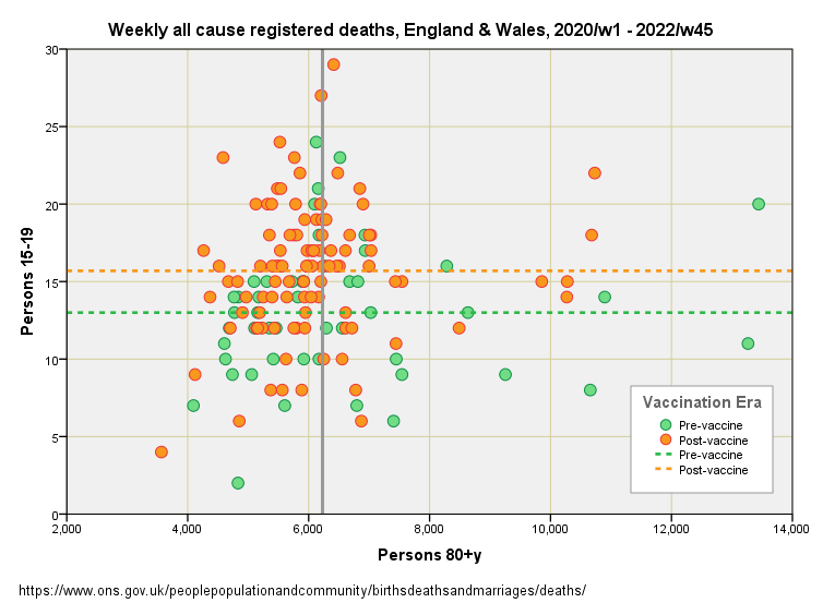
I decided to produce the plot again, but colour code it using an indicator variable to mark vaccine rollout. We now see a preponderance of orange blobs up in the left-hand quadrant indicating a greater number of younger deaths than expected in relation to the weekly pattern for older deaths. The two dashed lines indicate the overall means for the two scatters, and it should be obvious that post-vaccine cluster with its higher overall mean for young folk isn’t a good thing:
Obviously, the vaccine rollout indicator is not a pure variable in that much else was changing at the same time. Given that we are talking about elevated young deaths it would be ludicrous to place the blame on delays to diagnostics and treatment for an otherwise healthy subpopulation, but we may have to consider elevated levels of suicide and toxic behaviours (drugs, alcohol and risk taking). Either government policy led to the elevated deaths we observe or vaccine harm, and quite possibly both.
Generalised Linear Modelling
Gnarled and warty analysts will point to the difference in means between the orange and green dashed lines, say something about heaps of variance, and ask if the differences are really statistically significant given all the noise. A valid point indeed!
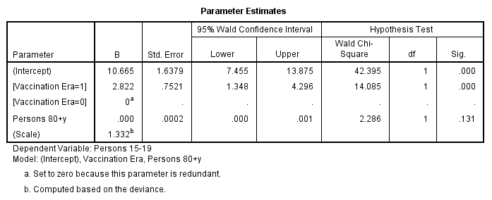
We can check this using generalised linear modelling (GLM) and use an appropriate model error structure (Poisson error with identity link) with 15 – 19y deaths as the dependent variable and 80+y deaths as the independent variable, with the vaccine rollout indicator entered as a predictor (factor). I appreciate this sounds like gobble-de-gook, but it is necessary for analytical rigour!
When the handle is cranked we get this brain-mangling output:
There are two key features to note. Firstly, we observe that weekly all cause death for persons 80+y is not a statistically significant predictor or weekly all cause death for persons 15 – 19y (p=0.131). This should not come as a surprise since all cause includes COVID, and the response of these two groups to the virus could not be more different! Secondly, we discover that the vaccine rollout indicator is a highly statistically significant predictor (p<0.001), indicating an extra 2.82 young deaths in the post-rollout era compare to the prior period. Given the overall mean weekly death rate for the 15 – 19y group prior to rollout was 12.91 deaths per week, this rising to 15.74 after rollout, then we are looking at a most substantial hike indeed (+21.9%).
Non-COVID Deaths
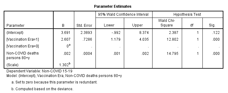
What we can do at this point is use the GLM model structure to explore non-COVID deaths for both age groups. A quick flick of the wrist and we get this:
We now see weekly non-COVID deaths for persons 80+y becoming a highly statistically significant predictor of weekly non-COVID deaths for persons 15 – 19y (p<0.001). This is fascinating because I would have put good money on a weak relationship at best! If we think about this we come to the realisation that common factors such as seasonality and service provision serve to bind the relationship between young and old. This is a darn good thing because it serves to strengthen the value of the model.
In terms of non-COVID death we find the vaccine rollout indicator to be highly statistically significant as before (p<0.001) but with a slightly lowered estimate of an additional 2.61 non-COVID deaths per week in the 15 – 19y group. Here’s the corresponding scatterplot:
Next Up…
With a simple but effective methodology bubbling on the stove and yielding interesting results I shall be using GLM to check quinary sub-populations under 60 years of age to see what we may see. Until then…
Kettle On!


Rolling this out on the young who have never been at risk is nothing less than callous. I have two teenagers who were willing to get this junk until I told them no way, not only was there no long term data available the trials run until 2023, so you are taking part in an uncontrolled, monitored and unpaid trial with absolutely no comeback if, when anything goes wrong. They didn’t even have the decency to inform people of the correct potential masses of side effects that could happen.
We’ve seen a complete derelict of duty from not only the government, all medical governing bodies who have done nothing to protect the public from the medical tyranny and lies that has gone on.
Vaccine hesitancy is at a all time high, millions did not have a problem before will never touch another shot of anything and I for one do not blame them, the MRHA has ok’d the fast track of gene therapy to be constantly rolled out. What we’ve witnessed is the fox( pharma) let loose in the chicken run with parliaments full approval, we’ve already started to be inundated with wonderful new drugs and treatments which I personally wouldn’t touch without digging deep into all research and data available.
My youngest went and did some research digging on the covid jabs while I was at work, they then told me they would not be getting any of them.
Both my children told me I was correct to not let them have it as the news filtered out that it didn’t stop transmission as they promoted or infection. They were willing to go with the flow because they were told it was the right thing to do, rather than what was the right thing for them. This last two years has been a valuable lesson in ignoring the manipulation techniques and standing your ground on what’s right for you.
- If you found clustering in super young children, that would likely be accidental poisoning getting in cupboards at home.
- I wonder if you need to exclude some outliers in these calculations.