Hunting For Vaccine Benefit (part 2)
Using UK GOV Dashboard Data And Keeping It Plain And Simple
In part 1 of this series I unearthed evidence of both vaccine benefit and vaccine harm in terms of decreased or increased numbers of COVID cases following dosing. Raw daily counts of new first episodes and new reinfections were studied using a time series technique called cross-correlation analysis, with results for the booster dose reaching statistical significance owing to the clarity of the signal. The dynamic relationship between dosing and case count across time is such that authorities may chose to focus on evidence of vaccine benefit or vaccine harm; thus, we may take the nature of results published so far as an indicator of professional integrity (lack thereof).
Sensible types will appreciate that case counts will rise and fall with the level of viral testing undertaken across the nation. Statistically-speaking test activity is a potential confounding factor in the analyses of raw counts made so far and so these were repeated using the rate variable of COVID cases per 100 viral tests. This variable may be thought of as a case detection rate but I also like to think of it as a rough proxy for case density (a.k.a. disease prevalence).
Results For COVID Case Detection Rate
Dose 1
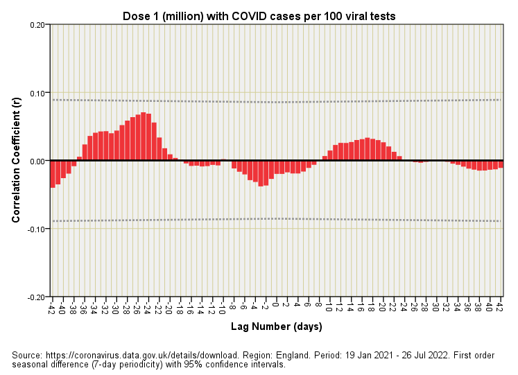
Again we find the CCF plot for the initial dose failing to produce time-lagged correlations that reach statistical significance. If we rummage once again in the garbage can associated with chance effects we find a palisade of negative correlations denoting potential vaccine benefit that straddle lag zero. This poses a causal dilemma in that benefit accrued both before and after inoculation, which is absurd. Either this is random garbage (that may still find its way into authoritarian reports) or claims of benefits following the first dose were illusory, this illusion being brought about by the clashing periodicity of viral tests, positive cases and doses administered. Those who enjoy cogitation may think about constructive and destructive interference of periodic variables. Those who do not enjoy cogitation this early in the morning may think about the phrase ‘a fluke result!’
So then, does that small rise in positive correlation around the 2 week mark indicate genuine vaccine harm or are we looking at random garbage, or is that slippery snake of wave interference sliding into scupper things? If we follow the science, trust the science or whatever-the-science we should be concerned right now that population-level analysis may be generating mirages. Equally, however, if we don’t take care with sampling frames for individuals subject to survey that slippery snake is going to bite us in the rear end. The glossy results will look convincing, but so are illusions.
Dose 2
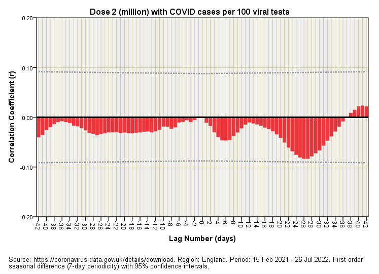
The second dose decided to do something different to the first but then again the world didn’t stay still. Nothing reaches statistical significance and the slippery snake suggests vaccine benefit at a lag of 1 week, then again at 3 – 4 weeks. If we are to accept this result - as plucked out of the garbage can - then we are obliged to explain the vaccine benefit that accrued before vaccination!
Is that pre-causal benefit mere random nonsense? Is it the shadow of benefits accrued from the first dose, or is it our slippery interference friend? I can’t tell, and neither can the authorities who dice their results into black and white.
Dose 3
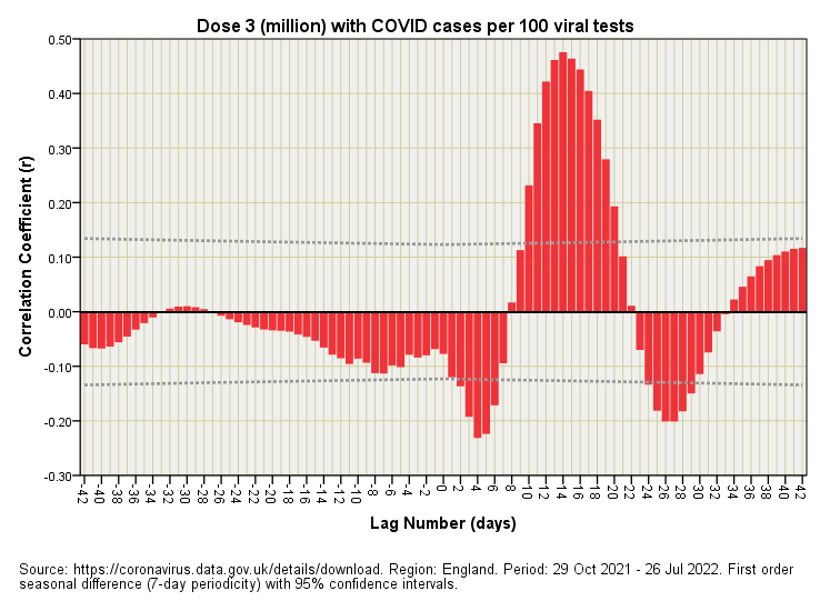
Here’s the booster doing its positive-going, positive lag correlation mountain again, and yelling out “vaccine harm!” once more. A well-defined and statistically significant result such as this is hard to ignore and is unlikely to have been caused by wave interference amongst periodic variables. What we have here is fairly decent evidence of a rise in COVID cases around 2 weeks after receipt of the booster. We also have two blips of vaccine benefit at the 4-day and 4-week mark. A benefit after just 4 days is dubious to say the least, in which case how certain can we be of a similar benefit that appears at 4 weeks?
The answer is that we cannot be certain. What strikes me is how this slide is reminiscent of what happens when we drop a stone into a pond. We have an impulse and a response that is a damped oscillation; a ripple effect. Just what is going on in the nation as a whole to create this?
Coffee & Cogitation
This is worth a few cups of coffee and further cogitation because if the viral tests are not testing for anything of substance then the behaviour of folk alone is the very sort of thing to yield such a curious result; that is, they may be changing their self-test behaviour in response to being vaccinated, then worrying about their health some 2 weeks later. That sort of tricky sticky thing that will merge with anything of substance.
Now that sort of tricky sticky thing doesn’t rule out the very real respiratory cases treated by some ICU staff, but what we have to be careful of here is leaping from the level of the clinical case study to the epidemiological dynamic of the entire nation and extrapolating what shouldn’t be extrapolated. These slides arise from daily counts that are not necessarily counts of sick people or even people with any trace of SARS-COV-2 though they will, of course, include such.
Right now my thinking is of a population-level case dynamic induced largely through behavioural changes and wave interference of periodic variables rather than anything of substance. In plain English, aside from a small number of critical cases we are generating our own pandemic. But we shall have to see what the next analysis brings. Until then…
Kettle On!


Very interesting analysis, thank you.
Given the issues arising from measuring covid with positive test results, is it time to do the same analysis against deaths with covid and deaths without covid, to see if there is a similar pattern with the 3rd dose?
From memory you couldn’t find vaccine benefit when you last looked at this?? [Head scratch]
But at that time we were on dose 2 I think!
Typo in dose 3 section? “4weeks” s/b “2 weeks”?