
Hunting For Vaccine Benefit (part 7)
Using UK GOV Coronavirus Dashboard & NHS England Hospital Activity Data And Keeping It Plain And Simple

And so we approach the final frontier: death; more precisely certified COVID death across England for the period 19 Mar 2020 – 3 Aug 2022. It may be worth peeking at part 1 of this series to understand what I am doing and why; meanwhile, herewith a time series plot of the variable of interest:
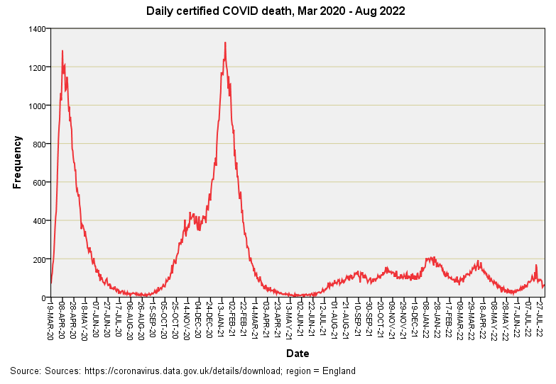
We should all be familiar with this pattern by now but I will just point out that the first wave peak matched the third wave peak for ferocity despite UK GOV charts showing a different story for cases. The ‘triple humper’ of 2022 is fascinating and I shall come back to this later.
So, let’s get the frying pan on and get stuck in with those cross-correlation plots for 60-day windows by dosing phase because I have no idea what I’m going to find…
CCF Results
Dose 1
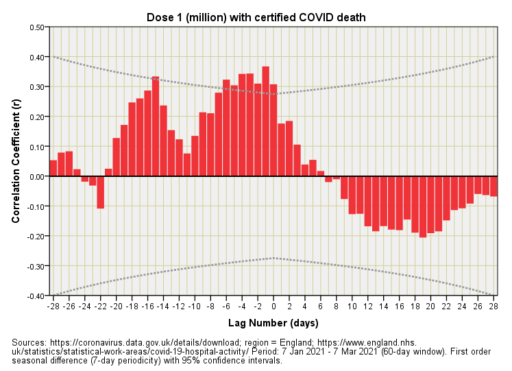
Now this is fascinating. We have some statistically significant positive correlations but they’re appearing at negative lags of between -1 and -6 days. Without knowing this we’d put this down to vaccine harm, but retrospective harm is physically impossible. Thus, I can only conclude that England witnessed a spate of certified COVID deaths just prior to vaccine roll-out. There’s no real sign of benefit but I shall be expanding the study since 60-day windows might isolate dosing effects but these are rather restrictive and reduce statistical power somewhat. Even then there will be confounding issues as we move from the peak winter season into spring: death rates reducing as doses settle is a recipe for an over-baked illusion!
Dose 2
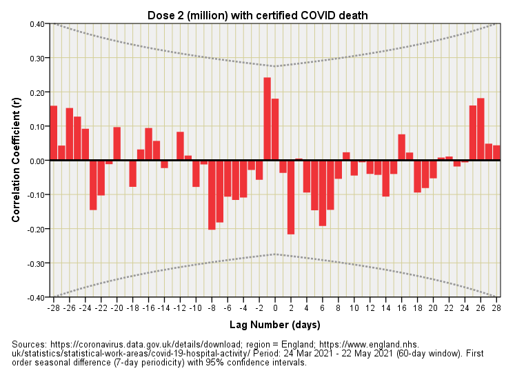
This is pretty much what I had expected, with no result of significance and no discernible pattern.
Dose 3
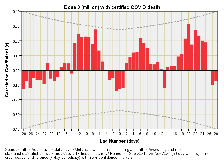
No significant results here either. If we rummage in the garbage can we might claim vaccine harm using those positive correlations at positive lags but then again we’d have to claim retrospective harm for all those positive correlations at negative lags. I suspect this might be a three pipe problem!
The Second Pipe
Try this for size…
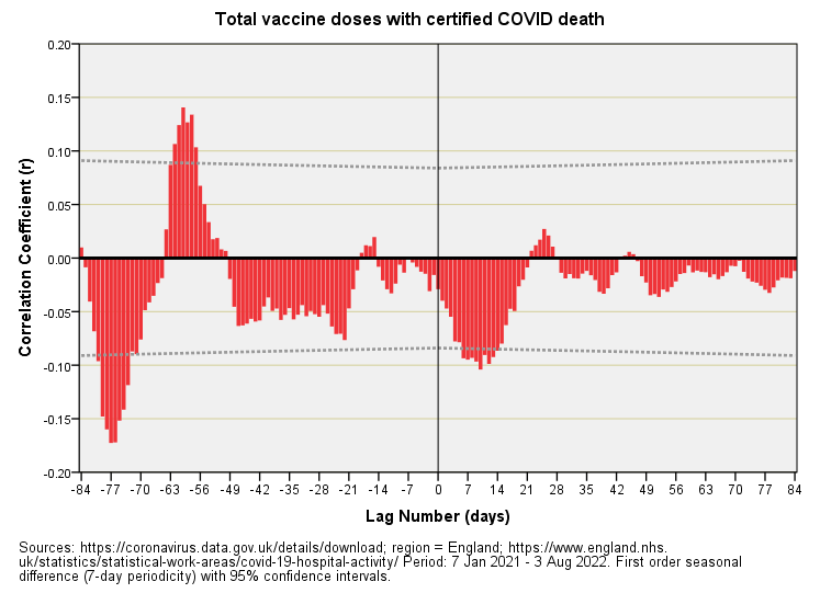
Now that’s what I call a CCF plot! I’ve combined daily counts of dose 1, dose 2 and dose 3 to give a series for total doses administered and this has enabled me to open the study window out to 7 Jan 2021 - 3 Aug 2022. Everything is in here including the kitchen sink, so anything and everything that would have affected certified COVID death counts - including changes to the certification process - will be brewing away down in those bars.
Taking everything at face value (and there’s a lot to take at face value) then we appear to have evidence of vaccine benefit that peaks at lag of 7 - 14 days before disappearing. If that is genuine benefit then it’s pretty short-lived. This feature is not alone, however, and we’ve got some retro-splaining to do. There’s a bunch of bars suggesting vaccine harm 8 - 9 weeks prior (certified deaths rising before vaccination doses rise) and there’s a bunch of bars suggesting vaccine benefit 11 weeks prior (certified deaths falling before vaccination doses rise). There’s no way these effects can be causal and so this must place doubt on the validity of the one result deemed to be causal. All bets are off, I’m afraid.
So what we likely have here are lots of things happening in the world (seasonal variation, mutation, changes in definitions, changes in protocols, changes in treatment, changes in service provision etc etc etc) that are driving changes in mortality several weeks down the line that pop up as illusory vaccine benefit (and thus illusory harm) at the level of the general population. Whoops-a-daisy! What an absolute arse of an analytical problem.
Get Baking!
What I need to do next, therefore, is bake some indices that attempt to level the playing field in as broader manner as possible. If successful (and sensible) these will address the perennial claims of those highly vaccinated souls who, upon suffering multiple bouts of COVID (and other adverse reactions), will offer the salve: “it would have been worse without the vaccine.” Another approach is to reach for the big spanner (intervention analysis using ARIMA).
Kettle On!