
Hunting For Vaccine Benefit (part 3)
Using UK GOV Dashboard Data And Keeping It Plain And Simple

In part 2 of this series I flipped from using raw daily case counts to using the rate variable of COVID cases per 100 viral tests in cross-correlation analysis against daily doses. Evidence of vaccine harm and vaccine benefit (defined in terms of increasing or decreasing positive test results) bobbed in and out of existence, with the booster giving the clearest signal. Whether this is the jab causing these changes directly or the response of the immune system to a foreign substance is open for debate.
Analysing a great sausage of data like this over time is problematic because so many things change. Not only do folk go get another jab but the rules for testing change, society changes and attitudes change. The virus mutates, the seasons change and the neighbour gets a new car.
The most obvious change comes from phased roll-out of vaccines from the elderly and vulnerable to the young and healthy; the impact of this becomes congealed into one sticky mess. For this reason (and because a smart subscriber suggested the same) I decided to re-run the CCF analyses again but restricting the time series for each dose to the first 60 days to give a veneer of purity to matters. Not ideal, of course, but it’s a start.
Where Do I Begin?
Not to ‘tell the story of how great a love can be, the sweet love story that is older than the sea’ but to kick off the 60-day window for dosing. Let’s have a look at a time series plot then decide:
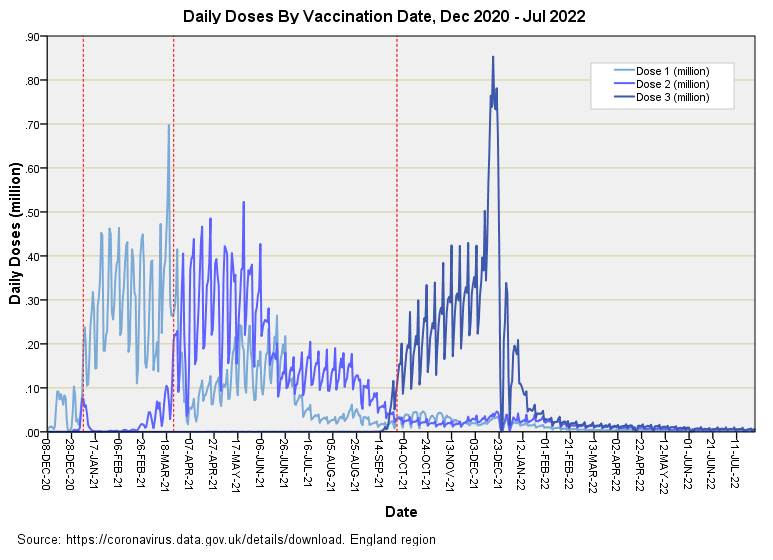
I’ve used my dashed red crayon to mark time points when daily doses consistently rose above 100,000. Though essentially arbitrary these give a pleasing and consistent start to proceedings. The 60-day definition thus provides a date range of 7 Jan - 7 Mar 2021 for the initial dose, 24 Mar - 22 May 2021 for secondary dosing and 28 Sep - 26 Nov 2021 for the booster. We can change these windows if so desired but what appeals here is that we’ve (sort of) separated initial and secondary dosing effects.
A run of 60-days is not a lot of time in time series work so we must expect those 95% CI boundaries to crush cross-correlations into insignificance; in this instance it is the sub-significant pattern that matters. A 60-day window also means we must restrict ourselves to looking at ±28 day lags but this is a small price to pay since most of the action appears to be taking place within 4 weeks of dosing.
Results: 60-day Window CCF
Dose 1
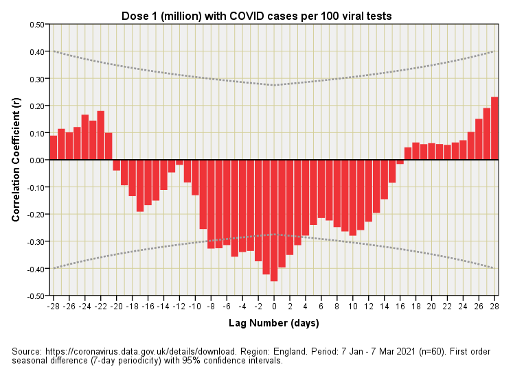
Well, well, well, what do we have here? That palisade of statistically significant negative-going red bars is revealing vaccine benefit in that COVID cases are diminishing as vaccine doses are increasing.
But there’s a dirty great fly buzzing in the ointment of national salvation in that those benefits were accruing with zero lag (now that’s what I call magic). Not only that but the benefits starting accruing before vaccines were dished out, as witnessed by those statistically significant negative correlations at negative lags. Unless Pfizer et al have developed a time machine then this result is impossible if we assume the standard laws of physics apply.
Those who are used to eyeballing these plots will at once realise what has been happening. There has been an underlying and most natural tendency for the case detection rate to be dropping at the time when they started jabbing folk. An illusory success by any standards, and a grand illusion that must have been played out by the authorities in full knowledge (I can’t be the only analyst on the planet to spot this).
Dose 2
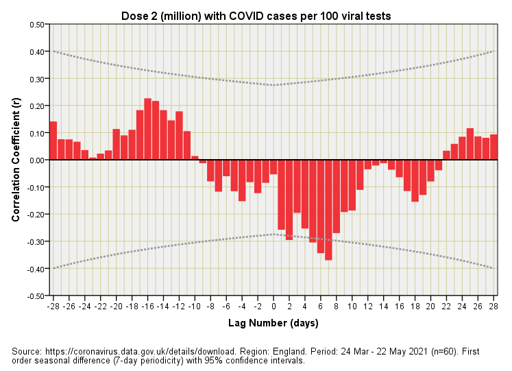
The dynamic of the second dose now follows a similar profile to that of the first in that we observe more or less instant vaccine benefit. There is less funny business going on here with benefits accruing after 1 week or so after the jab, but disappearing shortly after. Ironic, then, that the ONS and others in command of the numbers should have set out by defining vaccinated folk as those who were jabbed 14 days prior: they missed a trick there! Experts will need to tell us whether synthetic mRNA can work its magic in this short time frame or whether we are simply looking at another illusion brought about by timing of the roll-out in relation to the changing case detection rate.
Dose 3
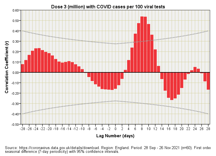
Mama mia, here we go again! There is that palisade of positive-going red bars at positive lags once more, indicating vaccine harm (cases rising after the booster). Now some may argue that the reason for this is that the 2021/22 COVID winter peak just so happened to occur a week or two after everyone scrambled for their booster, thus giving the false impression of vaccine harm. It could also be our immune system having a strop. Whatever the reason we have a booster that didn’t really do what was claimed for cases still rose after peak dose distribution, as this plot plainly shows. No doubt some bod will utter “it could have been worse” or, “this shows that it is working”, which sorely tempts me to investigate these claims in a future newsletter!
Amalgams
Slicing the data as though a cake is one way of handling the complexity of the situation. Another is to flip 180° and go full-on amalgam. I shall reveal what I mean by this in the next newsletter. Until then…
Kettle On!
All through the COVID fiasco many of us haven't really given 'cases" much credence as they are so ambiguous from the validity of the tests themselves, symptomatic or not, through to the number of tests undertaken in the various cohorts of the population etc.. Add to this average age of death from/with covid at 82yrs then actually being ill from it, whilst mild or nasty in health terms is virtually irrelevant.
My engineer's mind being a little wary of deep statistical analysis (sorry, but I must admit to finding it fascinating) for it's own sake past a bit of normalising has always looked to excess deaths for a truer picture, alongside hospitalisations for COVID, especially as there has been virtually no early treatments administered in our western world.