Spectral Analysis Of All Cause Death (part 2)
I utilise an engineering tool to investigate periodicity for all cause death within England & Wales by date of death for the period 1st June 2014 – 31st July 2023
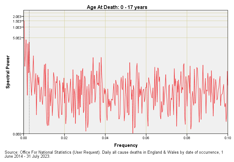
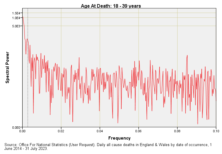
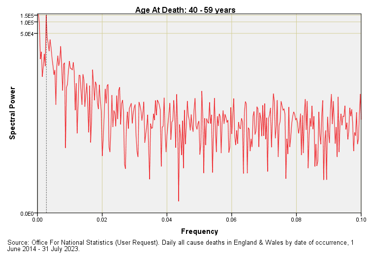
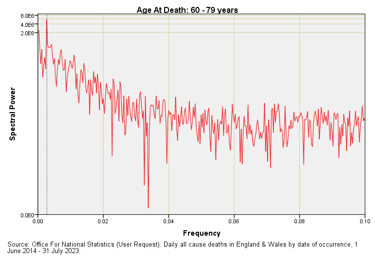
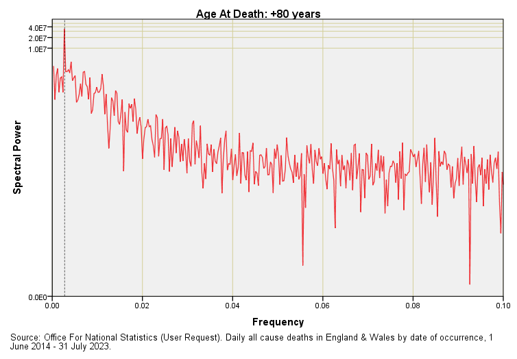
In the first article in this series I waffled on about annual periodicity without actually showing this. With a daily data series we are going to find annual periodicity down at f = 0.00274. For those still wondering how this pithering frequency comes about I shall quickly mention that there are 365 days in the year and the inverse of this number (1 ÷ 365) fetches up at 0.00274. In essence 365 is the wavelength. This is a pretty small number to be plotting on an axis that reaches the giddy Nyquistian heights of f = 0.5, so here are five more periodograms for all cause deaths across England & Wales for the date range 1 June 2014 – 31 July 2023 with the x-axis truncated to f = 0.1:
The frequency f = 0.00274 denoting annual periodicity is marked by a rather fine dashed line. With a bit of squinting you’ll see corresponding spectral peaks for age groups 40 – 59 years onward but nothing of substance for the two youngest age groups. Seasonal (as in winter) death is something that creeps up on us.
Note the absence of any other peaks apart from a weird one sticking up at f = 0.085 for the 18 – 39 year group. This represents a periodicity of 11.76 days that I presume is artefact. I don’t see any evidence of 14-day (f = 0.071) or 28-day (f = 0.035) periodicity, so all is as it should be as lives randomly come to an end in these two nations.
Normally we ignore downward spikes in these plots for these can arise even within a totally random time series but there’s a couple of whoppers at f = 0.033 for the 60 - 79 year age group that caught my eye that mark 30-day periodicity. This is most curious and we may ponder on reasons why there is a notable absence of 30-day periodicity that digs deep into the noise floor. If life support machines are being turned off at day 28 then we’d see a peak at f = 0.036 but we do not. Neither do we see this curious hole in the +80 year group so it may just be a numerical wrinkle. Either way it’s a good excuse for munching on a few biscuits.
In the next article I shall take a peek at certified and 28-day COVID death counts as provided by the UK GOV coronavirus dashboard.
Kettle On!


Is it possible for me to message you directly? Would be interested in your thoughts on a dataset I've been looking at..
Can you explain this in ~layman's terms...'there is a notable absence of 30-day periodicity'? Does this mean that every 30 days during the period studied (during a subset of the period studied?) there are significantly fewer deaths than expected?