


Spectral Analysis Of Certified COVID Death (part 2)
I utilise an engineering tool to investigate periodicity for certified daily COVID death within England for the period 30 January 2020 – 6 October 2023

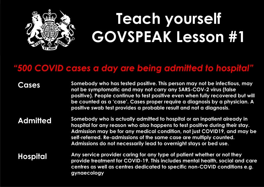
In part 1 of this miniseries I popped the following paragraph below a slide summarising the new daily death count for certified COVID deaths, as revealed by the UK GOV coronavirus dashboard:
Loud and not very proud is that first sizzingly sharp peak in spring of 2020 when everybody seemed to die synchronously regardless of age, sex, medical diagnosis, immune function, SARS-COV-2 infection, occupation and location – a strange fact that bothers me and certainly bothers the bods at PANDA, with this article being their latest thoughts on the subject.
Regular readers will know that I bang on about the peculiarity of that first spike in COVID deaths every now and then but this morning I fancied trying something that might give us a definitive answer one way or another.
The trouble with this spike is that it is coincident with closure of NHS services, the shunting of frail and elderly people, the introduction of dubious end-of-life care protocols, inappropriate use of ventilation, withdrawal of antibiotics that prevent bacterial pneumonia… and much more. Old folk were isolated - a sure killer - and most people feared for their life to the extent that utterly crazy behaviours ensued. And, yes, some sort of viral-thingy was on the loose (that turned out to be nowhere near as deadly as billed) that somehow managed to put in an appearance during autumn of 2019 if not earlier. Not so novel, then!
The truth of this dark period for centralised healthcare is beginning to emerge, as it surely will, and it looks to me like the murk can’t all be pinned on ignorance, stupidity, political shenanigans and arrogance of those charged with looking after the health of the nation (though no doubt these account for a great deal). It strikes me that if you want to privatise the NHS without public backlash then having it fail in a spectacular fashion sufficient to anger everybody is a good ploy. That being said the global extent of what unfolded should concern us all: in my view we witnessed a blueprint for medical mayhem rather than public health.
Suspicion has built to the point where independent analysts are even questioning the basic data churned out, and rightly so. In this recent article, for example, the PANDA team sketch out an eight-point argument that questions the veracity of the death tally for New York City back in spring 2020 that makes me wonder if other data authorities have also been ‘creative’. It also makes me uneasy because if I can’t trust any numbers from the UK government I might as well turn this publication into one that distributes gluten-free recipes. Those who have followed my work since July 2020 will understand the numerical games that have been played by the authorities - here’s a slide I baked back in December 2021 after yet another run-in with the Office for National Statistics:
An Idea
Whilst watching the rain from the tail end of an Atlantic squall batter down on my office window this morning, being amused by a crow who was trying to crack a snail shell on the cherry tree, I had an idea. A very simple idea, mind, but one that should do the business good and proper!
I realised I could take the daily time series for all adult in-hospital deaths possessing an ICD10 COVID-19 diagnosis that I have been analysing in earnest these past few weeks and convert this into its standard score form. Do the same with the daily count of certified COVID deaths issued by the UK GOV coronavirus dashboard team, get out the crayons, torch the pan and whoosh!!!...