Testing… Testing… (part 1)
The relationship between viral tests and COVID ‘cases’
In my newsletters I often refer to the sensible folk who realise that (all things being equal) more testing means more cases, which is why I tend to use rates such as COVID cases per 100 viral tests. Things are not always equal, however, and crazy stuff happens like people changing their attitude to self-testing. A mutating virus we can deal with, changing definitions of what constitutes a COVID case we can deal with but even the best analysts can’t deal with everything.
Back on 1st April 2020 a total of 16,301 PCR tests were undertaken across the nation of England, with 4,150 COVID cases being declared (25.5% detection rate). Six months later, on 1st Oct 2020, a total of 210,923 PCR tests were undertaken, with 11,445 COVID cases being declared (5.4% detection rate). Between these two dates COVID cases rose by 7,295 – a staggering 276% increase - and scary top-line figures such as these were broadcast to a gullible public who were led to believe things were getting worse.
In fact, things were not getting worse they were getting better since we may note that the detection rate (in terms of cases per 100 tests undertaken) had fallen from 25.5 to 5.4. At no point did those in authority care to explain the situation, and my rather sharp notes to Public Health England/ONS were ignored (n.b. I’ve been a consultant to both organisations). PHE did eventually switch to using a rate but this was cases per 100k of population which is utterly pointless for reasons that should be pretty darn obvious. Additional sharp words to PHE explaining why rates per 100k of population were pointless were also ignored, and so the public continued to bathe in disinformation on a grand scale. I’m pretty sure I wasn’t the only ranting analyst.
Multiple Tools
Rates such as cases per 100 tests are but one of several tools analysts can adopt to level the playing field. We can resort to standardisation (e.g. case counts standardised to 500,000 daily tests) or normalisation, the latter being popular in the field of climate science whereby temperature anomalies are derived from the 1961-1990 30-year climate normal. Then there are those fancy age-standardised mortality rate thingies whereby we account not just for differing risk of death by age but also for changes in the underlying base population.
Whilst crude case rates are very handy beasts in using them we have to be careful we aren’t bulldozing a basic general rate through data that are essentially a family of different underlying rates. A prime example of this arises when we consider case detection for the two differing methods of PCR and LFD.
Let’s go get my crayons out…
Relationship Between Cases & Testing
The PCR Test
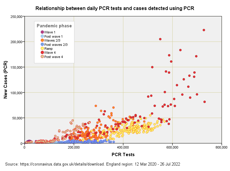
Here we have a scatterplot of daily cases detected using PCR (by specimen date) against daily PCR tests undertaken (also by specimen date) since the pandemic began. PCR is the primary method for the pillar 1 scheme (those with a clinical need and frontline workers) and so we are essentially looking at institutional outcomes.
Ignore the colour scheme for the moment and drink in the big picture of cases rising as the number of tests increases. More tests generally means more cases and this simple fact stems from the laws of probability. If the PCR test was absolutely flawless in its performance then more tests would not mean more cases, but it’s not flawless by any stretch of the imagination! Like all other medical tests it is subject to failure and will generate both false positive and false negative results that muddy the water.
Colour My World
If we now consider the colours we get to see how case detection changes with the pandemic phase. Data points for the first wave are tucked away right down near the origin and these expand into the pale blue dots that mark the glorious summer of 2020. These streak along the bottom as testing increased but cases did not, this feature giving us a useful handle on minimum test specificity.
Notice how the rate of case detection rises when there is something to detect, this being the mathematical product of disease prevalence and the number of tests. That is to say, if 10% of the population have COVID and we test 100 folk we expect to detect 10 cases, whereas if we test 1,000 folk we expect to detect 100 cases. If just 1% of the population have COVID then divide these numbers by 10. In either instance more tests must always result in more cases unless the disease is on the wane, in which case our detection rate will fall to near zero.
Testdemic en croûte
Just to make life difficult more tests will also mean more cases if the rate of testing accelerates beyond the rate of viral decline; that is, if infection is declining within the population at a rate of 2% per day and testing of that population is rising by 3% per day then we’ll detect more cases even though the pandemic is on the way out! Does that stink or what? Has any authority explained this? I guess not. In essence, we are all submerged within a grand testdemic, with many folk addicted to testing themselves as much as they are to the futile act of mask wearing and social distancing.
You can get a handle on the dynamics if you squint at the above slide and imagine a data ‘fluid’ that ascends from the cool blue blobs, through the yellow and orange to the hot red blobs that mark the monster peak of winter 2021/22. This fluid is now sliding back down into the cool blue and the whole thing will endlessly oscillate until such time as we abandon the PCR test as an automated diagnostic and replace it with old-school physicians with some ‘common’.
A Proxy For Prevalence
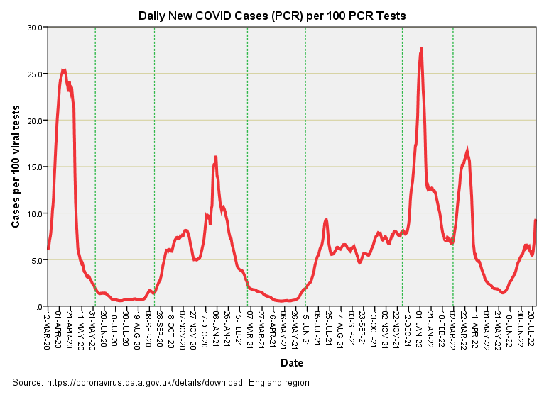
Those 867 colourful data points in that there slide provide 867 estimates of the case detection rate, and if we assume one test per person we’ll also get an estimate of disease prevalence (cases per 100 people tested). Here’s what that looks like if we string those estimates along in time:
In this time series plot the dashed green lines mark the 7 periods presented in the previous scatterplot. We now see that the first wave comes up looking as strong as the 4th wave monster peak of winter 2021/22 even though the first wave is dwarfed in comparison on the UK GOV case count landing page. What this is telling us is that the monster 4th wave - when defined as case counts alone - has come about because of ludicrous levels of testing and not because a terrible mutant virus was on the rampage. I like to call this out as disinformation because I believe it to be deliberate. The appropriate graph to display to the public from an epidemiological point of view would be similar to the one I’ve just presented.
We can turn my graph into a better proxy for disease prevalence by making an adjustment for the rate at which individual people are tested (which varies over time) and I may cover this topic again in a future newsletter. One thing to be cautious about is extrapolation of this proxy to the general public - these rates largely arise from the testing of folk in a clinical setting so are bound to be biased. Think of them as institutional rates and you won’t be far wrong!
The LFD Test
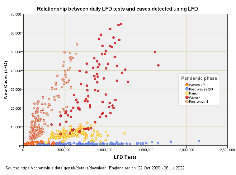
Here we have a scatterplot of daily cases detected using LFD (by specimen date) against daily LFD tests undertaken (also by specimen date) since the pandemic began. LFD is the primary method for the pillar 2 scheme (the wider community) and so we are essentially looking at national outcomes. Ignore the colour scheme for the moment and once again drink in the big picture of cases rising as the number of tests increases.
When there is nothing to detect (blue blobs of post waves 2 and 3) you can crank up testing and nothing much happens, this feature arising from a high degree of test specificity (see this newsletter for a bit of background). But once the virus is out and about you’ll count more cases if you undertake more tests (this needs to be a mantra that we all sing to each other everyday on the off-chance that some folk will wake up from their smartphone slumber).
There’s a mightily impressive positive relationship between daily LFD tests and daily LFD cases for the mega fourth wave (red blobs) that crashed upon us during the 2021/22 winter season, but what is arguably more interesting is the continuation of a strong relationship since this wave subsided. This begs the question of what it is that the LFD test is continuing to detect if the virus has gone quiet: are we looking at some form of triple and quadruple vaccine-induced interference or something else?
Another Proxy For Prevalence
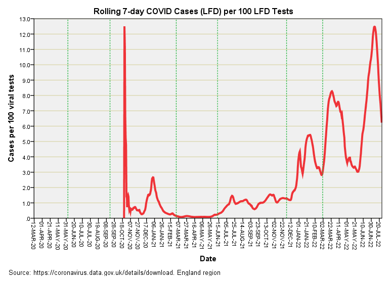
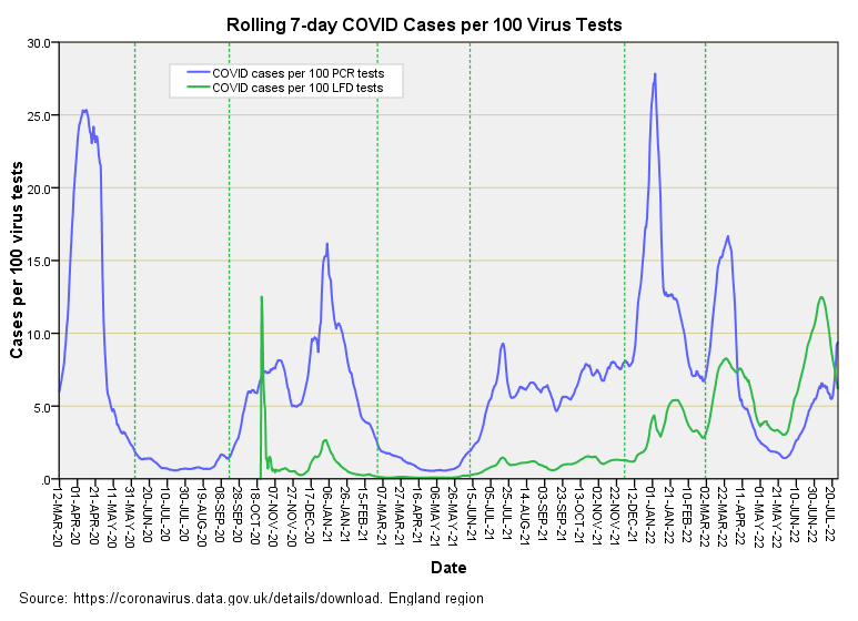
Here’s the time series plot of the 643 estimates of the case detection rate (a proxy for prevalence if we turn a blind eye to tests per person per week varying over time):
An abrupt start for certain and that super spike and Jan 2021 hump tells me they didn’t waste any time on randomisation - straight in and up the nose of sick people if you please! Once the nation was poking their noses en masse we observe things settling down, with the time series trundling along at very low levels of case detection during spring of 2021. After that we see a near exponential rise in the detection rate, punctuated by three great surges. The question that pops into my tea-rinsed mind is how much of this is real?
I ask this not because I am being a brazen-faced, churlish ruffian but because I spied this cantankerous chart:
The LFD test - a test largely in the hands (or should I say hooters?) of the general public - is now out-gunning PCR at roping in counts of COVID cases. I am sure that the virus doesn’t care which test is thrust upon it so it must be that the LFD test has been producing some rather wild results these last few months.
Phase the PCR test out and flip to increased reliance on LFD for both pillar 1 and 2 schemes and you’ll be able to extend the illusion of a pandemic with ease. I suggest subscribers keep their eye on test activity details and scrutinise any changes to the national scheme. In this regard we should note the main methodological document was ear-marked as ‘guidance withdrawn’ as from 12 Apr 2022.
Where Are We?
We are at the stage where I am gathering basic understanding of the relationship between test type, test use, test activity and case detection. The next step is to bring these factors together in a model that enables me to predict what the case rate would have been if we’d standardised the national scheme for both pillars from the outset. If this yields sensible-looking estimates of daily cases then I can proceed with the business of addressing claims that it would have been worse without the vaccine. In a nutshell I’m trying to unscramble the highly biased COVID case history of the nation. This will require a decent cake (Somerset apple cake with clotted cream maybe) and maybe a pudding or two!
Kettle On!


Everything about this from the start has used smoke and mirrors, governments rely on the public being too lazy and gullible to actually look and research the real information on the government websites.
Only the other week in a conversation my hubby brought up that only 2million hadn’t taken the jabs, I told him that was misinformation and disinformation they harp on about at it’s finest, ons reports show it well over 18million, msm provided the figures the government wanted to influence people into believing it was the right thing to do as everyone else had. It also served as a double edge sword to make those who were adamant they were not getting feel isolated and alone. What it has done is backfire big time as lightning that fire underneath people has made them search and find people just like them worldwide, they have united and have looked into things they would have never have before and don’t like what they see.
Personally I could never understand the constant testing some did without any need. I never did one pcr test and didn’t do my first lft until I had covid last summer and I had to prove I was clear before I returned to work. All that testing was ridiculous and people wouldn’t have done them jus as now if they’d have had to dip into their pockets to do so. The public has been conditioned by the using of the word free that no cost is attached. Plenty on social media we’re calling this all out and I even said to the hubby at the start that the cuts and fallout from lockdown and furlough would make the crash of 2008 look like nothing.
I don't know if you saw Rishi Sunak's Lockdown Confession on my Facebook page, posted the other day, but it would help to explain why PHE and ONS were ignoring your sharp notes.