In part 4 of this series I got out the big spanner, this being formal intervention analysis of excess non-COVID death using ARIMA, the idea being to develop a baseline model from which we can ascertain the impact of various independent variables of interest. I waded straight in with case detection rate (CDR) - a proxy for disease prevalence - this being defined as COVID cases per 100 viral tests, which was found to explain around 5% of excess non-COVID death across England & Wales for the period 2020/w50 - 2022/w33 following a 2 week lag. This is an odd finding because disease prevalence shouldn’t figure in a predictive model for non-COVID deaths, and I assumed this may be due to errors with certification.
Then came the big one - vaccination - this being defined as total daily doses of anything they’re jabbing folk with regardless of whether it is first, second or third doses. Unfortunately I was unable to secure fourth and fifth dose data at the time of writing since this data were not presented on the UK GOV coronavirus dashboard. Well, the big one didn’t disappoint with around 30% of excess non-COVID deaths being explained by variation in daily dosing after a 23 week lag… except that model coefficients pointed to vaccine benefit and not harm!
My job now is to try and knock my hypothesis down by expanding my modelling strategy to include the long term impact of lockdown, loss of service provision, long-COVID and deterioration illnesses such as cancer. Meanwhile Joel Smalley, who is about the hottest COVID cruncher out there went, and produced this fine piece of work.
A Fresh Approach To Excess Death
Estimating excess death might seem straightforward but in reality the most common technique - subtraction of the prior 5-year mean value from observed counts - is a little shaky. If those 5 years are truly and wonderfully representative then we’re off to a good start, but if not we can be led up the garden path. Then there’s the wrinkle of calculating the excess for 2021 and 2022 given their baseline embraces the pandemic year of 2020. Then there’s the wrinkle of flu seasons arriving earlier or later than usual, which makes a mockery of subtracting week 1 of the of the baseline mean from week 1 of the current year.
On consideration of these issues, and after a decent cafetière of Colombian roast, I decided to do something a little different and that is to derive a weekly baseline series from the 120 week period that is 2010-2019, the idea being to average out any peculiarities. A period this long necessarily means the population has been growing slightly so adjustments to historic death counts have to be made. Ideally we’d go full quinary age band and gender standardisation but time pressures forced a quick and easy standardisation to 58 million souls. When I can I’ll refine this method but I doubt if the results will change that much, if at all.
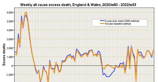
So what does this fiddling look like, and have I seriously mashed things up too much to be recognisable? Computer says no:
Here we see a time series plot of the 5-year prior means method used by the Office for National Statistics (blue) compared with my new-fangled 10-year standardised baseline method (orange). Differences are slight apart from one peculiar period at the beginning of 2022 where we see my 10-year baseline method indicate zero excess death for several weeks, as opposed to a peculiar dip in the ONS figures.
This difference will come about if the 2015-2019 reference period used by the ONS for estimating excess in 2022 over-estimates the weekly death count at the beginning of the year when compared to the 2010-2019 reference period.
This difference is even more pronounced for non-COVID excess death:
Thus we find that a longer 10-year mean baseline period irons out wrinkles that lead to peculiar lurches into negative excess. The upshot is we ought to junk the official method of estimating excess death, and we most certainly ought to look more closely at methods used in pro-vaccine benefit studies - that blip of negative excess could easily be mistaken for vaccine benefit when it is mere statistical artefact!
ARIMA Re-Run
This worried me enough to get my big spanner out again and re-run the ARIMA model that closed part 4 just to check I could replicate results using the 10-year baseline data. It turns out I could indeed:
Not only did the series for combined daily doses once again turn out to be a statistically significant predictor for non-COVID excess death over the period 2020/w50 - 2022/w33 (p<0.001), but it also transpires that my proxy for disease prevalence (CDR) drops out of the equation with a non-significant p-value of p=0.173.
This is rather pleasing because it removes all the head scratching of wondering why non-COVID death should be linked to disease prevalence; it ain’t linked if we junk ONS’ method of estimating excess death and roll our own!
As for that all important coefficient of determination; this fetches-up at r-square = 0.284 for the above combi boiler model. In plain English this means 28.4% of the variation we see in weekly non-COVID death over this period can be explained by variation in weekly dosing. So it’s a useful model but it’s based on a negative coefficient for vaccine dosing which indicates a model for vaccine benefit and not harm.
We better end with some pudding…
Staff Absence
Now that I’ve got the basic data behaving better I shall endeavour to expand the study. They say great minds think alike but I reckon it’s more accurate to say seriously tuned-up geek-bods tend to think alike. And so it was that I’d just pulled down NHS staff absence records to use this as a proxy for disease outbreak, long-COVID, lockdown stress, adverse reaction to vaccines etc etc etc when Joel Smalley texts a few minutes later to suggest the very same. With that I shall raid the bread-bin!
Kettle On!
It seems to me the issue is .. do the jabs cause damage systematically (Clots, myocarditis etc) that leads to death.. if so it should affect both covid and non covid deaths equally... the main confounding thing is that covid deaths typically have 3-4 other comorbidities..
Looking at non covid deaths eliminates not only covid but many of the other commodities and so naturally you would see a higherR2..
By looking at all cause mortality below age 60 you are also limiting the influence of multiple comorbidities (age being the biggest)
And so getting a more real sense of the systemic influence of the vac.....
we know myocarditis is higher in young males .. but clots maybe more important for the aged?
It’s Like unraveling spaghetti
The other factor is a favourite of mine.. that being: one co morbidity can perhaps kill 10% on it’s own...but add a similar co morbidity that on it’s own kills 10%, then the two together will kill 50% add another and you have 90%..
So coincidental stresses are something to look for ie seasonal peak in flu is a combination of cold stress, low VIt D, lack of ventilation, low humidity, and disease.. age as well...
This making my head hurt! A worry is that so much depends on the accuracy of the data, I have little confidence in what is written on death certificates. We live in interesting times, unfortunately.
As an aside John, as a subscriber am I right in thinking I get access to your climate work as well? If so, there is a glitch in the matrix as I can't seem to log in to it.