In part 5 of this series I investigated use of a population-standardised 10-year baseline for use in the derivation of excess weekly non-COVID death and compared this to the 5-year prior means baseline as used by the Office for National Statistics (ONS). Differences were minimal apart from a striking disparity for the first few weeks of 2022, whereby the ONS method yielded a negative excess for non-COVID death that evaporated when the 10-year method was rolled into place. This revealed just how tricky it is to derive robust estimates for excess death, and my concern was use of this artefactual negative excess in claims of vaccine benefit. I ended by mentioning use of NHS staff absence records and this is where we shall pick up the thread this morning.
More Spaghetti, Vicar?
The problem with all of this work is that the data we rely on for illumination are a great big pile of tangled spaghetti. Yes, folk went out and got jabbed but this is only one of many factors impinging on health. We’ve got short COVID that is mutating and we’ve got long COVID that is poorly understood, with all manner of health issue surfacing down the line. Then we’ve got the strains and stresses of living through a seriously sh*t time, with lockdown, masking, social distancing and umpteen regulations serving to hammer people in various ways. Then we’ve got the long term cost of shutting down diagnostic services and elective procedures, as well as broad spectrum deterioration in the nation’s health; increased alcoholism and refined carbohydrate intake to name but two. Things were always going to get worse before they got better.
Squaring these many factors up against adverse effects of vaccination over the same time frame at the level of the population is a near impossible task, with an ever-expanding list of new factors to consider before we can utter definitive statements on what the vaccines exactly are and are not doing. That there’s a significant amount of ‘funny business’ is going on is as plain as the nose on my face, and I am sure everyone of us by now will have experienced unexpected deaths amongst their friends and family. My job is to try and quantify these collective experiences at the national level using formal statistical techniques that place vaccine harm leading to death beyond any shadow of doubt. This is going to take time, patience, cogitation and a serious amount of tea!
Absence As A Proxy For Health
One idea I have, that is shared by the champ of COVID stats - Joel Smalley, is to use NHS staff absence records as a proxy measure of the bucket load of health issues mentioned above. Staff will go sick for many and varied reasons but by and large this is a useful measure of their individual as well as collective health. I appreciate that NHS staff are a strange breed and are not representative of the population as a whole but right now I cannot get hold of weekly absenteeism figures across various employment sectors. Even if I could we’d still be looking at a biased sample with the UK unemployment rate (a rather dubious figure) running at about 4% for those of decreed employable age.
Then there’s a sizeable sector of the population (around 19%) aged 65 years and older for which health (and the likely impact of lockdown policies) is a whole different ball game. How do we quantify the many background factors affecting these people such that we can separate these from vaccine harm? I have a few ideas up my sleeve but it will take time, data and effort to trundle these out. Meanwhile, at least we can have a quick look at the health profile of the most peculiar set of Earth angels that I have ever had the pleasure of working with. Kettle on, biscuit tin open; away we go…
Start At The Beginning
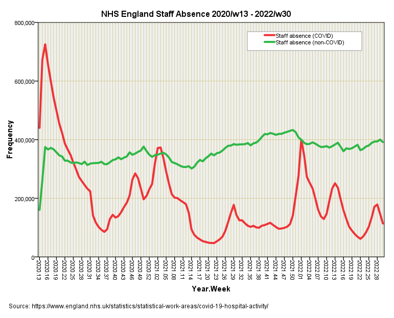
We shall start at the beginning by looking at the time series for non-COVID and COVID related weekly staff absence for the week ending 27 Mar 2020 onwards (2020/w13), for this is where the data starts. You may obtain a copy of this for yourselves from here:
I’m not impressed with the figures for the first 2 weeks, which look as though they represent incomplete counts, so I shall exclude these from analyses. Non-COVID staff absence across NHS England sure looks like a nice, steady count over these 123 weeks but at this scale appearance can be deceptive. My eyeballs certainly want to pick out an upward trend from 2021/w14 to 2021/w50 and this will be worth looking at since it is unusual. Obviously, a key figure that we don’t know here is the total number of staff employed each week, so this may represent a genuine increase in absence or a reduction in absence rates offset by an increase in employment levels, though many will say there was fat chance of that in an underfunded service being run into the ground. Whatever was putting pressure on numbers certainly eased off after the 2021/22 seasonal peak.
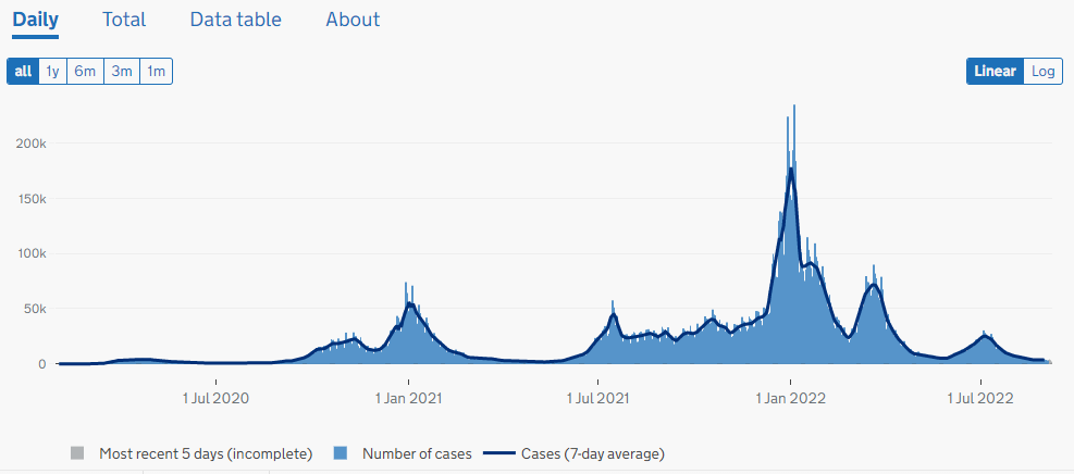
The curve for COVID is interesting since it does not mirror the case count offered on the UK GOV coronavirus dashboard, with many more staff absent during the first wave back in spring of 2020 than the case count peak of Dec 2021 - Jan 2022:
We may deduce from this that serious amounts of nose poking by the general public ended with a large number of positive test results and a body of bored people who sat at home feeling completely well. Then again we don’t really know what was driving the peak in absence, with some professionals confiding they were totally stressed out and seriously scared. Thank you, the Behavioural Insights Team, for callously ‘nudging’ folk into sheer terror through manipulative publicity campaigns that sought to deliberately misinform a naïve public.
At some stage I shall analyse case counts and staff absences in order to obtain an estimate of asymptomatic presentation, thence to derive estimates of real cases and not spurious test results. It will also be very much worth determining whether vaccination did anything to reduce staff absence - this will be presented as a forthcoming new series - but for now we need to move along the bus to see if NHS staff absence can help explain some of the variation we see in non-COVID excess death so we may get a better handle on vaccine harm.
Staff Absence As A Predictor Of Death
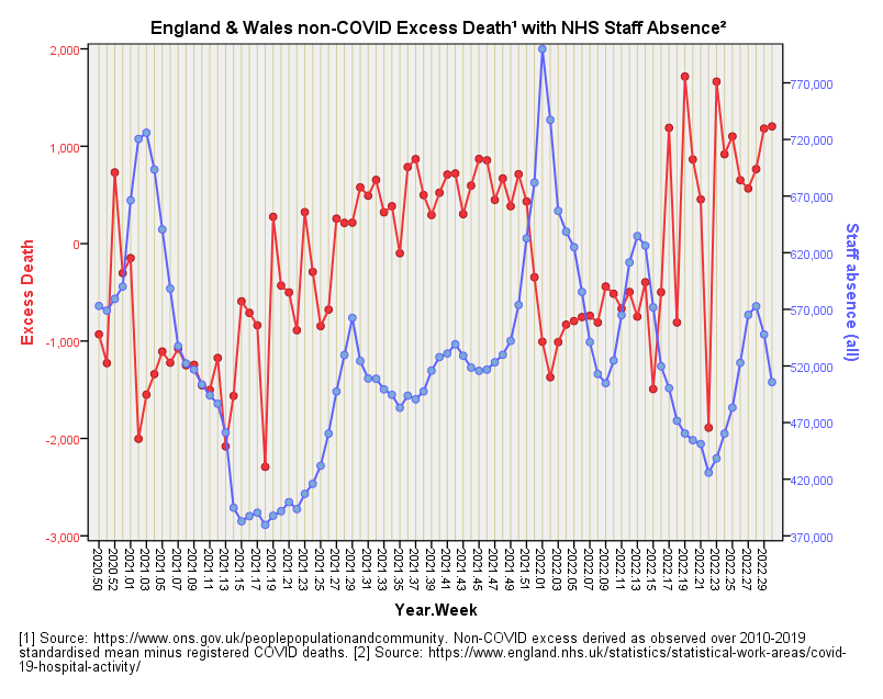
In the slide below we once again come face to face with the raw data before I start pressing any buttons. I’ve lumped absences due to COVID in with all other reasons to see the really big picture of health within the health service:
My first impression is of an inverse relationship, whereby excess death mounts when staff absence is low (and vice versa) but I don’t think we better suggest NHS professionals are responsible for excess death! This serves as a fine example of the pickle we may get ourselves in when looking at time series data. In this regard my eyeballs are somewhat influenced by the inversions during the two winter seasonal peaks where we observe a fair bit of absence but low excess death. We must note that low excess death does not infer few deaths; it means that deaths are doing what is typically expected, and that may involve a lot of deaths!
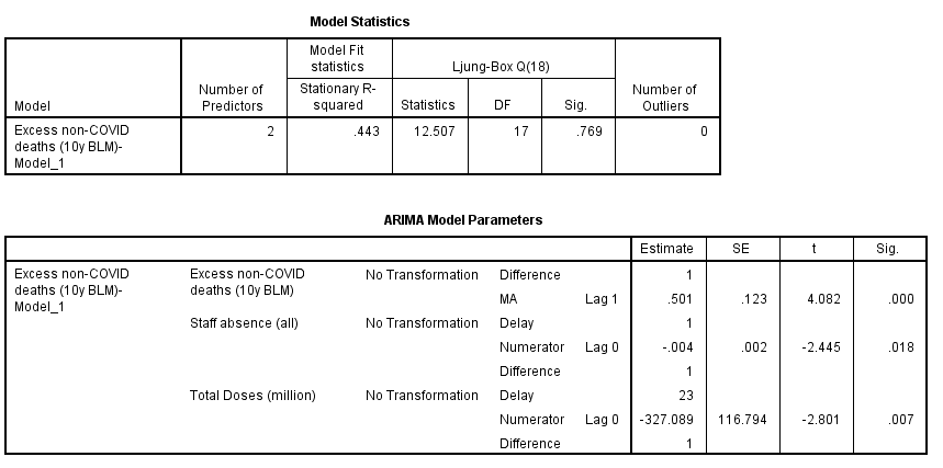
Apart from an extended period during 2021 when staff absence and excess death are both creeping up together I don’t see other periods of high correlation that might suggest creeping vaccine harm, but we better let ARIMA decide. Herewith the best combi boiler for staff absence and combined daily doses that I can muster for the prediction of excess non-COVID death for the period 2020/w50 - 2022/w30:
This is quite fabulous for it suggests staff absence levels across NHS England can be usefully employed as a predictor of excess non-COVID death providing we allow for a delay of one week (p=0.018). Generally speaking absence rises one week before excess death falls, this being a convoluted way of marking out peaks in seasonal illness.
The Slap Across The Chops
At this point our story of vaccines and death is going to take one of those horrid plot twists, and I am going to slap our thinking across the chops sufficient to seriously startle. Best to put your cuppa down at this point!
In that table above we also see an entry for total doses that is wonderfully statistically significant (p=0.007). This indicates that combined daily vaccine dosing is a strong predictor of excess death providing we allow for a lag of 23 weeks. The all important coefficient of determination fetches-up at r-square = 0.230, which means that 23.0% of the variation we see in weekly excess non-COVID death over this period can be explained by variation in weekly dosing when combined with staff absence as a proxy for general health.
So far so good, but please note the exact form of phrasing I have been using throughout this series, it being along the lines of: “X% of the variation we see in excess non-COVID deaths can be explained by variation in weekly dosing.” What I’ve been doing is exploring models to predict excess deaths from dosing but up to now I haven’t said anything much about the direction of that effect, all I’ve done is mumble something about negative coefficients for lagged dosing indicating a model for vaccine benefit and not harm.
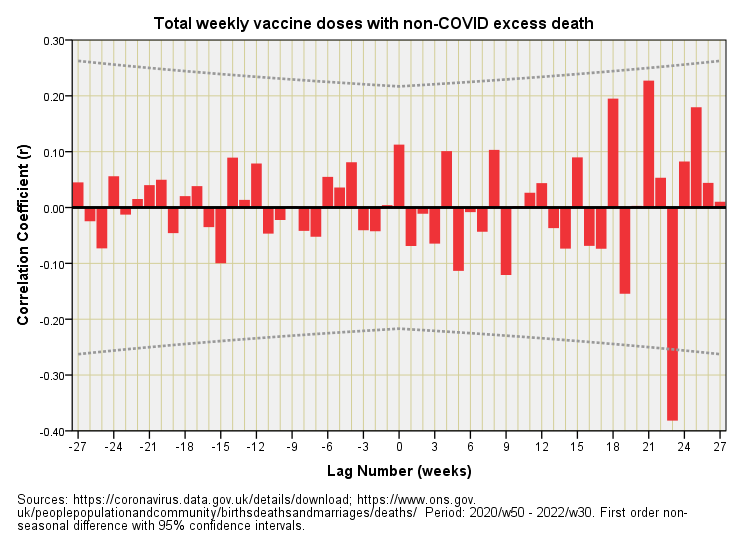
Let us now take a good look at the direction of the effect using cross-correlation with lags out to ±27 weeks:
That dirty great red bar at a lag of +23 weeks is what my series of ARIMA models have been detecting. These have all suggested that the weekly pattern of variation in non-COVID excess deaths has been following the weekly pattern of variation in vaccine dosing some 23 weeks later. But look at the direction of the correlation - it’s negative! Eagle-eyed analysts familiar with ARIMA will have spotted the negative sign in front of the estimate of the coefficients displayed to date, the current model offering -327.09 as a multiplier for vaccine doses.
In plain English this means we observe a negative relationship between daily dosing and excess non-COVID deaths some 23 weeks down the line. In plainer English this means if dosing was up one week then excess deaths will be down 23 weeks later; conversely if dosing was down one week then excess deaths will be up 23 weeks later. Now that is some slap to the senses!
Does this mean vaccines are conferring benefit? Not necessarily.
It means that there’s a time-based dynamic between the data series for dosing and the data series for excess non-COVID death that serves to provide a false impression of benefit. The problem is this same dynamic may also provide a false impression of harm - the spaghetti really is that tangled!
Another Plot Twist
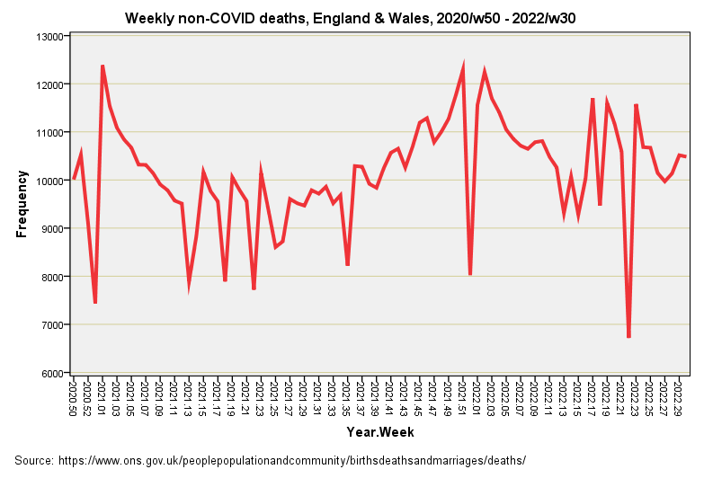
But there’s another plot twist. Excess death after elevated levels of vaccination may well be lower some 23 weeks later because folk who were biologically frail in the first instance may not have made it to 23 weeks, with their early death leaving a hole in the excess that my modelling has picked up. If there’s a strong early build in death soon after vaccination then week 23 onward may be unusually Spartan for this reason. Have a look at this:
We have an initial seasonal peak in non-COVID deaths that coincided with vaccine roll-out followed by a steady build to a second seasonal peak for 2021/22. We also observe some unusual sharp declines that suggest issues with death registration and certificate processing. What if those dips have been flipping results to produce an illusion of vaccine benefit?
Where Are We Now?
We’re back to quirks in the data being a right pain in the rear end. We’re also left wondering if excess death, as it is typically calculated using historic week-on-week means, is a useful handle on the situation or whether it is leading us into illusion and further tangle.
As always, a period of cogitation and coffee is needed, but I have a few ideas in the pipeline that I shall be revealing in the next newsletter. Until then…
Kettle On!


Great stuff!
The suggestion of vx harms has massive implications, so I really appreciate your thoroughness when investigating the data.
As soon as covid and non-covid deaths are separated, we have some kind of a value judgement going on.
In past years, covid was not present, but there have always been respiratory pathogens. It would seem that covid displaced these over the last couple of years.
If we are calculating non covid Xs deaths, then would we be better using non flu deaths as the reference? Or more reasonably, use all cause deaths (now) and against your calculated reference?
But why use xs deaths at all?
As I understand it, the stats (both ARIMA and xcorrelation) use the variation in the independent and dependent variables. So if there is an effect of doses at a population level, wouldn't we expect to this in all cause deaths?
Hi I love all this statistical sleuthing. My son, a soon to be PhD, who uses modelling for virus analysis is a total sceptic. I just throw in some of his raw comments. Maybe they might flick the odd light switch and thence might be of some use.
'Do you think the number of excess deaths might be look weird the winter after thousand of old people died a week the previous winter?
Do you think the ongoing open label trials for the vaccines would pick up its killing people after 5 months?
We doesn't he look at high vaccine coverage areas like Scotland, they should have bright red excess deaths after 5 months... /s'
Cheers Glenn