Weekly Deaths Update (part 1)
Registered weekly deaths in England & Wales 2010 - 2022
A critical matter we need to squarely note with the analyses that follow is that date of death registration is not date of death. The registration process relies on availability of admin staff and that means delays, particularly at weekends and bank holidays, but also when illness strikes and the national death toll mounts. Those suits responsible for processing death data speak of delays of two weeks and more, running into months. We thus never glimpse the true picture unless we look back at least a year - please so bear this in mind when eyeballing data for 2022 and the latter half of 2021.
Another critical matter is standardisation against a known population. Anybody who has spent anytime pulling down mid-year population estimates from ONS will realise just how flimsy these are. Yes, we have the occasional household census but there are issues with this. Yes, we have various registers but there are issues with these. Yes, we have expert modelling but there are issues with this. The population is remarkably tricky to nail down but we shall see that this isn’t as critical as many think!
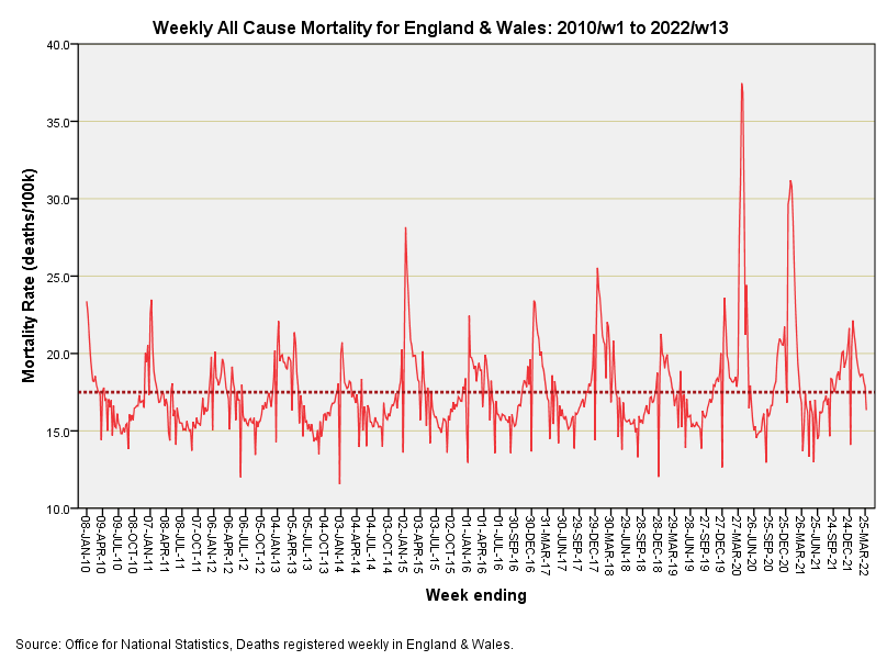
The population estimates I have used come from various ONS sources and these have been bolted together using a smidgen of statistical modelling and some jiggery-pokery to obtain weekly estimates from half-yearly and yearly data series. Rough and ready I admit, but this sleight of statistical hand does allow me to furnish this side:
The dashed line is the series mean at 17.5 deaths per 100k population per week, though some would no doubt prefer I plot the series median of 16.9 deaths per 100k population. The series minimum of 11.56 was reached during w/e 27 Dec 2013, with the series maximum of 37.5 being reached during w/e 17 Apr 2020. The distribution of weekly rates is Normal-like but not strictly Normal (Kolmogorov-Smirnov test for Normality p<0.001), with an asymmetric distribution of rates that is positively skewed (2.419, S.E. 0.097). For those keen on plain English this means the distribution of rates has a big bottom, for which we must be thankful. You can see this in the flesh by noting how many weeks hover below that dashed line compared to above.
Those spikes sticking out below do not mean hardly anybody died during that week; they simply mean nobody was in the office to register the deaths that did occur. Equally, the spikes sticking out the top do not necessarily mean everybody suddenly died during one week; they simply mean the office staff rolled their sleeves up and got stuck in. This graph does not tell us when deaths occur: it tells us when they were processed!
One spike I do like to point out is the 28.2 deaths per 100k population that was reached during w/e 9 Jan 2015. That was old-fashioned influenza no doubt. I recall folk getting ill and hospitals heaving but I don’t recall masks, hand washing, social distancing, bans on congregating, tracking apps, daily testing, lockdowns and all the rest. If we travel further back in time no doubt we’ll see more spikes of substance.
In terms of office staff processing death certificates we find a rather sharply defined pandemic that should have raised an eyebrow or two during a few weeks in spring 2020 and again during the winter season for 2020/21 but that’s about it. You make like to try the rule-of-thumb trick: nearly erase those few weeks then ask the next Extra Terrestrial you meet to spot the pandemic.
A Word About Standardisation…
Some people berate me for not standardising everything that moves (or dies). Folk go crazy generating age-standardised figures, and even age by gender standardised figures. But why stop there, why not also consider measures of deprivation and equality of access; or something else entirely? One thing we can be sure of is that if we factor a reliable outcome measure by guesstimate populations for age, gender etc we’ll end with a polluted pool whereby errors in each and every estimate will have multiplied and propagated. Been there, done that. I find it interesting that you don’t generally get to see a thorough discussion of inflated error ranges arising from age-sex standardisation procedures but there you go.
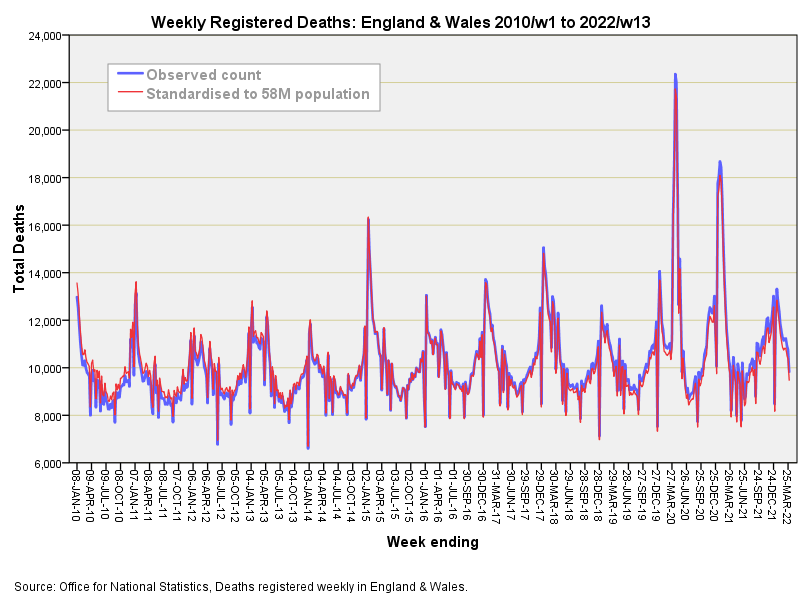
Meanwhile, let’s take a look at the above slide again but this time we’ll compare the raw observed weekly counts with those standardised for a population of 58 million1. By doing this we’ll get to see the impact of adjusting for population growth over a period of 13 years:
I don’t know about anyone else but I’d want my money back! Those with keen vision will be able to spot an imperceptible tilt such that the red line sticks slightly proud of the blue line at the left hand end but dips slightly below at the right hand end. That’s it, that’s yer lot; that’s the impact of the population growth over 12 years on the death tally. We’ve gone to the trouble of estimating the population on a weekly basis, run up a spreadsheet and come out with something virtually identical to the raw counts.
The good news is that we can analyse raw counts instead of fiddling, especially if we are going to narrow the study period down to 2020 - 2022. The not so good news is that we don’t have any reliable estimates of what really matters and that is the age profile of the population over time. Sure there are guesses made by organisations who are trying to track vaccine performance but I’d like to be a fly on the wall when they meet to discuss how to go about this!
England & Wales are estimated to have hit the 58 million mark back in the autumn of 2015.


tidy, lots of fun and games to come!