
What bed is that, then? (part 3)
Entering the world of the bed manager...

In part 2 of this series I ended with this paragraph:
‘With overnight bed availability around 8% down and occupancy around 20% down just how busy can our hospitals have been given the combined loss in throughput amounts to around 26%? Well, for the staff working in these hospitals life could have been totally and utterly hectic despite patient throughput being suppressed because we haven’t yet considered staff absences due to symptomatic COVID and staff absences due to a positive test. For the next episode I hope to collar a wedge of staff absence data…’
This morning I can happily report that I have indeed ‘collared a wedge of staff absence data’, which may be found sitting right at the end of the monthly COVID publication near the top of this webpage. The current XLSX file extends to 2 Feb 2022 and looks like this…

Cell B11 states: Provider Level Data - Staffing Data - Total number of staff absent from work through sickness or self isolation; so what we are looking at is staff absence through a mix of sickness (COVID and non-COVID) as well as the outfall of PCR test protocol1. The slide below converts these numbers into a handy visual…
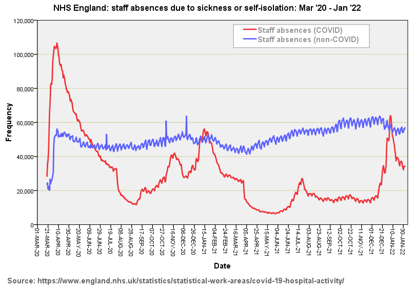
I’ve no idea what level of non-COVID staff absence is observed historically so cannot comment on the tremendous uptick at the beginning of March - this may easily be a data collection issue or the beginning of an elevated trend. Owing to the scaling of this graph what cannot easily be eyeballed is a slight positive trend in increased levels of non-COVID absence over the period Mar ‘20 - Jan ‘22.
Staff absences due to COVID follow pretty much the same overall wave pattern as the national case series with the notable exception of much higher numbers of staff absence for the first wave. Compare that red line with this screenshot of the UK GOV coronavirus dashboard…
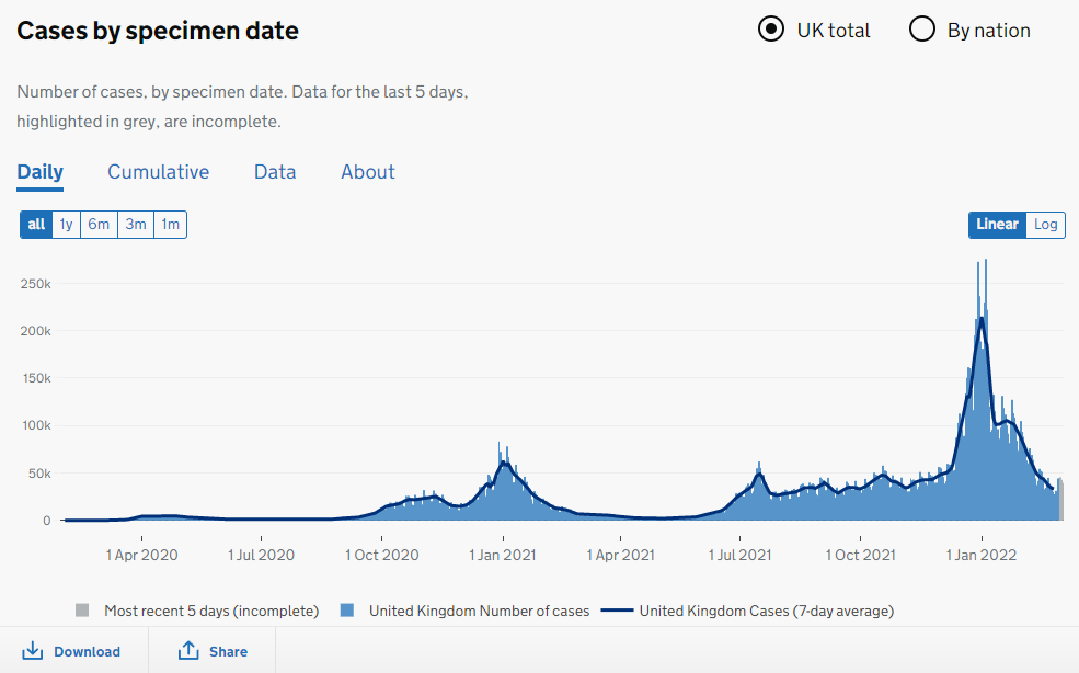
The two series are pretty much reversed! There’s a great deal of scope for speculation here starting with elevated risk of genuine infection for frontline staff and elevated risk of self-isolation owing to a positive test result (which may or may not be in error). Then there are the issues of natural immunity, variants and vaccination to tease out as well as PPE, protocols, management, attitudes, changes in staff behaviour and test regime. This is a rich recipe indeed!
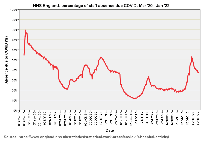
As regards the toll taken by COVID on staffing levels, herewith a slide of percentage of absence due to COVID for the period Mar ‘20 - Jan ‘22:
Beds need nurses
Hospitals do not open beds without adequate nursing support. Determining the adequate level of support is not straightforward and a primer may be found here. If the nursing pool starts to dwindle then matrons and clinical nurse managers will start closing beds. Closing beds on a ward-by-ward basis will reduce beds occupied overall and thus lower occupancy rates, since the bed still exists somewhere in the admin system even if it is not being used. We should thus expect to see an inverse relationship between staff absence levels and beds occupied. And we do…
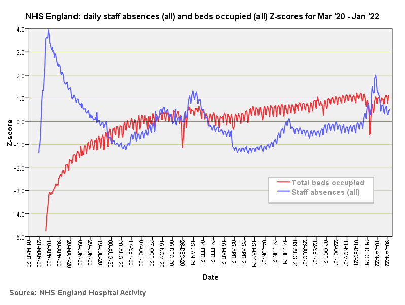
What I’ve done here is add the COVID and non-COVD staff absences together and produce a Standard score (Z-score) of this combined time series that replaces the raw count data with a normalised score for ease of comparison (blue line). Over this I have layered the Z-score transformed series for Total Beds Occupied that we last saw in part 1 of this series (red line). We now see why beds occupied across NHS England (and thus bed availability and occupancy) took a serious dive at the beginning of March: staff absence went through the roof.
In fact, if we take a closer look at those Z-scores we see a +4.0 deviation in staff absence matching a -4.0 deviation in bed occupancy slap bang in the first wave peak in late March - early April. Lower levels of staff absence during Mar ‘21 - Dec ‘21 (negative Z-scores) enabled the service to be steadily rebuilt (positive Z-scores).
For those who like these things I can report that the Pearson bivariate correlation coefficient for total beds occupied vs. staff absences (all) fetches up at r = -0.615 (p<0.001, n=670), this being a robust negative correlation even when considering the entire span of 670 days. With that I do believe it is time to get the…
Kettle on!
Personal contacts have also confided that they sometimes pulled a sickie out of fear and being stressed beyond their eyeballs. I asked one frontline worker if he’d like me to clap, his wry response being, “I’d rather have a pay rise.” Quite.