Exploring Excess Death (part 2)
I investigate alternative methods for estimating excess death using ONS weekly registration data for 2010 - 2023
In part 1 of this series I was forced to take an unconventional approach to calculating excess death; unconventional, that is, in that I didn’t adopt the usual ONS method1 of subtracting prior 5-year means from observations on a matched week-by-week basis owing to the nature of the data in my pantry, being a short-span daily series.
The tastiest bit of this experimental baking consisted of deriving a year-long seasonal template from smoothed historic data and stitching this together in repeated fashion to form a baseline, thence to apply a modicum of ARIMA modelling. This got me to thinking about adopting a similar approach for the ONS weekly registered deaths series.
In my pantry I have weekly registered deaths for England & Wales going back to 1982, data for which was downloaded from the main ONS repository that goes by the main page title of All Data Related To Death - does what it says on the tin!
At the time of analysis the latest file for weekly registered deaths came in a rather different and fiddly format, taking us to just week 4 of 2024, so I opted to end the data series at 2023/w52, which also makes things tidy when it comes to deriving seasonal means. After consideration (and some buttered toast) I decided to start my analytical period at 2010/w1 to keep things simple.
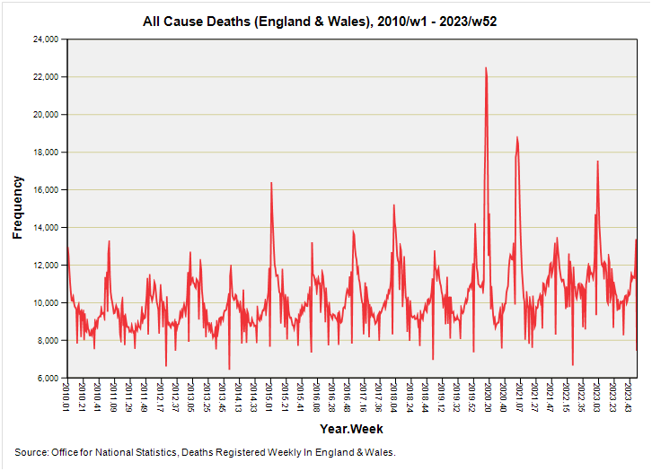
I suggest we start baking this blossom-laden morning by considering a time series plot of all cause weekly registered deaths for England & Wales for the period 2010/w1 – 2023/w52:
A most familiar plot! The usual caveats apply in that these are deaths by registration date and not date of death, hence all those strange spikes that stick out below during holiday periods, with catch-up on the paperwork occurring later to create ‘bumps’. Neither can we be certain that all recent deaths have been counted - especially younger deaths - owing to the considerable delays arising from involvement of the coroner. This is a hot topic that I may well cover again at a later date but for the time being please see my series that kicked-off on 12 December 2022.
Even though we may viciously debate cause there’s no doubt that people did die in large numbers during 2020, but they did so in peculiar bursts, the largest of which is evident during spring of 2020. If we could take a fine pair of secateurs to this well-defined peak, along with the peak coincident with (and immediately prior to) the first week of vaccination rollout, we might ask whether we’ve experienced anything approaching a proper pandemic i.e. one that causes a slew of death and serious illness over time as the pathogen transmits and is purged.
This peculiarity of the pronged pandemic has been tackled in several previous articles but I now forget which, so I shall tackle it again in this very series. Take those two big prongs away and we’re looking at a regular seasonal pattern that I shall be distilling in a short while.
What To Do With Week 53?
Before we begin with the distillation of essences we’ve got to decide how to handle years with 53 weeks. Since 1982 there have been a total of seven 53-week years, these being 1987, 1992, 1998, 2004, 2009, 2015 and 2020, and thus a baseline based on prior 5-year means does not make any sense for week 53 and is a right pain in the Aga.
There are a few ways we can get around this, the easiest being to use the baseline mean derived for week 52, which is what the ONS do and propose. We might also take the average of the preceding and following weeks instead of simply copying a value, this being a method I rather fancy. There is yet another nerd-drenched way and that is to derive the ratio of counts between week 52 and week 53 for the six non-pandemic years then derive the average ratio for those six years and assume this mean ratio will apply to all baseline series incorporating 53 weeks.
The differences between these methods are small, with my mean ratio method inflating the week 53 baseline estimates very slightly compared to a straight averaging of the preceding and following weeks. Owing to the big bod baking factor involved I decided to go with the averaged ratio method, but I am amenable to suggestion and bribery.
How Does The ONS Calculate Their 5-year Baseline?
The ONS play a terribly straight bat by averaging counts over the previous five years, but this simplistic method is about to be usurped by something rather more sophisticated. When it comes to deriving the baseline for 2021, which is supposed to utilise deaths registered during the period 2017–2020, then the ONS - like everyone else - has to contend with the headache of pandemic deaths.
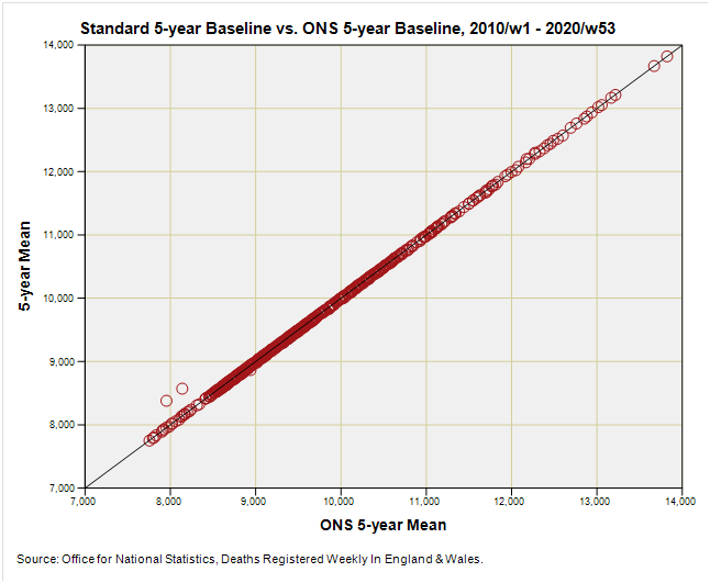
Let’s start by comparing ONS 5-year mean baseline figures with my 5-year mean figures (a.k.a. the ‘standard baseline) for the period 2010/w1 through to 2019/w52:
Very neat indeed. All values turn out precisely the same (unlike my macaroons and ginger snaps) except for the baseline values for 2015/w53 and 2020/w53, which just so happen to be rather similar in magnitude. For these two weeks the ONS simply took the baseline value of week 52 whereas I’ve done that big bod mean ratio nerd thing. The result is that I’m utilising slightly higher estimates, which will result in slightly lower excess.
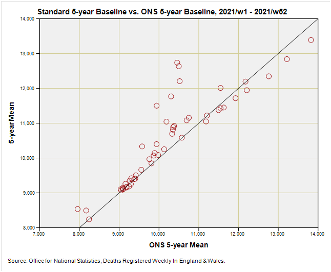
So let’s see what happens during that first critical year of deriving baseline values that have to embrace the big pandemic year of 2020:
OK, so things are all over the place as we may have expected. Blobs sitting on the X = Y line are where the ONS method matches the standard method for deriving the 2021 baseline, and blobs sitting away from this are where the ONS methodology alters course to account for the pandemic year of 2020. Reliance on prior five year means means the baseline for 2021 should based on years 2016 - 2020, but the ONS circumvented this problem by using 2015 - 2019 as the baseline period for 2021 as well as 2020. This is not ideal, as they admit.
One interesting point we can make using this graph whilst still warm is that some weekly values (those sitting on the X = Y line) are what the standard method yields, which in turn tells us that there were periods when the pandemic didn’t really count for anything. The ONS acknowledge this in their report on the proposed new methodology that will utilise those weeks during 2020 when a pandemic wasn’t evident.
Eagle-eyed folk will also note that there are some blobs that sit below the X=Y equality line. These blobs represent baseline values that the ONS are currently using that are higher than the standard baseline values they’d get if they’d forged ahead and ignored the pandemic. By golly and by gum, what a sticky mess! These values are going to affect any excess death calculation, and perhaps we can now begin to see why copying baseline values en bloc for a whole year is not necessarily a good strategy if you desire accuracy.
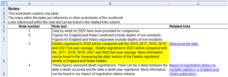
Let us go straight to the horse’s mouth and see what they say about derivation of baselines for those equally awkward years of 2022 and 2023:
They don’t mention that deaths registered in 2021 will be compared to the 2015, 2016, 2017, 2018 and 2019 five-year average but we figured that already (n.b. this is mentioned older ONS spreadsheet notes).
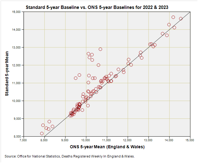
At this point I’d like to see how the 2022 and 2023 ONS baselines fare against the standard do-nothing-funny method. Try this:
There’s a fair bit of agreement owing to repeated use of years 2017, 2018, 2019 and 2021, with a cluster of points sitting above the line that have been elevated in value by counting weeks during 2020 as though the pandemic never existed.
I’m pleased to see little by way of data points below the X = Y line that would otherwise lead to underestimation of excess deaths. All in all a nice cup of tea, but is there a better way?
You bet your Battenberg there is!
I will now scrub-up for a bit of excision…
Kettle On!


A 365-day year contains 52.14286 weeks, having one small dry lump in the batter for one day excess, whereas a 366-day year has 52.28571 weeks and two dry lumps. Therefore even the 52-week years contain errors that just didn’t rise to the level of adding an additional week to the annum.
(edit: Also Each year begins on a different day that splits the werk partially to the prior year with remainder to current year. I presume there is an accepted procedure for declaring a 53-week year or it simply might be a 53rd batch if reports is recorded by year-end. In any case, it seems to me that all years have some days of error due to the residual days.)
One thought is whether employment of a resampling algorithm may provide benefit. A first approach is to resample each 53-week year to a 52-week year (or all 52-week yeara to a 53).
A second approach is to resample each year to days, then choose a convenient integer for a unit of time with which to do comparisons (more on that further down).
There are theoreticallly four resamplings to consider - 52 week data for a 365-day year, 52-week data for a 366-day year, and two cases for 53-week years. Resampling ratios: 52/365, 52/366, 53/365, 53/366.
N.B. the 366-day years could be resampled to a 365 day year as a way of neglecting the extra day in each leap year.
The result would be a dataset of resampled days for each year. Next, regrouping is in order to make comparisons tastier.
Choosing 7 re-sampled days for a comparison ’week’ would seem to comport with convention. One knows that 5 divides evenly into 365, but would be less conventional. In this case the 366th resampled day could be neglected or fudged (if not already handled via the notte bene above) - it occurs once per four years and being a resampled day has 1/7 the weight of an excess week, and half the weight of two dry lumps. One also knows that 6 divides evenly into 366, though that would seem benefit the less frequent leap years and dirty the non-leaps.