Exploring Excess Death (part 4)
I investigate alternative methods for estimating excess death using ONS weekly registration data from 2010 - 2023
In this article I am going to derive what I shall call the seasonal mean baseline. We observed strong seasonality in the exorcised time series of part 3 as well as the colourful factored line chart also therein. Today I’m going to take the pre-pandemic period of 2010 – 2019 and scrunch the death tally down into a single mean value per week of the year, but first I need to de-trend the data that is rising at an estimated rate of between 2.28 and 2.42 deaths per week, depending on how we like to fry our statistics.
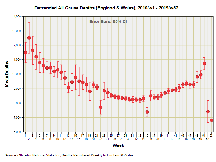
I like the taste of autoregression and the liberation from time dependency that this method brings so shall choose 2.28 deaths per week as my measure of fatal inflation (see part 3 for details). Here’s what the resulting de-trended mean weekly data looks like in the form of an error bar chart:
The lonely dot over on the far right represents 2015/w53. Note the wider error bars at the beginning and end of the year when weekly deaths can vary considerably from year to year. The curious may ask what is happening at week 13, week 22 and week 35 of each year and the answer is Easter, May Bank Holiday and August Bank Holiday. This leaping around is what happens when we rely on date of registration data.
When we stitch these de-trended weekly means together using clone glue we arrive at what I’m calling the seasonal mean baseline, being a template of the regular dynamic of death:
We can use this as an alternative baseline with which to calculate excess death and, if we so choose, we may wish to add that underlying trend back in that was estimated conservatively at an additional 2.28 deaths per week.
This might sound a bit wacko but before we reach for the tinfoil we ought to consider the limitations of the former ONS method of adopting the prior 5-year mean as the baseline. If those previous 5 years can be considered to be fully representative of what has been going on with the health of the nation then all well and good, but what if those 5 years were either laden down with death after death, with a few bad seasons strung together? What if those 5 years represent a series of unusually healthy winter runs? And what about changes to the underlying demographics?
After a bit of thought we come to the realisation that a span of 5 years in the realm of healthcare is no guarantee of ‘business as usual’, there being no such thing as business as usual. What if a startlingly effective diagnosis or treatment was released? What if the government decided to impose laws that impacted on the safety of the nation (e.g. drink/drive, seat belts, and offensive weapons). What then? What then is we go ahead and derive a time series for excess deaths that is as slippery in nature as a freshly caught eel, as we shall soon see!
In the next few sections I am going to reveal the results of several different methods for estimating excess death and shall end the series with a comparison of methods. I suggest we plug the tea urn in and start buttering the bread…
Methods For Estimating Excess Death
Method #1: Subtracting The ONS 5-year Baseline
I guess I better start straight in with the (former) official method and subtract the ONS estimated prior 5-year mean from observed weekly counts. This yields a difference series that looks like this:
Whose cumulative series looks like this:
The first thing that struck me when ogling this slide is that excess deaths began to accumulate in earnest in 2015. This is going to be a function of elevated counts from 2015 onwards and/or a depressed prior 5-year mean for the period 2010 – 2014 onwards. This might feel a little awkward to spread on our bread but we have to realise we’re not necessarily looking at anything other than a double-dipped confection. Excess, yes, but in relation to what, exactly?
I guess what I better do now to illustrate the issue is get the crayons out and plot annual mean values for the prior 5-year mean baseline as once estimated by the ONS:
Well there you go! By examining the baseline values provided by ONS instead of passing them by in a busy spreadsheet we get to see just how much bias is being generated using their original method. Mean annual baseline values for weekly registered deaths hit rock bottom during 2010 – 2015 and so we must automatically expect to see a rising excess for years 2016 - 2020 owing to a particularly quiet era for death.
If we mull this over with a nibble of some kind we get to realise that the first phase of steady decline from 2000 to 2009 will have automatically generated a negative excess for years 2010 - 2014. Thus, the excess we derive for any one year depends enormously on what went before it; and what went before it may not be representative of the long term health of the nation.
In many ways this double-dipped confection is exactly what we want to calculate but what we mustn’t then do is think in terms of absolutes, for a leap upward in excess in any one year does not necessarily mean that the death tally is up for that year; it may well equally mean that the historic count was unusually low! Here’s something that might help…
By Chicago Daily News - http://memory.loc.gov/ammem/ndlpcoop/ichihtml/cdnhome.html, Public Domain, https://commons.wikimedia.org/w/index.php?curid=10592171
Coming back to that cumulative excess slide we now realise that the climb in excess from 2015 onward (the girl on the right) has been generated by an unusually quiet historic period (the boy on the left). Some of you at this point might be thinking that this method of calculating excess death stinks, and I’m sort of with you on that. The jolly good news is that the ONS have gone and re-vamped their methodology big time and what they propose looks rather tasty but very black box.
Method #2: Subtracting The Exorcised 5-year Baseline
The idea behind this method is to avoid the leap-frogging method adopted by the ONS in their avoidance of using 2020 as a baseline by using the exorcised time series to adjust for the two dirty great spikes observed for 2020 as described in part 3; thence to derive a standardised prior 5-year mean baseline. Here’s what the difference series looks like:
And here’s what the cumulative series looks like:
We’re still stuck with that ramp from 2015 onward due to historically low weekly counts, and we may note just how similar this curve is to the ONS version; a direct comparison will be made later.
What I’d like to do now is shift a gear, drop prior 5-year means and pick up my seasonal mean wotsit as a baseline reference.
This could be interesting…
Kettle On!
It is probably a whole new tray bake altogether but reading this made me wonder what effect weather extremes might have on seasonal deaths.
Of course this might also be done in your climate kitchen. In the UK my money would be on colder winters not hotter summers being the worst. If reliable records are available would winter 1947 top summer 1967?
I've seen the recent figures for the recent increase in younger people's cancer mortality in the US, and they make grim reading. (from The Arrow) ..
The problem is with such small numbers of younger folks deaths (in the UK) , there are likely to be some serious annual variations, so really it might be better to look at ten year moving averages, not five, for younger age groups.