Emergency Department Admissions: Analysis of ECDS Dataset (part 4)
SMLR modelling of an ECDS extract of 237k admission records to the emergency departments of an undisclosed NHS Trust: the healthy vaccinee effect confirmed using decision to treat
I appreciate that getting one’s head around staged multivariate logistic regression modelling (SMLR) with propensity adjustment can be a bit too much for many folk, even with a large teapot on the go, several rounds of buttered toast, and the promise of fresh-baked mince pies.
But we’ve been here before, and those with sufficient stamina might want to flip back to this article to refresh the mind and illuminate the soul. Those with little time to spare might prefer a simple summary of what I’m doing and why.
SMLR: A Simple Summary
It’s pretty much a given that the older you get the more things go wrong with your body, so we might expect that older folk are more likely to get treated within the emergency department when they call for an ambulance. We might also expect them to be at greater risk of hospitalisation after that treatment. To account for this we can throw their age into an analysis.
But it isn’t just about age, for biological males are different from biological females (regardless of what our Prime Minister claims) and will be prone to certain diseases. Prostate trouble is a big one for us blokes, and osteoarthritis is a big one for post-menopausal women. This means we have to account for (biological) gender.
Then there are those diseases that can clobber the young as well as the old, and diabetes is particularly insidious in this regard, especially for those who are insulin dependent and are struggling with managing blood sugar levels. This means we also have to account for diseases, disorders and conditions.
Put all these together in a pot and you’ve a sizeable stew of things that simultaneously need to be taken into account before we can say anything about trends in treatment or hospitalisation. A classic way to do this is keep chopping the data down into smaller chunks, for example: we may consider males aged 60 – 69 years without mention of diabetes. This approach is intuitively accessible for most folk and gives answers we can readily understand in the form of pie charts, bar charts, counts and percentages. The trouble is you can end up with just a handful of cases, and it’s going to be impossible to generalise any exciting results to the wider population. Hence my preferred use of multivariate methods whereby I can dial-up as many factors as I have in my pantry and allow them to simmer together.
When it comes to a binary outcome (e.g. treated or not treated) then logistic regression is the classic spanner of choice, for it not only permits multivariate stuff but also allows you to specify a sequence of priorities when it comes to accounting for things.
In my logistic models concerning ED admission you’ll see me consider age and sex first and foremost followed by mode of arrival (arrived by ambulance or made own way). The latter tells us how serious things were in the first instance – this is important for serious stuff requiring an ambulance is more likely to end in treatment and/or hospitalisation.
I then consider a long list of diseases, disorders and conditions that have been lumped into a reasonable number of main categories. Yes, I could indeed consider 800+ diseases individually, but sample sizes are likely to become pathetically small; and it would take months to crunch an answer even on the fastest desktop. So main categories it is, with cardiac leading the way with three distinct subgroups (AMI+, ACS+ and Conduction+): the meaning of these will be discussed later.
But it doesn’t stop there. These are all called ‘main effects’ in statbod-speak. What we can also consider are interactions between these variables, starting with age by sex effects (you’ll sometimes see this written as age * sex). For example, 69.1% of 90+ year-old males are treated within the ED compared to just 65.6% of 90+ year-old females. Quite why elderly males are more likely to be treated than females is not clear but that’s an age * sex effect right there… and it needs to be accounted for!
Get all this stuff right and you end up with a logistic regression that does reasonably well at predicting whatever it is you want to predict. At the moment I’m interested in predicting any treatment given within the ED as well as subsequent hospitalisation since these are primary clinical outcomes for any ED. We could also predict death within the department and I may do this at a later date.
So what can we do with these predictions? Well, the beauty of Logistic Regression is that it kicks out predictions in the form of probability scores such that a probability of 0.000 means zero chance of being treated or hospitalised and 1.000 means total certainty of being treated or hospitalised. Thus, an admission with a (modelled) score of 0.750 has a good chance (75%) of whatever it is we are looking at happening when they arrive on the ED; whereas an admission with a score of 0.200 has fat chance of anything happening (20%). We can use these scores in an attempt to adjust for the complexities of life such as that age * sex example. They tell us what the model thinks should be happening, and if this doesn’t match expectation we can get the kettle on, open the biscuits and try to fathom why not.
Setting the Scene
Back in part 5 of this series I revealed evidence of the healthy vaccinee effect using the CDS 010 dataset. To ensure clarity I used the pre-vaccine era of 2017/w1 – 2020/w49 to model the basic health status of ED admissions in terms of risk of treatment and risk of hospitalisation. Today I’d like to boldly venture further down the same jungle track using the more sophisticated ECDS dataset for the period 2021/w1 – 2021/w38. The key thing here (also being a cracking point made by an astute reader) is the use of the very same period in time to determine basic health status rather than a stretch of four years prior to rollout. If we can see the healthy vaccinee effect emerging once more during 2021 then we may take this as confirmatory evidence.
Something else courageous I wish to do is lump everybody together, whether COVID cases or nay, to ensure all warts have been kissed at one and the same time in a single glorious model. If any differentiation is seen after this, then again we can be assured we are looking at something real.
Vaccination Trajectory
One last thing I wish to mention at this stage is a brand new indicator variable I’m calling Vaccination Trajectory. Basically there are three types of admission in relation to the vaccine:
Folk who were not vaccinated prior to admission and remained unvaccinated for the duration of the sample.
Folk who were not vaccinated prior to admission but were vaccinated shortly after.
Folk who were vaccinated prior to admission
Here’s how the numbers break down:
We shall meet this variable again when I use it to factor risk scores.
A Risk Score For Decision To Treat
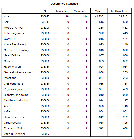
I shall start with a summary table of the 20 variables that I’ll be using in a staged multivariate logistic regression in the prediction of decision to treat within the department (Treatment Status):
As before, the mean of any binary variable coded as [0,1] provides the proportion of admissions; we thus see that 0.516 (51.6%) of admissions were females. Mode of arrival is coded as [0=made own way; 1=ambulance]; thus we see that 28.6% of admissions arrived by ambulance. Total diagnoses is the total number of diagnoses made within the ECDS record, there being a maximum of three fields for the purpose.
Some readers may be surprised to learn of zero diagnosis (10.1% of admission records do not possess a diagnosis). There are very good reasons for this that you can see for yourself any night after pub closing time, and especially Friday and Saturday nights in busy city hospitals. Someone with a bruised head invariably gets booked in but can’t be bothered to wait. Security can be called to take aggressive customers away, and some people simply disappear when their turn for triage comes round. On top of this some people simply receive guidance (or a warm cup of tea), and desk clerks can forget to process data especially if the medical notes have gone missing. On occasion a blue light admission is wheeled right through to cardiac without stopping. Then there are those occasions when nothing wrong can be found!
I’m going to assume most diagnostic categories will be self-evident to readers – I sure hope so because the shortlists are not that short! Cardiac conduction includes all form of arrhythmia including brady and tachycardias as well as all flavours of conduction block – think of this category as the electrical wiring gone wrong. ACS+ includes all forms of acute coronary syndrome together with cardiac inflammation (pericarditis, endocarditis, myocarditis). Ideally I’d have cardiac inflammation as a standalone category but the sample size was far too small (n=157) and preliminary factor analysis of all 7 cardiac subcategories linked ACS with inflammation. AMI+ is your classic heart attack (ST elevation myocardial infarction) together with cardiogenic shock and cardiac arrest (these being frequent outcomes for severe STEMI cases).
Blood disorders include clotting disorders as well as various form of haemorrhage, thrombosis, stroke, cerebral ischaemia, oedema, and embolism.
Organ/sepsis includes all forms of organ failure, especially of the liver and kidney, as well as hepatitis, sepsis and septic shock.
Bottom of the list is the dependent variable of Treatment Status telling us that 54.2% of admissions were treated in some manner. When I say ‘treatment’ I mean exactly that: I have excluded requests for certificates, referrals to GP/elsewhere, specimen collection, handling the homeless and similar miscellaneous entries. In my world ‘treatment’ involves something that was done to somebody – i.e. a medical procedure.
Modelling Strategy
The sample used was all adult admissions to the ED over the period 2021/w1 – 2021/w38 (n=236,856). In the first stage all 20 independent variables listed above were entered as main effects using a conditional forward selection process. In the second stage an additional 37 two-way interactions were submitted to a conditional forward selection process to further explore age (19 two-way) and sex (18 two-way) interactions with various diagnostic categories. Beyond this level of parameterisation diminishing returns for model performance were severe.
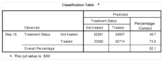
The final model absorbed 35 of the 57 possible terms before the run came to a halt at step 16 with the following classification results:
As we may observe the model was particularly good at predicting true positives, with a performance of 73.5% of treatments correctly identified. It wasn’t as good at predicting true negatives with performance dropping to 48.7% correct classification. There are two ways of looking at this: either the model is weak in some aspect or it’s telling us something valuable about the (lack of) decision to treat in an emergency department in the middle of vaccine rollout in post-lockdown Britain.
Risk Score Basics
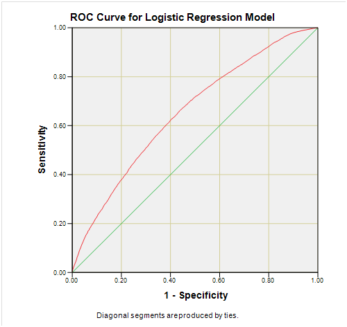
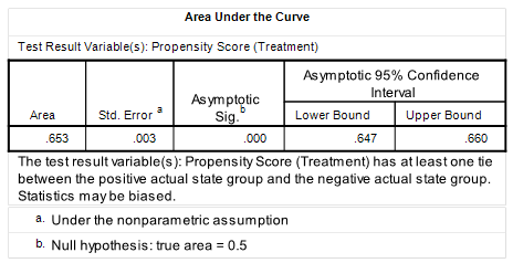
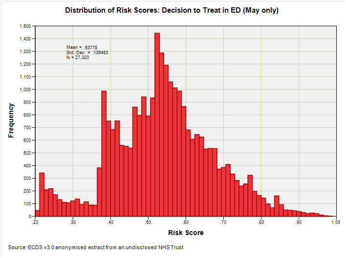
Here’s the ROC for those who relish these things but do bear in mind the sample for this was restricted to the 27,320 admissions for May 2021 to avoid my graphing module from meltdown:
And while we’re at it we better look at the summary stats table for the full sample of 233,062 modelled cases as well as squint at the histogram of scores derived the for May 2021 sub-sample:
As always, things are more complicated than we’d prefer, with a triple-humper distribution yielding a mean score of 0.541 (n=233,062). Readers with time to spare might find themselves wondering what the humps mean in real life whilst waiting for their rough cut cane sugar cubes to dissolve in their Arabica medium roast blend (as I am doing now). The humps represent surges in the case profile of admissions to which ED physicians will respond in terms of treatment (or not).
The BIG Small Result
Instead of writing reams about the intricacies of the 35-parameter SMLR model (something I may well reserve as a treat for founder members) I’m going to wade straight in with one of those colourful slides that explain everything we need to know in one swish of a crayon:
How’s about that, then? I’d like to use words such as cool, hip, tasty, and sexy but these days I better use boujee, bussin’, drip, and ate, but then again, that’s my POV.
We now see that when we adjust for a whole bunch of stuff using SMLR we arrive at predictive scores for risk of treatment that confirm the healthy vaccinee effect over the period 2021/w1 – 2021/38 when rollout was in full swing.
But there are subtle twists to this in that the healthiest folk of all came in all juiced-up, with those who went on to get jabbed after their admission coming second. The distinction is most readily seen for the 70 -79 and 80 -89 year age groups but melts into a pool of water ice for the three youngest groups.
This reminds us to ask awkward questions of those experts attempting to dismiss claims of the healthy vaccinee effect, for it would be easy to show lack of an effect using samples carefully culled from cohorts largely under 60 years of age.
So that’s decision to treat for you. What I better do next is re-run the analysis to obtain scores for risk of hospitalisation during 2021. Until then…
Kettle On!




still a bit above my pay grade but i am catching up ( slightly)