Exploring Vaccine Harm (part 2)
A possible method for the assessment of relative vaccine harm in younger people
In part 1 of this series I explored a new technique for assessing elevated all cause and non-COVID weekly death in persons 15 – 19y by comparing these counts with those for persons 80+y. What I like about this approach is that by using the most vulnerable and vaccinated age group as a reference we iron out excess deaths due to lockdown policy and service closure. The 80+y group arguably will have been truly clobbered more than most, thus serving as a valuable yardstick.
With that yardstick in place we observed an inexplicable hike in 15 – 19y deaths for the post-vaccination era compared to the pre-vaccination era that was highly statistically significant and substantial. Whether or not this can be blamed entirely on vaccine harm remains to be seen, but we have yet another alarm bell ringing that the authorities are going to ignore (this deep in they have to - they have no choice).
Thus we find ourselves living in a bizarre new world where regulatory bodies cannot be relied upon to protect the public, and where corruption and self-interest within these bodies cannot be ruled out. The gentle folk of the land are going to have to do their own digging and their own thinking if they are to escape what appears to be Darwinian selection in full and demonic swing.
Crank The Handle
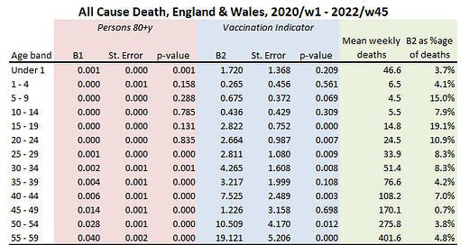
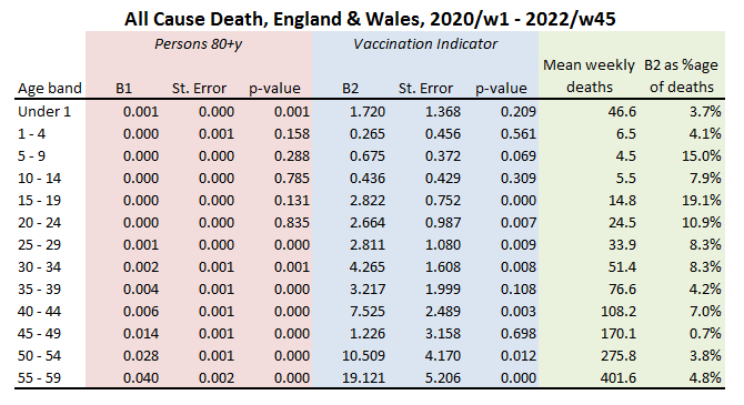
With all that said and done I shall now crank the handle on the generalised modelling procedure developed in part 1 and present the results of 13 model runs in the form of a summary table:
The pink area contains the gubbins relating to the weekly count for 80+y as a predictor for the weekly count of younger years. From this we can see that this independent variable is pretty much useless (p>0.05) for the prediction of all cause deaths below 25 years of age. Beyond 25 and the elderly subpopulation becomes a handy predictor, which is… er… handy.
The area of interest for most folk will be the blue area, which provides the gubbins for the vaccine rollout indicator as a predictor for teenage death. The column to consider first and foremost is headed ‘p-value’, where we see a highly statistically significant effect suddenly kick in for persons 15 – 19y (p<0.001). The coefficient associated with this (B2) takes up a value of +2.8, indicating an elevation of nearly three extra deaths per week in the post-vaccine era. The column ‘mean weekly deaths’ gives the overall base rate for the entire series, this being 14.8 deaths per week for persons 15 – 19y, for which an excess of +2.8 yields a percentage leverage of +19.1%. That is some leverage that the authorities are studiously ignoring.
Age bands 15 – 19y, 20 – 24y, 25 - 29y, 30 - 34y, 40 - 44y, 50 - 54y and 55 - 59y all yield statistically significant results for the vaccine rollout indicator with leverages ranging from +0.7% - 19.1%. The Chris Whittys of this world will argue, “ah, yes, but lockdown kills”. Yes it does, which is why we need to pay particular attention to results for 25 years of age onward, for all of these older subpopulations exhibit a statistically significant correlation with weekly rates for the 80+y reference group, and the 80+y reference group will have been sensitive to lockdown perhaps more so than any other group owing to increased social and clinical vulnerability as well as reliance on availability of medication and care.
In stats-speak we call this a covariate, and in these models the 80+y covariate will have accounted for variation in weekly deaths due to lockdown harm plus a truck load of other things. What is left is vaccine harm plus anything odd the younger groups might have been doing (e.g. committing suicide, getting lethally intoxicated).
The Whitty Wangler
We may call this approach the Whitty Wangler, for by using a vulnerable subpopulation as an independent variable (covariate) we have taken a few first steps to address variation in deaths caused by lockdown harm. In this regard it is interesting to note that lockdown harm crops up for persons aged 25 years and over, but doesn’t apply to younger generations; a finding that makes a great deal of sense, especially if we are talking deaths arising from delays to diagnosis and treatment.
A quick squizz at the coefficients in the column B1 reveals an accelerating correlation with the 80+y reference group with increasing age and this may be taken as a rough proxy for the deterioration in underlying health with age.
With that all said and done I shall revert to coffee and cogitation mode! Until next time…
Kettle On!


It’s become transparent why more than one lockdown was needed and indeed happened.
The lockdowns are the scapegoat to answer every problem question that is put towards them. It’s not their decisions, bad policy, dodgy pharmaceuticals that are at fault or guilty of causing harm, it’s the lockdowns fault end of in their world and that’s what they’re sticking with.
As someone who on paper is classed as high risk from this, due to previously having pneumonia, age bracket and unvaxxed I should have been dead and buried along time ago according to them, this especially as I worked through apart from a weeks due to supply issues my boss had at the start. When we opened back up we were constantly busy and I’ve served thousands of people, handled more money than I can count, yet I’m still alive and kicking just like millions of others. What we as a country did witness was a dereliction of duty from our healthcare system that should always focus on early treatment instead of ignoring those in need that were ill and could be saved.
I'd be interested to see what the average death rate is for young people from 2015-19 as well