Flip Flop Flu, WHO Rule 3 & The Blip Of COVID (part 1)
A festive frolic involving a bit of time series modelling of deaths from influenza and pneumonia so that we may see what we once saw
Whilst spaced out on a heady mixture of Covonia for chesty coughs, rum + raw honey toddies and Christmas carols I penned an intermission that included a daft slide. There’s a story behind that slide that you can bone-up on by going back to my original article entitled Flip Flop Flu (part 1). To cut a long story short the WHO decided to annihilate flu and pneumonia deaths back in 1984 - 1992, and again from 2001 onwards by virtue of a change in the coding of death certification known in the business as “rule 3”.
The groggy monkey in me wanted to know what the time series for flu and pneumonia deaths might have looked like if rule 3 had not been permanently implemented in 2001 and, in particular, whether COVID would still have stood out like a sore thumb.
Definitions
We need to start with a couple of definitions and so for this particular bake I chose the nations of England and Wales combined, and I decided to consider causal death. Yes indeed, I’m well aware of the many problems and issues surrounding cause of death coding! These existed in the era before COVID and it was my painstaking job to boss a team about to do this as best we could whilst casenotes were still hot and registrars willing to be grilled.
This landing page of the Office for National Statistics, with the grand title of All Data Related To Deaths is where you need to go with your shopping basket and search phrases such as pneumonia and COVID. A couple of hours later and you’ll be knee-deep in spreadsheets in daily, weekly, monthly and yearly formats that need to be cobbled together to form a coherent spreadsheet for analytical purposes. This is the bit in the movie when the hands of a clock whirl round while a frantic montage of industry is shown over a suitable orchestral score.
When the final bars of music slow us to real time we may sit back in our chair and puff contentedly on a pipe (a liquorice one if we are health conscious) and slam down a neatly engraved spreadsheet for the period 1901 - 2022 with the following goodly columns, backed by a broad smile:
England & Wales Population (mid year estimate)
Registered Births (live)
Registered Deaths
Natural Change (Births – Deaths)
Crude Mortality Rate (Deaths/100k)
Deaths due to influenza and pneumonia
Deaths due to COVID
Let us now get the oven on and start baking some treats!
Christmas Cake
I couldn’t resist kicking-off with all cause crude mortality for the period 1901 – 2022. This is one of those slides that is rather like Christmas cake: there’s all sorts of nuts and fruit in there, along with ale, brandy, egg and grated carrot. Interpretation is difficult because soooo many things have been changing over time, and not just in terms of healthcare and the social sector. We are looking at the kitchen sink; in this instance the kitchen cake:
What strikes me is the stability of the rate from 1920 right through to 1980 or thereabouts. A lot happened in that time (and not just in medicine) but, despite this, crude mortality for us Brits remained around 1,200 deaths per 100k population. We seemed to be getting things right from 1980 through to 2011 in one way or another (though we need to consider historic birth trends and, ideally, we ought to age-standardise this curve).
What is obvious is that it started to go pear-shaped back in 2011 and we may wonder whether COVID was simply a bunch of death waiting to happen. I am sure we can all come up with a long list of factors explaining why the health of the nation has been in decline for 12 years, starting with the paradoxical notion that the health of the nation may not be in decline, and we may be looking at a birth blip working its way through!
COVID during 2020 is waving to us in the bottom right-hand corner, and one of those cheeky take-home messages I’d like to conjure is that, at 1015.38 deaths per 100k population, this matches a crude rate last seen in 2003 (1019.64 deaths per 100k population). That’s a bit of a slapper right there and, being of a certain age, I feel like I’ve been tangoed.
But let us move along the bus to pneumonia and influenza:
This is not a crude rate but the raw count for I want to draw attention to the flip-flop-flu period stemming from implementation of WHO rule 3. I think we can all spot the Spanish Flu, and no doubt subscribers will be wondering how deaths due to COVID compares – this analysis will appear a little later for what I want to do next is run ARIMA time series with outlier detection blazing to see what this spanner yields by way of eventful events. Here’s the nubbins:
What I want us to do at this stage is ignore the ARIMA(0,1,1) model performance and coefficients and gawp at the bottom table of outlying years. The Spanish Flu kicks off in 1918 with an estimated +123,329 additional deaths over that expected (p<0.001), simmering down to an additional +35,031 deaths in 1919 (p<0.001). There are two other outbreaks of something to consider in 1929 (+29446 deaths, p<0.001) and 1951 (+14915 deaths, p<0.001) and subscribers may want to Google what went on in those years.
As regards my big beef with WHO rule cookery we see three entries marked as ‘level shift’. In my stats package a level shift usually denotes a change in policy rather than an outbreak, so here are three estimates for policy change under WHO rule 3. Thus, in 1984 we lose 28,804 deaths due to pneumonia & influenza (p<0.001), with 26,272 missing deaths being returned to the pool following abandoning of the policy in 1993, only for us to permanently lose an estimated 24,927 pneumonia & influenza deaths per year from 2001 onward when ONS decided to lick WHO’s boots. These figures offer a starting point for correcting the record back to how it once was.
Refined Flour
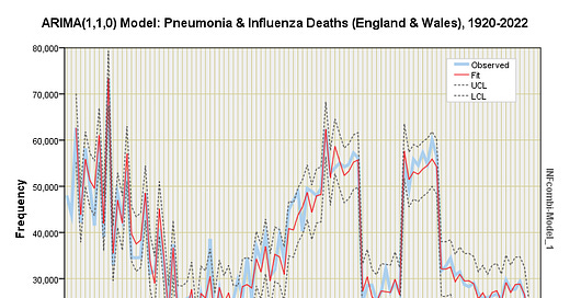
What I am going to do now is ignore the extraordinary events of 1918/19 and start the clock at 1920. I’m also going to establish event indicators for WHO Rule 3 (temporary and permanent) and throw in crude mortality rate as an independent (predictor) variable. This is what we now get:
We now have an ARIMA(1,1,0) model that is a stonking fit to the data, and offering suitably refined estimates for the impact of WHO Rule 3. Back when the ONS trialled implementation in 1984 – 1992 we lost an estimated 27,090 deaths per year from the pneumonia & influenza annual tally (p<0.001), with an estimated 24,679 deaths per year being lost since the permanent 2001 implementation (p<0.001).
The table of outliers tells an interesting epidemiological story with outbreaks of something in 1922, 1927, 1929, 1933, 1937, 1943 and 1976. The negative level shift of 1939 is rather curious and we may wonder why pneumonia & influenza death took a backseat during the onset of WWII.
The pandemic year of 2020 offers intrigue in that the algorithm has detected a transient drop in pneumonia & influenzal death to the tune of 17,942 missing deaths with a decay factor of 0.81 (p<0.001). Have these been erroneously coded as COVID? My ARIMA model seems to suggest this, and neither is it any tired-old limp biscuit model; take a look at this for a tasty tray bake:
This surely is good enough to cause certain subscribers to swoon, and my betting money is on those missing deaths being erroneously coded! Let’s go fix that in part 2…
Kettle On!
A decay factor of 0.8 means the effect impacts beyond 2020, so we are looking at missing deaths in 2021 and, possibly, 2022.
Wow! Present company excepted, it seems that the "Lies, d... lies and statistics" circus has been in full swing for some time!
Hope you are soon back to good health by the way. How you can come up with all this with a fuzzy head I can't imagine!
Tried to send you a bowl of nourishing soup but it wouldn't fit in the envelope. And I'm sure Mrs Dee makes the best soup anyway